
Your customer pulls out their phone during lunch break. They’ve been thinking about that dress they saw on Instagram. Three taps later, they’re on your Shopify store. But something’s wrong. The images load slowly. The text is tiny. The checkout button seems impossible to find.
They’re gone in seconds.
This scenario plays out millions of times every day. Mobile commerce now drives the majority of e-commerce traffic and sales. Yet many Shopify store owners still treat mobile as an afterthought. That’s a costly mistake.
Here’s what you need to know: Google’s mobile-first indexing means your store’s mobile experience directly impacts search rankings and discoverability. Shoppers expect fast, seamless, and intuitive experiences—regardless of device. A mobile-optimized Shopify store increases conversions, reduces bounce rates, and builds long-term customer loyalty.
In this comprehensive guide, you’ll discover how to transform your Shopify store into a mobile powerhouse. We’ll cover everything from design fundamentals to advanced optimization techniques. By the end, you’ll have a clear roadmap to create a mobile experience that not only meets but exceeds your customers’ expectations.
Foundations of Mobile Optimization for Shopify
Building a successful mobile store starts with understanding the core principles. Let’s begin with the foundation that everything else rests upon.
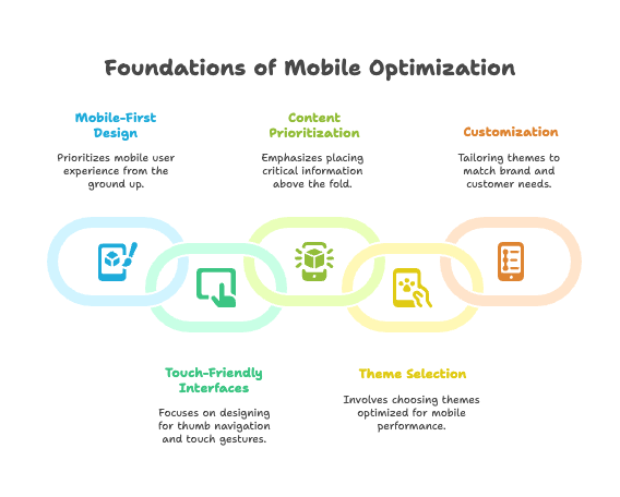
Understanding Mobile-First Design Principles
Mobile-First vs. Responsive Design
There’s a crucial difference between mobile-first and responsive design, and understanding it can make or break your mobile strategy. Mobile-first design prioritizes mobile user experience from the ground up. You start with the mobile experience and then enhance it for larger screens.
Responsive design, on the other hand, adapts layouts for all screen sizes but may start with desktop assumptions. Most Shopify themes are responsive by default, which is great. But here’s the thing: responsive doesn’t automatically mean optimized for mobile.
Your Shopify theme might resize beautifully across devices, yet still provide a frustrating mobile experience. Why? Because true mobile optimization requires rethinking how customers interact with your store on small screens.
Importance of Touch-Friendly Interfaces
Mobile users navigate with their thumbs, not mouse cursors. This fundamental difference changes everything about interface design. You need to design for thumb navigation and touch gestures, not precise clicking.
Large, well-spaced buttons and links are essential. Apple recommends a minimum touch target size of 44 pixels, while Google suggests 48 pixels. But size isn’t everything—spacing matters too. Cramped buttons lead to accidental taps and frustrated customers.
Here’s a common mistake: relying on hover-dependent elements. That slick dropdown menu that appears when someone hovers over “Collections”? It doesn’t work on mobile. Prioritize tap interactions and ensure every important function is accessible through touch.
Prioritizing Content for Mobile Users
Mobile screens are small. Real estate is precious. Every pixel must earn its place. Place critical information and calls-to-action above the fold—the area visible without scrolling.
But what counts as “critical”? Your product name, price, and primary product image. Your add-to-cart button. Your main navigation. Everything else can wait.
Minimize clutter and distractions. That sidebar full of widgets? It’s probably hurting your mobile conversion rate. Use concise, scannable text and clear product imagery. Remember: mobile users are often multitasking, distracted, or in a hurry.
Choosing and Customizing a Mobile-Optimized Shopify Theme
Selecting a Mobile-Responsive Theme
Not all Shopify themes are created equal when it comes to mobile performance. The Shopify Theme Store offers filters to help you find mobile-optimized themes, but don’t stop there.
Check theme reviews for real-world mobile performance feedback. Look for specific mentions of mobile speed, usability, and customer satisfaction. Pay attention to negative reviews too—they often reveal mobile-specific issues that aren’t immediately obvious.
Here’s a pro tip: Before purchasing any theme, preview it on multiple devices. Shopify’s theme preview is helpful, but nothing beats testing on actual phones and tablets.
Customizing for Mobile Excellence
Even the best mobile-optimized theme needs customization to match your brand and customer needs. Shopify’s theme customizer includes mobile preview options, but use them wisely.
Adjust font sizes for readability. What looks perfect on desktop might be too small on mobile. Test image dimensions and spacing to ensure they work across all screen sizes. Make sure navigation and cart access are always visible—customers shouldn’t have to hunt for basic functionality.
Consider your target audience’s device preferences. If your analytics show most mobile visitors use older or budget smartphones, optimize for lower-resolution screens and slower processors.
Essential Elements of a High-Performing Mobile Store
Now that you understand the foundations, let’s build something remarkable. These elements separate good mobile stores from great ones.
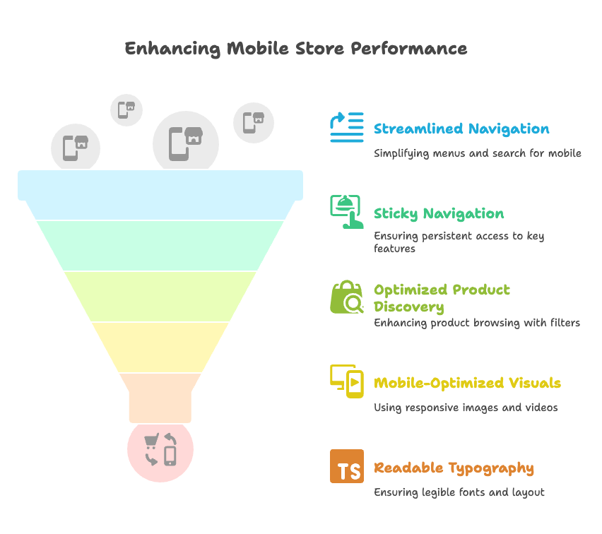
Streamlined Navigation and User Experience
Simplifying Menus for Small Screens
Desktop navigation doesn’t translate to mobile. Period. Your beautifully organized desktop menu with eight categories and multiple subcategories becomes a confusing mess on a phone screen.
Limit top-level menu items to key categories. Three to five main categories work well for most stores. Use hamburger or dropdown menus to save space, but make sure they’re intuitive to use.
Add a prominent search bar for quick product discovery. Many mobile users prefer searching to browsing through categories. Make your search function easily accessible—ideally visible at all times.
Sticky Navigation and Quick Access Features
Mobile users scroll a lot. If they have to scroll back to the top every time they want to access their cart or main menu, you’re creating friction. Implement sticky headers for persistent access to cart and menu.
Consider floating action buttons for chat or support if they’re relevant to your business. But be careful not to block important content or create a cluttered interface.
Optimizing Product Discovery
Product discovery on mobile requires a different approach than desktop. Use filters and sorting options designed specifically for mobile interfaces. Dropdown menus work better than sidebar filters on small screens.
Highlight featured products and collections for easy browsing. Create clear visual hierarchies that guide users naturally through your product catalog. Consider implementing infinite scroll or pagination that works smoothly on touch devices.
Visuals and Content Adaptation
Mobile-Optimized Images and Videos
Images make or break mobile experiences. Slow-loading images frustrate customers and hurt your search rankings. Use responsive images with the srcset attribute to serve appropriate sizes for each device.
Compress images without sacrificing quality. Tools like TinyPNG or Shopify apps like Crush.pics can reduce file sizes by 50-80% while maintaining visual appeal. Consider using next-generation formats like WebP for even better compression.
Test banners, carousels, and videos for display and performance on mobile devices. That stunning hero video on your homepage might look amazing on desktop but cause serious loading issues on mobile.
Readable Typography and Layout
Typography on mobile requires careful attention to detail. Choose legible fonts and adequate line spacing. Remember that users might be viewing your store in bright sunlight or dim lighting—contrast matters.
Avoid dense text blocks. Use headings and bullet points to break up content and improve scanability. Your product descriptions should be easy to digest quickly.
Ensure color contrast meets accessibility standards. This isn’t just about compliance—it’s about creating an inclusive experience for all users, including those with visual impairments.
Avoiding Intrusive Elements
Pop-ups and interstitials that work on desktop often become intrusive nightmares on mobile. Google actually penalizes sites that use intrusive interstitials on mobile.
Minimize or eliminate pop-ups on mobile. If you must use them, ensure they’re easy to dismiss and don’t interfere with the core shopping experience. Use non-intrusive banners for promotions or cookie notices.
Mobile Performance and Speed Optimization
Speed kills—or rather, the lack of it kills conversions. Mobile users are even less patient than desktop users. If your store doesn’t load within three seconds, you’ve lost a significant percentage of potential customers.
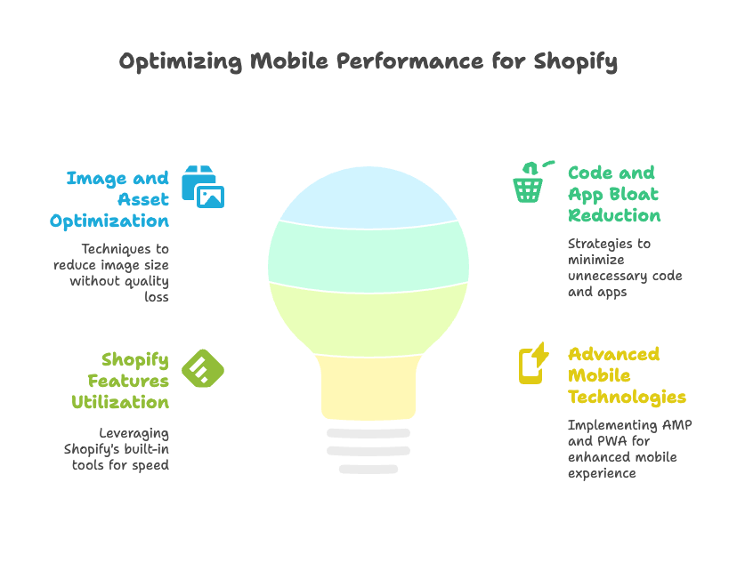
Image and Asset Optimization
Compressing Images Without Quality Loss
Images typically account for 60-70% of a page’s total weight. Optimizing them is crucial for mobile performance. Shopify’s built-in image optimizer helps, but you can do better with third-party solutions.
Apps like TinyPNG and Crush.pics offer more aggressive compression while maintaining visual quality. They can automatically optimize new images as you upload them.
Enable lazy loading for images below the fold. This technique loads images only when users scroll to them, dramatically reducing initial page load times. Most modern Shopify themes include lazy loading by default.
Minimizing Code and App Bloat
Every app you install adds code to your store. That code has to load on every page view. Remove unused apps and scripts that slow down your store—they’re digital deadweight.
Audit your installed apps regularly. That app you tried six months ago but forgot to uninstall? It’s still loading code and slowing down your store. Be ruthless about removing anything you don’t actively use.
Minify CSS and JavaScript files when possible. Combine files where it makes sense. Leverage Shopify’s content delivery network (CDN) for faster global delivery of static assets.
Leveraging Shopify Features for Speed
Choosing Fast-Loading Themes
Theme choice dramatically impacts performance. Some themes are simply better optimized than others. Prioritize themes that have been tested for speed and mobile performance.
Look for themes that mention performance optimization in their descriptions. Check their demo stores with tools like Google PageSpeed Insights or GTmetrix to get objective performance data.
Browser Caching and Content Delivery
Shopify automatically enables browser caching for most resources, but verify settings if you’ve added custom code. Properly configured caching can dramatically improve return visit performance.
Shopify’s built-in CDN serves your static assets from servers close to your customers. This reduces loading times, especially for international customers. Make sure all your assets are leveraging this CDN.
Accelerated Mobile Pages (AMP) and Progressive Web Apps (PWAs)
Consider AMP integrations for lightning-fast product and collection pages. AMP creates stripped-down versions of your pages that load almost instantly on mobile devices.
Progressive Web Apps (PWAs) offer app-like mobile experiences without requiring customers to download anything. Several Shopify apps can help you implement PWA functionality, creating faster, more engaging mobile experiences.
Mobile Checkout Optimization for Shopify
The checkout is where good intentions become revenue. A poorly optimized mobile checkout can destroy even the best marketing efforts. Let’s make sure yours converts like crazy.
Streamlining the Checkout Process
Reducing Form Fields and Steps
Every additional form field in your checkout reduces conversion rates. On mobile, where typing is more difficult, this effect is amplified. Consolidate name and address fields wherever possible.
Hide optional fields behind expandable links. Don’t force customers to scroll past fields they don’t need. Use single-page or dynamic checkout flows that adapt based on customer selections.
Consider implementing smart address lookup that auto-completes addresses based on postal codes. This reduces typing and speeds up checkout significantly.
Enabling Guest and Express Checkout Options
Forced account creation is a conversion killer on mobile. Allow guest checkout to reduce friction for first-time customers. You can always encourage account creation after the purchase is complete.
Integrate express payment options like Shop Pay, Apple Pay, Google Pay, and PayPal. These services can reduce checkout time from minutes to seconds by using stored payment and shipping information.
For returning customers, ensure the login process is smooth and offers features like auto-fill and biometric authentication where available.
Clear Calls-to-Action and Error Messaging
Your checkout buttons need to be large enough for easy tapping and clearly labeled. “Complete Order” or “Place Order” works better than vague terms like “Submit.”
Provide real-time error feedback for form fields. Don’t wait until customers submit the entire form to tell them their email format is incorrect. Display progress indicators throughout checkout so customers know how many steps remain.
Use color and visual cues to guide customers through the process. The path to completion should be obvious and reassuring.
Testing and Optimizing for Conversion
A/B Testing Checkout Variations
Small changes in checkout flow can have massive impacts on conversion rates. Regularly test different layouts, button placements, and payment options to find what works best for your audience.
Test one element at a time to isolate what’s driving improvements. The position of your security badges, the color of your checkout button, or the order of payment options can all significantly impact conversions.
Monitoring Mobile Checkout Analytics
Use Shopify Analytics and Google Analytics to track mobile conversion rates and identify drop-off points. Pay special attention to the mobile checkout funnel—where are customers abandoning the process?
Set up conversion goals that track mobile vs. desktop performance separately. This data will help you prioritize optimization efforts and measure improvements over time.
Advanced Mobile SEO and Discoverability
Getting traffic to your mobile store requires a sophisticated understanding of how mobile search works. The rules are different, and the stakes are higher.
Implementing Mobile SEO Best Practices
Mobile-First Indexing and Structured Data
Google now uses the mobile version of your site for indexing and ranking. This means your mobile pages need to be as content-rich and crawlable as your desktop versions.
Ensure all important content is accessible on mobile. Hidden content or content that requires interaction to reveal might not be indexed properly. Use structured data markup for products, reviews, and breadcrumbs to help search engines understand your content.
Rich snippets from structured data can significantly improve your click-through rates from search results, especially on mobile where screen space is limited.
Mobile Keyword and Voice Search Optimization
Mobile searchers use different keywords than desktop users. They’re more likely to use conversational language and location-based queries. Research mobile-specific keywords and incorporate them naturally into your product pages.
Voice search is growing rapidly on mobile devices. Optimize for voice queries by using conversational, long-tail phrases. Think about how people speak, not just how they type.
Questions starting with “how,” “what,” “where,” and “when” are common in voice searches. Include FAQ sections that address these types of queries.
Local SEO for Mobile Users
Mobile searches are three times more likely to be local than desktop searches. If you have physical locations, optimize aggressively for local search.
Claim and optimize your Google My Business listing. Add local schema markup to your contact pages. Ensure your store locator is mobile-friendly and provides accurate directions and contact information.
Even if you’re purely online, consider local SEO if you serve specific geographic markets or want to target location-based keywords.
Social and App Integration
Seamless Social Media Shopping
Social commerce is predominantly mobile. Integrate Instagram Shopping, Facebook Shop, and TikTok Shop to reach mobile-first audiences where they’re already spending time.
Ensure product links from social media platforms load quickly and display properly on mobile devices. Social traffic often has lower intent than search traffic, so your mobile experience needs to be compelling enough to convert browsers into buyers.
Test your social media content regularly on mobile devices. What looks good on desktop might be illegible or poorly formatted on mobile.
Mobile App Strategies for Shopify
Consider building a branded mobile app for repeat customers. Apps can offer faster loading times, offline browsing, and enhanced personalization features.
Use push notifications strategically to drive engagement and sales. App-exclusive offers and early access to sales can incentivize app downloads and usage.
However, remember that app development and maintenance require significant resources. Ensure you have a clear strategy and sufficient user base to justify the investment.
Testing, Maintenance, and Continuous Improvement
Mobile optimization isn’t a one-time project—it’s an ongoing commitment. The mobile landscape evolves rapidly, and your optimization strategy must evolve with it.
Cross-Device and Cross-Browser Testing
Regularly Test on Multiple Devices and Browsers
Shopify’s preview tools are helpful, but they can’t replace testing on real devices. Different phones, tablets, and operating systems can display your store differently.
Test on both iOS and Android devices across various screen sizes. Don’t forget about tablets—they occupy a unique middle ground between phones and desktops.
Use browser testing tools or services that let you see how your store performs across different mobile browsers. Chrome dominates mobile browsing, but Safari, Firefox, and Samsung Internet all have significant user bases.
Accessibility and Usability Audits
Accessibility isn’t just about compliance—it’s about creating inclusive experiences that work for everyone. Use automated tools to identify accessibility issues, but supplement them with manual testing.
Test your store with screen readers, voice control, and other assistive technologies. Consider users with motor impairments who might have difficulty with precise touch gestures.
Regular usability testing with real users can reveal issues that automated tools miss. Watch how people actually interact with your mobile store—you might be surprised by what you discover.
Ongoing Optimization and Analytics
Monitoring Performance Metrics
Set up comprehensive tracking for mobile performance metrics. Monitor page speed, bounce rates, conversion rates, and user engagement separately for mobile and desktop traffic.
Use tools like Google PageSpeed Insights, Shopify Analytics, and Google Analytics to gather performance data. Set up alerts for significant changes in key metrics so you can respond quickly to issues.
Pay attention to real user metrics, not just lab-based performance scores. How fast your site loads in testing environments might differ significantly from real-world performance.
Staying Updated with Shopify and Industry Trends
Follow Shopify’s blog and documentation for new features and best practices. Shopify regularly releases updates that can improve mobile performance or provide new optimization opportunities.
Stay informed about mobile commerce trends and emerging technologies. What works today might not work tomorrow, and early adoption of new features can provide competitive advantages.
Join Shopify communities and forums where store owners share experiences and solutions. Real-world insights from other merchants can be invaluable for optimization strategies.
Conclusion and Next Steps
Mobile optimization isn’t just about making your store “work” on phones—it’s about creating experiences that delight customers and drive business growth. The strategies we’ve covered represent a comprehensive approach to mobile excellence, from foundational design principles to advanced optimization techniques.
Remember that mobile optimization is a continuous process requiring regular testing, updates, and adaptation to new technologies. Consumer expectations continue to rise, and new devices and browsing behaviors emerge constantly.
Shopify store owners who prioritize mobile experience will benefit from higher engagement, better search rankings, and increased sales. The investment in mobile optimization pays dividends through improved customer satisfaction and business performance.
Your next steps should include auditing your current mobile experience against the strategies outlined in this guide. Implement the most impactful changes first—typically performance improvements and checkout optimization—then work through the other areas systematically.
Set up a schedule for ongoing reviews and improvements. Mobile optimization is never “finished,” but with consistent attention and improvement, your Shopify store can deliver exceptional mobile experiences that convert visitors into loyal customers.
References
- CRM Masters. “Shopify Mobile Optimization Checklist for 2025.” CRM Masters, April 16, 2025. https://crm-masters.com/shopify-mobile-optimization-checklist-for-2025/
- Shopify. “5 Simple Hacks for an Optimized Mobile Ecommerce Design.” Shopify Blog, November 3, 2015. https://www.shopify.com/partners/blog/74754051-5-simple-hacks-for-an-optimized-mobile-ecommerce-design
- TinyIMG. “Optimize Shopify for Mobile: Best Practices and Tips.” TinyIMG Blog, August 25, 2023. https://tiny-img.com/blog/mobile-shopify-optimization/
- Collabnix. “A Developer’s Guide to Mobile-First Shopify Store Design.” Collabnix, October 29, 2024. https://collabnix.com/a-developers-guide-to-mobile-first-shopify-store-design/
- Shopify Community. “How can I increase mobile site speed for better traffic?” Shopify Community, May 1, 2024. https://community.shopify.com/c/technical-q-a/how-can-i-increase-mobile-site-speed-for-better-traffic/m-p/2065189
Ready to supercharge your Shopify store’s mobile performance and boost conversions? Growth Suite is a Shopify app that intelligently optimizes your discount strategies to capture mobile visitors who might otherwise leave without purchasing. It analyzes visitor behavior in real-time and presents perfectly timed, personalized offers that convert browsers into buyers—all while protecting your brand integrity. Install Growth Suite with a single click and start seeing results immediately!