
The Critical Importance of Mobile Optimization for Shopify Stores
Ever pulled out your phone to buy something online, only to find yourself pinching, zooming, and eventually giving up on a frustrating website? You’re not alone. The harsh reality is that most of your customers are shopping from their phones, and if your Shopify store isn’t optimized for mobile, you’re watching money walk out the virtual door.
Mobile shopping isn’t just growing—it’s dominating. With over 70% of all e-commerce traffic now coming from mobile devices, the landscape has fundamentally shifted. Yet shockingly, mobile conversion rates still lag behind desktop by nearly 50%. That gap represents pure profit potential just waiting to be unlocked.
What if you could turn those mobile browsers into buyers? What if your Shopify store could capture sales that your competitors are missing? That’s exactly what this guide will help you achieve.
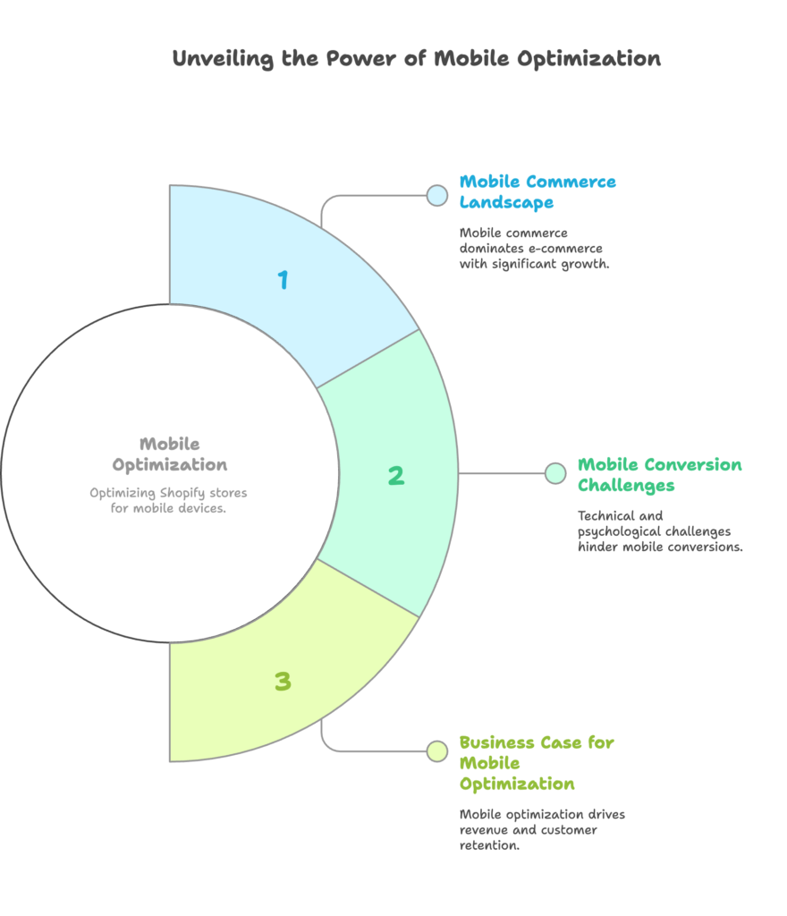
The Mobile Commerce Landscape
The numbers tell a compelling story. Mobile commerce sales are projected to reach $710 billion in the US alone this year—representing a staggering 73% of all e-commerce. For Shopify store owners specifically, mobile traffic now accounts for approximately 79% of visits, but often converts at just 1-2% compared to desktop’s 3-4%.
Think about that gap for a moment. If your store gets 10,000 mobile visitors monthly with a 1.5% conversion rate, improving that to just 2.5% would mean 100 additional sales every month. At an average order value of $75, that’s $7,500 in additional monthly revenue—without spending an extra penny on marketing.
Google’s mobile-first indexing has further raised the stakes. Sites that aren’t mobile-friendly now suffer in search rankings, creating a double penalty: fewer visitors and fewer conversions. Your competitors who optimize for mobile aren’t just capturing more sales—they’re becoming more discoverable too.
Understanding Mobile Conversion Challenges for Shopify Stores
Why do so many Shopify stores struggle with mobile conversion? The challenges are both technical and psychological.
Mobile users face real technical hurdles—slower page loads on cellular networks, limited screen space for product details, and multi-step checkout processes that feel cumbersome on a small screen. A one-second delay in page load time can reduce conversions by up to 7%, and mobile users are particularly impatient.
But the psychological barriers are equally important. Mobile shoppers have shorter attention spans (often just 8 seconds) and different browsing patterns. They’re frequently shopping in context—maybe on a lunch break, during a commute, or while watching TV—with numerous distractions competing for their attention.
And yet, mobile shoppers still expect a seamless experience. A shocking 85% say they expect a mobile site to be as good or better than the desktop version. Meet that expectation, and you gain a loyal customer. Fall short, and they’re just a tap away from your competitor.
The Business Case for Mobile Optimization
Let’s talk dollars and sense. Mobile optimization isn’t just a technical nicety—it’s a revenue driver with a clear ROI.
Consider a simple calculation: If your Shopify store generates $200,000 in annual revenue with 70% of traffic from mobile but a conversion rate that’s 40% lower than desktop, improving your mobile conversion rate to match desktop could increase your annual revenue by $56,000.
That’s before accounting for the compounding effects. Mobile-optimized stores see higher customer retention rates, more repeat purchases, and increased average order values over time. They also typically experience lower customer acquisition costs, as improved conversion rates mean you’re getting more value from every advertising dollar spent.
In the competitive Shopify ecosystem, where over a million merchants are vying for attention, a superior mobile experience is increasingly the key differentiator. Customers remember smooth, frustration-free shopping experiences—and they vote with their wallets.
Mobile User Experience Fundamentals for Shopify
Having established why mobile optimization matters, let’s dive into how to transform your Shopify store’s mobile experience. We’ll start with the fundamentals of mobile UX that form the foundation of any high-converting store.
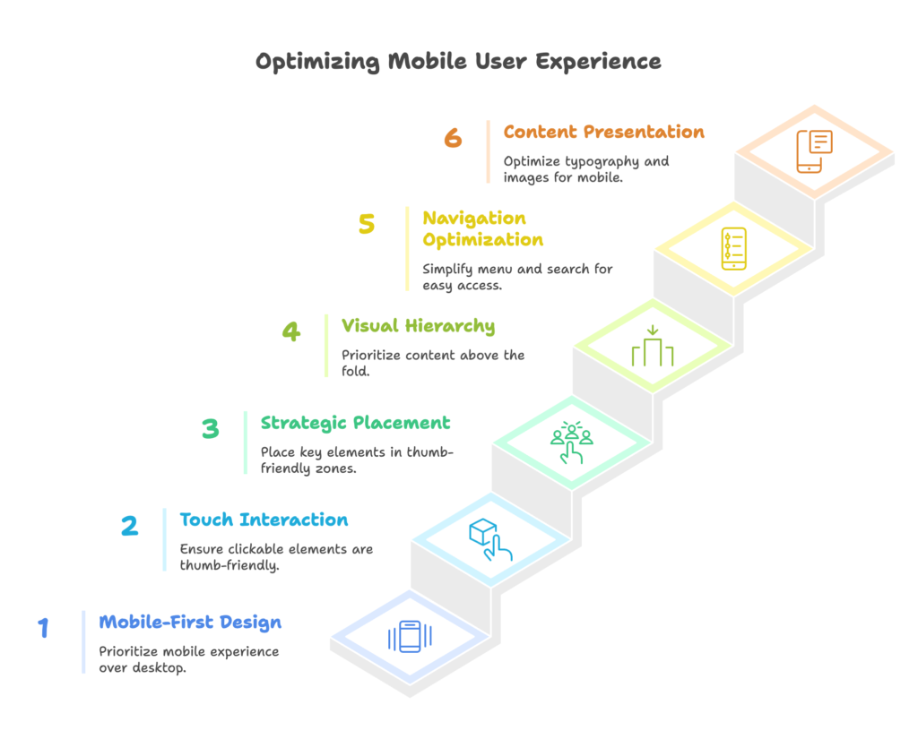
Mobile-First Design Principles
You’ve likely heard of responsive design, which adapts desktop layouts to fit smaller screens. But mobile-first design flips the script—starting with the mobile experience and then expanding to desktop. This crucial difference changes everything about how your store functions.
Why does this approach matter? Because it forces you to prioritize the essential elements of your shopping experience rather than trying to cram a desktop site onto a phone screen. Mobile-first design isn’t about making things smaller—it’s about making strategic decisions about what truly matters to your conversion process.
For Shopify stores, this means selecting themes built with mobile-first principles (like Prestige, Impulse, or Dawn) or customizing your current theme with mobile as the priority. The good news? Many newer Shopify themes are inherently mobile-first, giving you a solid foundation to build upon.
When it comes to touch interactions, size matters. Mobile users navigate with their thumbs, not precise mouse pointers. Clickable elements should be at least 48px × 48px (Apple’s recommendation), with adequate spacing between interactive elements to prevent “fat finger” errors. Nothing frustrates mobile shoppers more than accidentally tapping the wrong button!
Strategic placement is equally important. Heat mapping studies show that most users hold their phones in a way that makes the middle and bottom portions of the screen most easily accessible to their thumbs. Placing your most critical call-to-action buttons (like “Add to Cart”) in these “thumb-friendly zones” can significantly impact conversion rates.
Finally, visual hierarchy becomes even more crucial on mobile. With limited screen real estate, you must ruthlessly prioritize what appears “above the fold” (visible without scrolling). Your value proposition, key product benefits, and primary call-to-action should be immediately visible when a page loads. Use visual weight, color contrast, and white space to guide the eye to the most important elements first.
Mobile Navigation Optimization
Ever tried finding a specific product on a mobile site with a confusing menu? It’s the digital equivalent of wandering a maze. Navigation is the roadmap to conversion, and on mobile, simplicity is king.
The hamburger menu (those three horizontal lines in the corner) has become a standard that mobile users understand, but its implementation matters. Keep your menu structure shallow—no more than two levels deep if possible. Every additional tap required to reach a product category increases the risk of abandonment.
Organize your categories intuitively, using customer-centric labels rather than internal jargon. “Women’s Tops” is more immediately understood than “Female Apparel – Upper Garments.” Test your menu structure with real users to identify any confusion points.
Search functionality becomes even more critical on mobile, where browsing through categories can feel cumbersome. Make your search bar prominent and accessible—typically at the top of the screen. Implement predictive search that shows results as users type, reducing the effort required to find products.
Consider the power of sticky navigation elements that remain visible as users scroll. A persistent search bar or key category links can dramatically improve navigation efficiency, while a floating “back to top” button prevents endless scrolling. These small conveniences add up to a significantly improved shopping experience.
Mobile Content Presentation
Content that works beautifully on desktop can become an unreadable mess on mobile without proper optimization. Typography is your first consideration—font sizes should never drop below 16px for body text, with line heights of at least 1.5 for optimal readability.
Contrast becomes more important on mobile screens that may be viewed in variable lighting conditions. Dark text on a light background typically offers the best readability, with a contrast ratio of at least 4.5:1 to meet accessibility standards.
Mobile users are scanners, not readers. Break content into digestible chunks using subheadings, bullet points, and short paragraphs (2-3 sentences maximum). Expandable sections allow you to provide detailed information without overwhelming the initial view—perfect for product descriptions or FAQs.
Images and videos require special consideration on mobile. Optimize images to load quickly while maintaining clarity on high-resolution screens. Product photos should allow pinch-to-zoom functionality with clear details visible at maximum zoom. For videos, ensure they’re playable in-line (without opening a new app) and consider implementing autoplay for short, silent product demonstrations when users scroll to them.
Remember that mobile users may be on limited data plans or in areas with spotty connectivity. Provide text alternatives for key visual information, and consider implementing lazy loading for images further down the page to improve initial load times.
Technical Optimization for Mobile Shopify Stores
The most beautiful mobile design in the world won’t convert if it takes forever to load or breaks on certain devices. Let’s explore the technical optimizations that ensure your mobile Shopify store performs flawlessly for every customer.
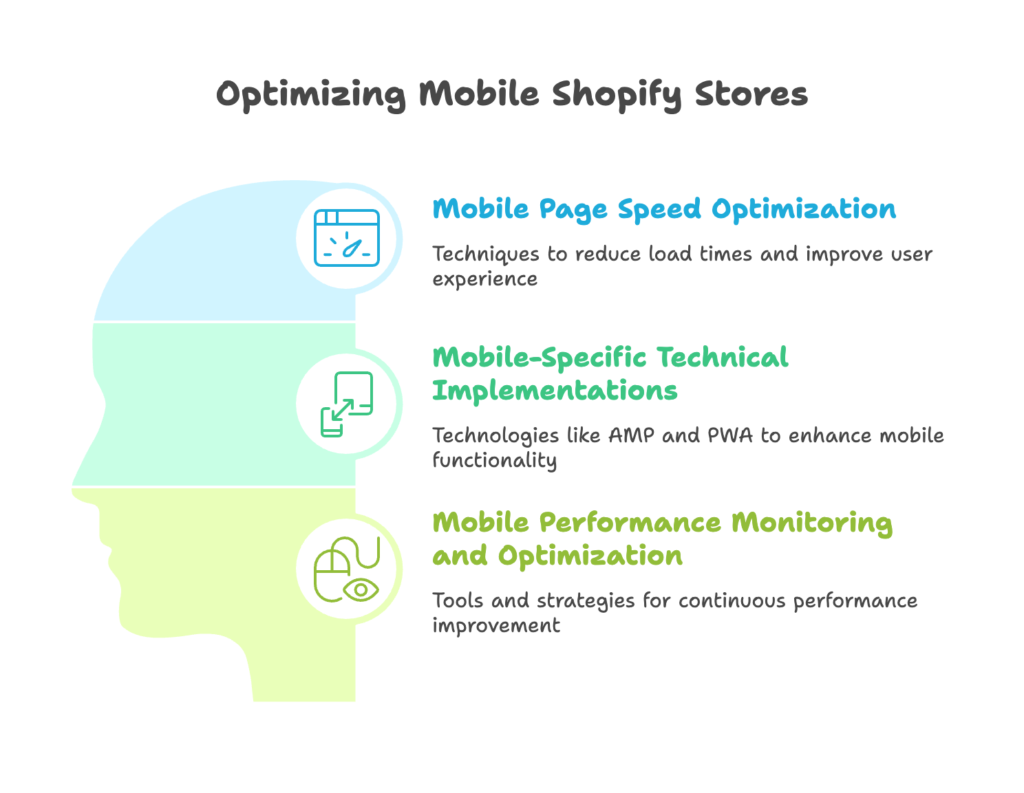
Mobile Page Speed Optimization
Speed isn’t just a convenience—it’s a conversion factor. Studies show that 53% of mobile visitors will abandon a site that takes longer than three seconds to load. Each additional second of load time can reduce conversions by up to 7%.
Images are typically the heaviest elements on any page, often accounting for 50-90% of total page weight. Implement proper image compression using tools like TinyPNG or Shopify’s built-in image optimization. Aim for file sizes under 100KB for product images when possible.
Go beyond basic compression by implementing responsive images with the srcset attribute, which serves different sized images based on the device’s screen width. Modern image formats like WebP can reduce file sizes by 25-35% compared to JPEGs of similar quality, though you’ll want to provide fallbacks for older browsers.
Code optimization is equally important. Minify your CSS and JavaScript files to remove unnecessary characters and whitespace. Reduce HTTP requests by combining files where possible and leverage browser caching to store commonly used resources. Implement critical CSS rendering to display above-the-fold content while the rest of the page loads.
Shopify-specific speed enhancements include selecting lightweight themes (Dawn is particularly performant), regularly auditing your apps for performance impact, and utilizing Shopify’s global CDN effectively. Remember that each app you install potentially adds JavaScript that must load before your site becomes interactive.
Mobile-Specific Technical Implementations
Beyond basic speed optimization, several mobile-specific technologies can enhance your Shopify store’s performance and user experience.
Accelerated Mobile Pages (AMP) create stripped-down, lightning-fast versions of your pages that load almost instantly from Google search results. While implementing AMP on Shopify has traditionally been challenging, several specialized apps now make it possible for blog posts and product pages.
Progressive Web App (PWA) features bring app-like experiences to your mobile website without requiring users to download an actual app. Service workers enable offline functionality and faster repeat visits, while push notifications can re-engage users even when they’re not actively browsing your site. Add-to-home-screen functionality creates a shortcut on the user’s device, increasing the likelihood of return visits.
Browser compatibility testing is non-negotiable. Your mobile site must function flawlessly across Chrome, Safari, Firefox, and Samsung Internet at minimum, with particular attention to iOS Safari, which has its own quirks and limitations. Tools like BrowserStack allow you to test your site across multiple devices and browsers without needing physical access to each one.
Mobile Performance Monitoring and Optimization
Performance optimization isn’t a one-time task—it’s an ongoing process requiring regular monitoring and refinement.
Google’s Core Web Vitals have become the gold standard for measuring mobile performance, focusing on three key metrics: Largest Contentful Paint (LCP) measures loading performance, First Input Delay (FID) measures interactivity, and Cumulative Layout Shift (CLS) measures visual stability.
For Shopify stores specifically, track mobile-specific conversion metrics like mobile cart abandonment rate, mobile average order value, and mobile checkout completion rate to identify performance bottlenecks in your conversion funnel.
Use testing tools like Google PageSpeed Insights, which provides both lab and field data about your site’s performance. Leverage Shopify Analytics’ device breakdown to compare mobile performance against desktop, and consider implementing real user monitoring solutions for more detailed insights.
Establish performance budgets—maximum limits for page size, load time, and number of requests—and hold yourself accountable to them as you add new features. Implement A/B testing for major performance changes to quantify their impact on conversion rates before rolling them out store-wide.
Mobile Product Page Optimization
Product pages are where browsing turns into buying. On mobile, where screen space is limited and attention spans are shorter, optimizing these crucial pages can dramatically impact your conversion rates.
Mobile Product Imagery
On mobile devices, your product images do the heavy lifting in convincing customers to buy. Make them count.
Rethink traditional image galleries for mobile viewing. Implement swipe-friendly carousels with clear indication of additional images and visible navigation dots. Enable intuitive pinch-to-zoom functionality that works smoothly across devices, with high-resolution images that remain clear at maximum zoom.
Consider implementing 360-degree product views that users can rotate by dragging their finger across the screen—particularly valuable for products where dimensional understanding matters, like furniture or fashion. Short product videos (15-30 seconds) can dramatically increase conversion by demonstrating the product in use, highlighting key features through motion.
Visual hierarchy becomes crucial with limited screen space. Prioritize your hero image—typically showing the product in use rather than isolated on a white background—followed by supporting images that address common customer questions or concerns. For clothing, include images of the product on different body types; for electronics, show close-ups of key features.
User-generated content builds trust and helps customers visualize the product in real life. Integrate customer photos within your product gallery, not buried in reviews. Instagram-style image feeds showing the product being used by real customers can increase conversion rates by up to 15% for certain product categories.
Mobile Product Description Optimization
Product descriptions that work on desktop often fail on mobile. Optimize your content for small screens and scanning behavior.
Implement a scannable content structure with the most compelling benefits visible immediately. Use expandable sections (accordions) to organize detailed information into digestible chunks that users can tap to reveal only when interested. Consider a tabbed interface separating “Overview,” “Features,” “Specifications,” and “Reviews” to allow users to quickly access the information most relevant to their decision.
Simplify technical specifications for mobile viewing. Replace dense text with visual icons representing key features. For products with numerous specifications, consider a comparison table optimized for horizontal scrolling on mobile screens, with the most important attributes visible without scrolling.
Mobile call-to-action optimization can make or break your conversion rate. Implement sticky add-to-cart buttons that remain visible as users scroll through product information, eliminating the need to scroll back up to purchase. Create clear visual hierarchy with your primary action (Add to Cart) in a contrasting color and secondary actions (Save for Later, Share) in less prominent positions.
Reduce choice paralysis by simplifying product options on mobile. If offering multiple variants, consider a stepped selection process rather than displaying all options simultaneously. Show in-stock status clearly to create urgency and help users avoid frustration from selecting unavailable options.
Mobile Upsell and Cross-Sell Strategies
Strategic upselling and cross-selling can significantly increase average order value, but the approach needs refinement for mobile screens.
Position product recommendations in the natural flow of the mobile shopping journey—after the add-to-cart button but before reviews, or immediately after a product is added to cart. Implement swipeable recommendation carousels that show 1.5-2 products at once, creating a “peek” effect that encourages horizontal scrolling.
Personalize recommendations based on browsing history and cart contents, clearly communicating the relevance with labels like “Frequently Bought Together” or “Complete the Look.” Limit recommendations to 3-5 highly relevant products rather than overwhelming mobile users with too many options.
For bundle presentation, simplify the visual representation to clearly communicate value. Show bundle savings prominently with both percentage and dollar amounts. Allow easy bundle customization with simple toggles for adding or removing items, minimizing the cognitive load for mobile users.
Post-purchase upselling offers an often-overlooked opportunity. Optimize order confirmation pages for one-click add-ons related to the purchase. Implement SMS-based post-purchase recommendations for time-sensitive offers, and consider incentivizing mobile app installation immediately after purchase to facilitate future mobile shopping.
Mobile Checkout Optimization for Shopify
The checkout is where all your hard work either pays off or falls apart. Mobile users abandon carts at nearly twice the rate of desktop shoppers, making checkout optimization perhaps the highest-leverage improvement you can make.
Streamlining the Mobile Checkout Process
Every tap, field, and second of loading time between the add-to-cart button and the purchase confirmation is an opportunity for abandonment. Ruthless simplification is required.
Minimize checkout steps to the absolute essentials. Shopify Plus merchants should consider implementing one-page checkout to reduce friction, while standard Shopify stores should ensure their checkout flow is as streamlined as possible. For multi-step processes, include clear progress indicators showing exactly where customers are in the process and how many steps remain.
Form optimization is crucial on mobile devices where typing is cumbersome. Use appropriate input types to trigger the right keyboard variant (email keyboard for email fields, numeric keyboard for phone numbers, etc.). Implement autofill functionality to leverage browser-saved information, and enable address lookup services that populate city, state, and zip code fields automatically after the street address is entered.
Inline validation provides immediate feedback as users complete forms, preventing frustration from discovering errors only after submitting. Use visual cues (green checkmarks, red error messages) to indicate field status clearly, with helpful error messages that explain exactly how to fix any issues.
Guest checkout should be your default option, with account creation offered as a post-purchase opportunity, not a requirement. Studies consistently show that forced account creation is among the top reasons for cart abandonment. Instead, highlight the benefits of account creation (order tracking, faster checkout next time) after the purchase is complete, when customers are more receptive.
Mobile Payment Optimization
The rise of digital wallets has transformed mobile checkout, offering a frictionless alternative to manual card entry. Failing to optimize for these payment methods is leaving money on the table.
Implement Shop Pay for all Shopify stores—it increases conversion rates by up to 1.91x by securely saving customer information and enabling one-tap checkout. Similarly, configure Apple Pay for iOS users and Google Pay for Android users, with clear visual buttons that stand out in your checkout flow.
For customers who prefer traditional payment methods, optimize the credit card entry process with auto-formatting as numbers are entered, clearly labeled fields, and visual representations of accepted card types. Provide clear visual feedback during payment processing with progress indicators or animations to prevent users from becoming anxious and abandoning during this critical moment.
Buy Now, Pay Later options have proven particularly effective for mobile conversion, with services like Klarna, Afterpay, and Affirm increasing conversion rates by up to 30% in some categories. Feature these options prominently in the mobile checkout flow, with clear explanation of payment terms and visual breakdowns of installment amounts.
Reducing Mobile Cart Abandonment
Even with an optimized checkout, some abandonment is inevitable. Strategic recovery tactics can recapture these potential sales.
Exit-intent strategies must be rethought for mobile, where traditional cursor-based triggers don’t apply. Instead, use back-button detection, inactivity timers, or scroll-up behaviors as triggers. Simplify exit offers for mobile—a straightforward discount code or free shipping offer with a prominent “Stay and Save” button often works best.
Cart recovery automation should leverage multiple channels. SMS recovery campaigns typically generate higher open rates than email for mobile shoppers (98% versus 20%) and faster response times. Optimize abandoned cart emails specifically for mobile viewing with large call-to-action buttons, minimal text, and clear value propositions.
Throughout the checkout process, strategically place trust signals to alleviate concerns about security and reliability. Mobile-friendly security badges should be visible but not distracting. Simplify return policy and guarantee information into scannable bullet points rather than lengthy text. Integrate short customer testimonials specifically about the checkout experience to build confidence at this critical conversion point.
Mobile Marketing and Conversion Tactics
Beyond site optimization, specific marketing tactics can dramatically improve mobile conversion rates. Let’s explore strategies designed specifically for mobile shoppers.
Mobile-Specific Promotional Strategies
Mobile users respond to different promotional tactics than desktop shoppers, often driven by immediacy and convenience.
Implement mobile-friendly discount presentation with codes that are easy to remember and type on a mobile keyboard. Consider copy-to-clipboard functionality to eliminate typing entirely. Sticky promotional banners at the top of the mobile viewport ensure offers remain visible without consuming excessive screen space.
Location-based offers can be particularly effective for mobile users, who often shop while on the go. Implement geotargeting to display relevant promotions based on the user’s location, such as free shipping to their detected region or local pickup options for nearby stores.
Urgency and scarcity tactics work powerfully on mobile, where immediate action is easier. Mobile countdown timers for limited-time offers create urgency, while real-time inventory status indicators (“Only 3 left!”) drive immediate purchasing decisions. Consider mobile-only flash sales during peak mobile usage times (evening commute hours, lunch breaks) to capitalize on contextual shopping moments.
Push notification campaigns can drive significant re-engagement when implemented thoughtfully. Develop a strategy for permission acquisition, focusing on the concrete benefits users will receive. Optimize timing and frequency based on user behavior patterns, and personalize content based on browsing history and preferences.
Mobile Customer Engagement Tools
Mobile shopping can feel impersonal without deliberate engagement strategies. The right tools create connection and confidence.
Mobile chat implementation bridges the gap between online convenience and in-store service. Optimize floating chat buttons for mobile with careful placement in thumb-friendly zones that don’t obscure product information or calls-to-action. Implement chatbots to handle common questions with visual elements like product carousels, quick-reply buttons, and emojis to create an engaging experience.
SMS marketing consistently delivers higher engagement rates than email for mobile users, with 90%+ open rates and rapid response times. Develop clear opt-in strategies that communicate the specific value users will receive, such as exclusive offers or early access to new products. Create conversion-focused SMS campaigns with concise messaging, strong calls-to-action, and deep links directly to product pages.
Mobile social proof elements leverage the power of community validation. Implement subtle real-time notification popups showing recent purchases or product views (“15 people are viewing this right now”), which create urgency without disrupting the browsing experience. Display review counts prominently on product thumbnails in category pages, allowing shoppers to quickly identify well-reviewed items.
Mobile Retention and Loyalty
Acquiring mobile customers is just the beginning. Retention strategies specifically designed for mobile users can dramatically increase lifetime value.
Mobile loyalty program implementation should prioritize simplicity and immediate gratification. Create programs with easily understood points systems and attainable rewards tiers. Implement mobile wallet integration for loyalty cards, eliminating the need for separate apps or physical cards. Use push notification reminders about available points or rewards to drive repeat purchases.
Optimize the post-purchase mobile experience to lay the groundwork for future conversions. Create mobile-friendly order tracking pages with visual progress indicators and proactive SMS updates at key stages. Implement mobile review solicitation at the optimal moment—typically after delivery confirmation but before the excitement of a new purchase has faded.
Re-engagement strategies should leverage mobile-specific behaviors and triggers. Implement browse abandonment campaigns for mobile users who viewed products but didn’t add to cart, with SMS reminders for high-intent products. Develop mobile-specific win-back campaigns for lapsed customers, using personalized recommendations based on previous purchases and browsing history.
Testing and Optimization Framework for Mobile Conversion
Sustainable improvement requires systematic testing and analysis. Let’s establish a framework for ongoing mobile optimization.
Mobile-Specific Analytics Implementation
Effective optimization starts with accurate measurement. Standard analytics often mask mobile-specific issues and opportunities.
Track key mobile metrics separately from desktop, including mobile-specific conversion rate, mobile average order value, mobile cart abandonment rate, and mobile page engagement metrics like scroll depth and time on page. Establish mobile-specific benchmarks rather than using desktop metrics as your standard of comparison.
Implement device-based segmentation to understand performance differences between iOS and Android users, smartphone versus tablet users, and even specific device models. Analysis often reveals surprising disparities—for instance, iOS users typically have higher average order values but Android users often show higher conversion rates on promotional items.
Mobile behavior patterns differ significantly from desktop. Map user journeys across devices to understand cross-device shopping behavior—many customers research on mobile but complete purchases on desktop, or vice versa. Proper attribution modeling ensures you understand the true role mobile plays in your conversion process.
Mobile A/B Testing Strategies
Testing on mobile requires unique considerations and methodologies to generate reliable insights.
Focus mobile-specific tests on elements with the highest impact: call-to-action button size and placement, mobile navigation alternatives, product image presentation, and checkout flow variations. Small changes often yield dramatic results—a simple button color change increased conversions by 14% in one well-known case study.
Mobile testing methodology must account for device diversity. Segment tests by device type to identify platform-specific optimizations, as what works for iOS may not work for Android. Control for network conditions by analyzing results separately for WiFi versus cellular connections, as behavior patterns often differ based on connection speed and reliability.
When prioritizing mobile tests, use an impact-effort evaluation framework to focus on changes that promise the highest return on investment. Analyze your mobile conversion funnel to identify the points of greatest dropoff, which typically represent the most significant improvement opportunities. Benchmark against competitors in your niche to identify areas where your mobile experience lags behind industry standards.
Continuous Mobile Optimization Process
Mobile optimization is never “done”—it’s an ongoing process requiring systematic approach and commitment.
Establish a testing roadmap with a mobile-specific testing calendar covering 3-6 months of planned experiments. Balance quick wins (like button optimizations or copy changes) with strategic improvements (like checkout flow redesigns) to maintain momentum while working toward significant gains.
Implement a phased approach to rolling out successful test results. Begin with partial traffic allocation to minimize risk, monitoring post-implementation performance closely before full deployment. Document all tests, results, and implementations to build an institutional knowledge base that prevents repeating unsuccessful experiments and helps identify patterns in successful changes.
Stay current with mobile trends through regular competitive analysis of leading Shopify stores in your niche and adjacent categories. Monitor Shopify platform updates and new mobile capabilities, and follow mobile UX best practices from authoritative sources. The mobile landscape evolves rapidly, and yesterday’s best practices can quickly become outdated.
References
- Shopify Blog. (2024, September 4). CRO for Mobile: How to Boost Mobile Conversions. https://www.shopify.com/blog/cro-for-mobile
- TinyIMG. (2023, August 25). Optimize Shopify for Mobile: Best Practices and Tips. https://tiny-img.com/blog/mobile-shopify-optimization/
- Instant.so. (2025, April 10). 15 best Shopify mobile optimization tips to enhance user experience. https://instant.so/blog/shopify-mobile-optimization
- ConvertCart. (2025, February 19). How Do I Boost My Shopify Conversion Rate? (50 Effortless Strategies). https://www.convertcart.com/blog/shopify-conversion-rate
- Tidio. (2024, November 8). Shopify Conversion Rate Optimization: Strategies to Boost Sales. https://www.tidio.com/blog/shopify-conversion-rate-optimization/
Ready to supercharge your Shopify store’s mobile conversion rate with perfectly optimized discount codes and campaigns? Growth Suite is a Shopify app that helps you analyze visitor behavior, create personalized limited-time offers, and boost customer engagement with native-looking notifications. It leverages AI to intelligently deliver the right offer to the right customer at the perfect moment. Install it with a single click and start seeing results!