![]()

Ever wonder why visitors leave your Shopify store without buying? The answer is hiding in plain sight—in their clicks, scrolls, and movements across your pages. While traditional analytics tell you what happened on your site, visual analytics reveal the crucial why behind user behavior.
For Shopify store owners, understanding this behavior isn’t just interesting—it’s essential for survival. With average e-commerce conversion rates hovering around a mere 2-3%, there’s enormous room for improvement. The stores that thrive aren’t guessing what works; they’re using visual data to see exactly how customers interact with their sites.
In this guide, we’ll explore how heat maps and session recordings can transform your understanding of customer behavior and dramatically improve your conversion rates. You’ll discover implementation strategies specifically designed for Shopify, advanced analysis techniques, and proven optimization strategies that have generated real results for other store owners.
The Critical Role of User Behavior Analysis in E-Commerce
Your Shopify dashboard provides valuable metrics—pageviews, bounce rates, and sales figures. But these numbers only tell half the story. They show outcomes without revealing the journey. Why did a visitor abandon their cart? Which product images did they scrutinize before making a decision? Where did they get stuck or confused?
Traditional analytics tools simply can’t answer these questions with certainty. They track what pages users visit but miss crucial details about how they interact with each element on those pages. This creates blind spots in your optimization efforts.
In today’s competitive e-commerce landscape, these blind spots are increasingly costly. Your competitors aren’t just battling you on price and product selection—they’re racing to create the most intuitive, frictionless shopping experience possible. Visual analytics gives you the insights needed to keep pace and pull ahead.
Fundamental Concepts of Visual Analytics
Before diving into implementation strategies, let’s establish a clear understanding of the two primary visual analytics tools: heat maps and session recordings.
Heat Maps: Types and Data Visualization Principles
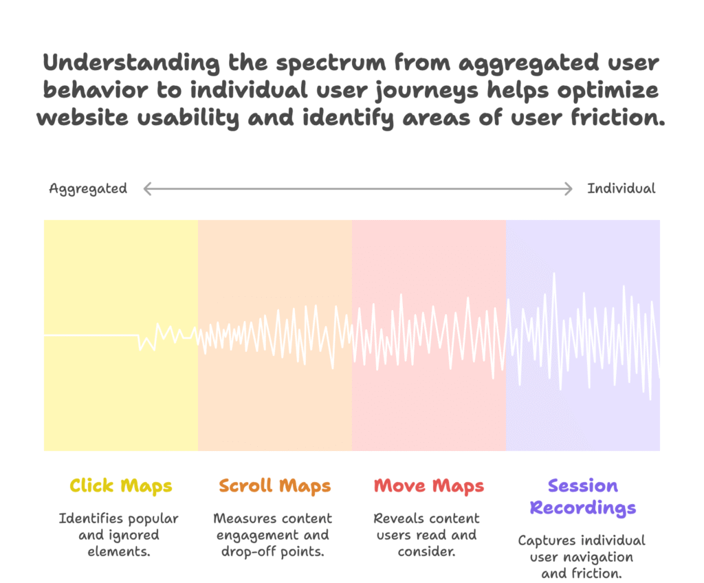
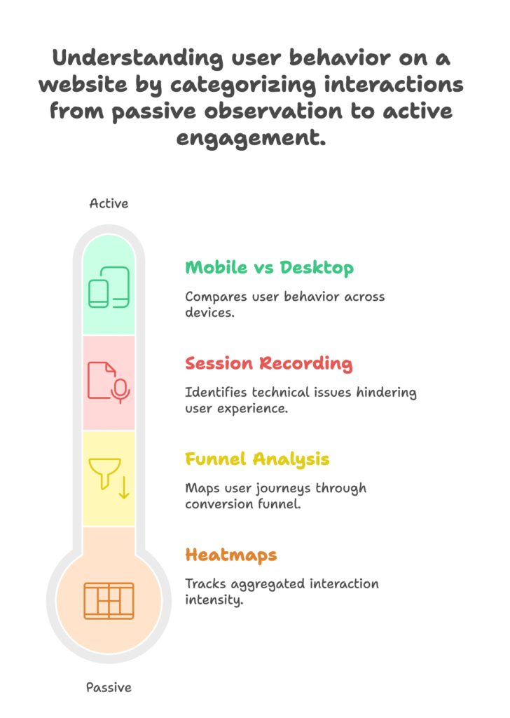
Heat maps are color-coded visual representations of user interactions on your website. Think of them as weather maps for user behavior—showing “hot” areas with high engagement and “cold” areas users ignore. There are three main types you should know:
- Click maps show exactly where users click or tap, revealing which elements attract attention and which go unnoticed. These maps instantly highlight if users are clicking on non-clickable elements (a sign of confusion) or missing important buttons.
- Scroll maps display how far down each page visitors typically scroll. They use color gradients to show the percentage of visitors who reach each section, making it immediately clear where you’re losing attention.
- Move maps (sometimes called hover maps) track mouse movements, which often correlate with eye movement. These maps reveal what content users are reading and considering, even if they don’t click.
Each type provides unique insights. Click maps help evaluate your interface design, scroll maps measure content engagement, and move maps reveal attention patterns and potential points of interest or confusion.
Session Recordings: Behavioral Context Capture
While heat maps aggregate data across many users, session recordings capture individual journeys. These recordings document real users navigating your store, showing every mouse movement, click, and page transition.
Think of heat maps as the forest view and session recordings as examining individual trees. When you watch recordings, you’ll see hesitations, confused back-and-forth movements, and moments where users seem stuck—invaluable context that aggregated data can’t provide.
Session recordings are particularly powerful for identifying specific friction points in your user experience. You might discover that users struggle to find shipping information, get confused by your filter options, or abandon carts when faced with unexpected costs at checkout.
Strategic Benefits for Shopify Stores
Armed with these visual analytics tools, Shopify store owners can unlock significant advantages in two critical areas: user experience optimization and conversion rate improvement.
Enhanced User Experience Optimization
A smooth, intuitive user experience doesn’t happen by accident. It’s crafted through careful observation and refinement. Visual analytics makes this process more scientific and less subjective.
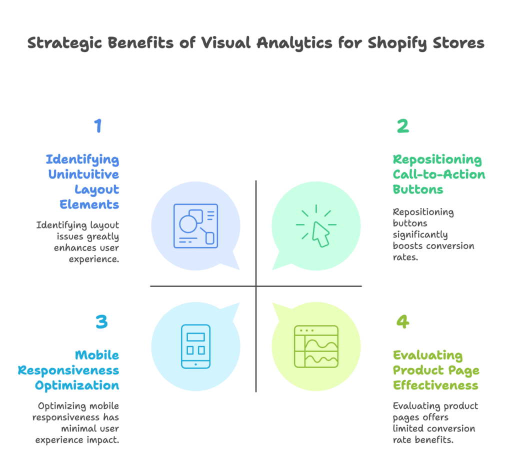
One of the most immediate benefits is identifying unintuitive layout elements. Your heat maps might reveal users repeatedly clicking non-clickable images, suggesting they expect these elements to be interactive. Or you might notice clicks clustering around empty areas where users expect to find navigation options.
Mobile responsiveness optimization becomes straightforward with device-specific heat maps. You might discover that a call-to-action button that performs well on desktop gets completely missed on mobile devices because it’s below the typical scroll depth or too small for comfortable tapping.
Scroll reach analysis helps reduce cognitive load on your visitors. If your heat maps show that 70% of visitors never scroll past your hero section, any critical information placed below that point is effectively invisible. This insight allows you to prioritize content placement more effectively, ensuring vital information appears where users actually look.
Conversion Rate Improvement Opportunities
Every step in your conversion funnel presents optimization opportunities that visual analytics can uncover.
Cart abandonment—often the most painful conversion issue for store owners—becomes less mysterious with session recordings. You might discover users getting stuck on shipping calculators, hesitating at security badges, or simply getting distracted by too many options. Each recording provides clues for streamlining the checkout experience.
Call-to-action placement becomes more scientific with click zone data. Heat maps might reveal that your “Add to Cart” button gets overlooked because it blends with surrounding elements or sits in an area with low visual attention. Simply repositioning these elements based on actual user behavior patterns can drive immediate conversion improvements.
Product page effectiveness evaluations gain precision through engagement heat maps. You can see which product images receive the most attention, which specifications users scrutinize, and where interest drops off. These insights allow you to highlight the most compelling product features and address common concerns proactively.
Shopify-Specific Implementation Framework
Now that we understand the benefits, let’s explore how to implement visual analytics specifically for Shopify stores.
Tool Selection Criteria for Shopify Merchants
Not all visual analytics tools work seamlessly with Shopify. When selecting your solution, three factors should guide your decision:
First, native integration capabilities with the Shopify ecosystem are essential. The tool should install easily, preferably through the Shopify App Store, without requiring complex code modifications. It should also respect Shopify’s theme structure and not interfere with other apps or checkout functionality.
Second, data compliance with Shopify’s security standards is non-negotiable. The tool should follow privacy regulations like GDPR and CCPA, especially regarding how it handles sensitive customer information during checkout processes.
Third, consider the cost-benefit ratio for your business scale. Visual analytics tools generally offer tiered pricing based on traffic volume:
- For smaller Shopify stores (starter and beginner levels), budget-friendly options like Hotjar’s basic plan or Webyze HeatMap offer solid functionality without overwhelming costs.
- For established Shopify businesses (intermediate level), more robust solutions like Lucky Orange or Clarity provide advanced segmentation and integration capabilities.
- For high-volume enterprises (advanced level), comprehensive platforms like Mouseflow or Smartlook offer enterprise-grade features including API access, advanced filtering, and custom reporting.
Technical Implementation Process
Installing visual analytics on your Shopify store is straightforward if you follow a systematic approach.
For most Shopify merchants, Hotjar offers the best balance of features, ease of setup, and price. Here’s how to install it:
- Navigate to the Shopify App Store and search for “Hotjar”
- Click “Add app” and follow the authorization process
- Once installed, access your Hotjar dashboard to activate heat maps and recordings
- Configure your recording settings, including which pages to monitor and what percentage of traffic to capture
For manual installation of other tools, you’ll typically:
- Create an account with your chosen analytics provider
- Obtain a tracking code snippet
- In your Shopify admin, go to Online Store → Themes → Actions → Edit code
- Locate the theme.liquid file and paste the tracking code just before the closing </head> tag
- Save changes and verify installation using the provider’s tools
Once your tracking is live, follow these data collection best practices:
First, ensure sufficient traffic for meaningful insights. Most heat map tools recommend at least 2,000-3,000 page views before drawing conclusions. For smaller stores, this might mean collecting data for several weeks before making significant changes.
Second, consider seasonal adjustments in your analysis. Shopper behavior during holiday seasons or promotional periods often differs from regular patterns. Create separate heat maps for these periods to avoid skewed conclusions.
Advanced Analysis Techniques
With your visual analytics tools properly implemented, it’s time to extract meaningful insights from the data you’re collecting.
Heatmap Data Interpretation Strategies
The colorful visualizations look impressive, but translating them into actionable insights requires systematic analysis.
Start with quantitative analysis using color intensity gradients. Most heat map tools use color progression (usually blue to red or green to red) to indicate interaction frequency. Establish baseline metrics for what constitutes “high engagement” on different page types. For instance, a product page might naturally have more interactions than a policy page.
Next, perform comparative analysis across customer segments. Most advanced tools allow you to filter heat maps by visitor type, device, or traffic source. Comparing new versus returning visitor behavior often reveals striking differences in navigation patterns and information needs.
Geographic-specific interaction trends can uncover cultural preferences worth addressing. Visitors from different regions might prioritize different product features, respond to different visual cues, or exhibit unique checkout behaviors that warrant customized approaches.
Session Recording Deep-Dive Methods
Individual session recordings provide rich qualitative data, but watching hundreds of videos isn’t feasible. Use these methods to extract maximum value efficiently:
Implement funnel analysis through multi-page journey mapping. Focus on recordings that show users moving through your conversion funnel, particularly those who abandon at critical points. Look for patterns in the paths they take and where they encounter obstacles.
Pay special attention to error detection in dynamic elements. Watch for instances where users interact with filters, search functions, or form fields that don’t respond as expected. These technical issues often go unreported but significantly impact conversion rates.
Systematically compare mobile versus desktop behavior discrepancies. The same page might present entirely different experiences across devices. Focus especially on complex interactions like multi-step forms, product configurators, or checkout processes that might break on smaller screens.
Actionable Optimization Strategies
The real value of visual analytics comes from the changes it inspires. Let’s explore concrete strategies for turning insights into improvements.
Layout Restructuring Based on Visual Data
Your heat map data will likely suggest several layout adjustments worth testing.
Consider menu reorganization using click distribution patterns. If your heat maps show certain navigation items receiving disproportionate attention, promote these options in your menu hierarchy. Conversely, if important categories go unnoticed, they might need more prominent placement or clearer labeling.
Hero section redesign informed by scroll depth metrics can dramatically improve engagement. If scroll maps show significant drop-off below your hero image, experiment with moving key information higher, adding compelling scroll cues, or creating a more captivating above-the-fold experience that motivates further exploration.
Product grid optimization through engagement heat zones often yields quick wins. If attention maps show users focusing on certain positions in your product grid (typically top-left), place your best-selling or highest-margin items in these hot spots. Many Shopify themes allow manual sorting for this purpose.
Conversion Funnel Enhancements
The checkout process deserves special attention since small improvements here directly impact your bottom line.
Use abandonment analysis from session recordings to streamline checkout steps. If recordings show users hesitating at shipping options, simplify the presentation or consider offering free shipping with a minimum order value. If they struggle with form fields, reduce required information or improve error messages.
Trust element placement guided by attention maps can reduce purchase anxiety. If heat maps show users scrutinizing your return policy or security badges, make these elements more prominent. Position trust indicators near points of commitment, such as “Add to Cart” or “Checkout” buttons.
Develop upsell positioning strategies from scroll behavior data. Cross-sells and upsells work best when placed where users naturally pause or show high engagement. Scroll maps might reveal these optimal positions, which vary by product type and page layout.
Continuous Optimization Cycle
Visual analytics isn’t a one-time project but an ongoing process of improvement. Establishing systematic protocols ensures sustained benefits.
Establishing Testing Protocols
Integrate A/B testing with heat map insights for scientific validation. Once heat maps suggest a potential improvement, create a test variation and split your traffic between the original and modified versions. Continue collecting heat map data during the test to see how interaction patterns change with your new design.
Measure change impact through before/after analysis. Take snapshots of your heat maps before implementing changes, then compare them with new data collected after modifications. Look for shifts in click distributions, scroll depths, and attention patterns to confirm improvements.
Performance Monitoring Framework
To justify continued investment in visual analytics, establish clear metrics for ROI calculation.
Track conversion rate lift per layout change to attribute improvements to specific modifications. For example, if repositioning your “Add to Cart” button based on heat map data increases product page conversion by 0.5%, calculate the additional revenue this generates monthly.
Monitor reduced support tickets from UX improvements as an additional success metric. Many usability issues that surface in visual analytics also generate customer service inquiries. As you resolve these issues, document the corresponding decrease in support volume and the associated cost savings.
Implement a quarterly review process for sustained optimization. Set regular intervals to comprehensively assess your visual analytics data, evaluate the impact of previous changes, and identify new opportunities for improvement.
Case Studies: Shopify Success Stories
To illustrate the real-world impact of visual analytics, let’s examine three Shopify stores that achieved remarkable results through data-driven optimization.
Fashion Retailer: 34% CRO Increase Through Scroll Optimization
A mid-sized fashion boutique discovered through scroll maps that 65% of mobile visitors never reached their product description section, which contained crucial sizing information. By restructuring their product pages to display size guides above the scroll threshold and adding a sticky “Add to Cart” button, they increased mobile conversion rates by 34% within three weeks.
Electronics Store: $120k Saved via Checkout Error Detection
An electronics retailer reviewed session recordings and identified a form validation error that occurred specifically when customers used autofill for address information. This subtle bug affected approximately 15% of checkout attempts. After fixing the issue, they recovered an estimated $120,000 in previously lost annual revenue.
Beauty Brand: 22% Mobile Conversion Lift from Heatmap Redesign
A beauty products store used heat maps to analyze their product category pages and noticed that mobile users frequently attempted to interact with decorative elements that weren’t actually clickable. By converting these elements into functional navigation and simplifying the overall layout based on actual touch patterns, they achieved a 22% improvement in category-to-product-page progression.
References
- Hotjar. “Powerful heatmaps for Shopify.” Available: https://www.hotjar.com/shopify-heatmaps/
- VWO. “Top 10 Shopify Heatmap Apps [With Features – 2025].” Available: https://vwo.com/blog/shopify-heatmap/
- Rocket CRO Lab. “Using Heat Maps to Improve Shopify Store Layouts.” Available: https://www.rocketcrolab.com/post/heat-maps-improve-shopify-store-layouts
- OpenStore. “Session Recording & Replays | Shopify App Directory.” Available: https://open.store/shopify-apps/session-recording-now
Ready to boost your Shopify store’s sales with data-driven insights? Growth Suite helps store owners run effective on-site discount campaigns and collect valuable customer data. Our powerful AI engine analyzes product, collection, customer, and order data to generate personalized, limited-time offers that dramatically increase conversions. Install Growth Suite from the Shopify App Store today with a free 14-day trial and join the many merchants who’ve seen immediate sales increases!