![]()
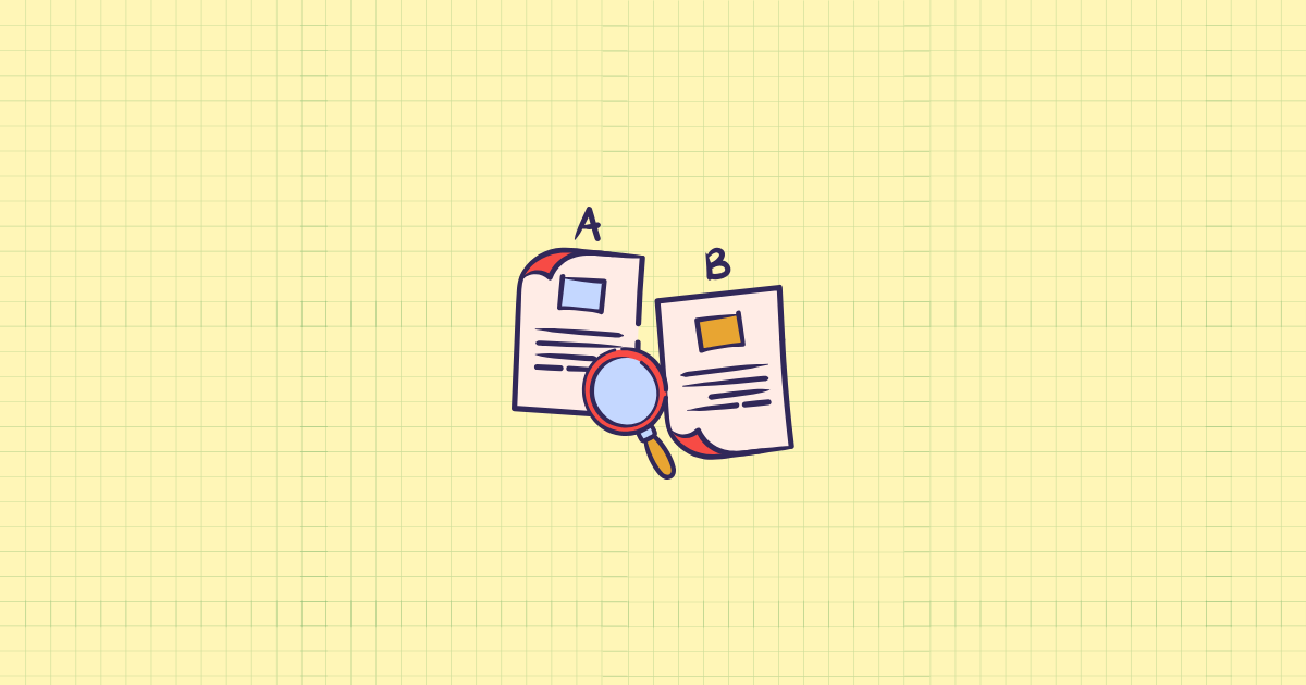
Why Your Shopify Customers Can’t Make Up Their Minds — And What to Do About It
Here’s a scenario that plays out thousands of times a day on Shopify stores: a shopper lands on your collection page, finds two or three products that look interesting, clicks back and forth between their tabs trying to remember which one had the better battery life or the lower price, gets frustrated, and leaves. No sale. No reason. Just confusion.
This is decision paralysis in action, and it costs Shopify merchants real money every single day. Research shows that 92% of consumers visiting a brand’s website for the first time are not ready to make a purchase — they’re searching for products, comparing prices, and evaluating variables. That means the overwhelming majority of your traffic is in research mode, not buying mode. The question isn’t whether your customers compare products. They do. The question is whether your store makes that comparison easy — or forces them to do it somewhere else.
Product comparison features change the entire dynamic. Instead of pushing customers toward a decision by hiding information, you invite them into a transparent side-by-side evaluation that builds confidence, reduces anxiety, and guides them straight to the “Add to Cart” button. Done right, comparison tools are one of the most powerful and underutilized CRO weapons in a Shopify merchant’s toolkit.
In this guide, you’ll learn exactly how comparison features work psychologically, which types work best for different store categories, how to implement them on Shopify without any coding knowledge, and how to design comparisons that actually convert. Whether you’re selling electronics, apparel, supplements, or home goods, there’s a version of this strategy that fits your store.
The Psychology of Comparison: Why Shoppers Need Help Choosing
Before diving into implementation tactics, it’s worth understanding why customers get stuck. This isn’t about indecisiveness — it’s about brain science. And once you understand what’s happening inside your shopper’s head, you’ll build far more effective comparison experiences.
Decision Fatigue Is Real, and It’s Costing You Sales
Every choice a customer makes on your store consumes mental energy. Browse a category, read a description, check a review, compare two products, reconsider — repeat. Research published in the Journal of Consumer Psychology shows that shoppers experience measurable cognitive fatigue after comparing more than seven to nine product options, with their satisfaction with eventual purchases decreasing and their likelihood of abandoning the shopping process entirely increasing exponentially.
This isn’t a personality flaw. It’s the prefrontal cortex running low on fuel. And when that happens, the easiest decision is no decision at all. The shopper closes the tab, tells themselves they’ll come back later, and usually never does.
Decision fatigue in ecommerce usually shows up in subtle but costly ways: shoppers scroll endlessly without clicking “Add to Cart,” they add items to wishlists instead of carts, and they abandon at the moment of choice rather than the moment of checkout. The key thing to understand is that this isn’t about a lack of interest — it’s about mental overload.
Compensatory vs. Non-Compensatory Decision Making
Here’s where comparison tables become genuinely fascinating from a UX perspective. According to Nielsen Norman Group research, when people have to select among a small set of alternatives — usually under five to seven — they typically engage in compensatory decision making: looking at the individual merits of each item and comparing their advantages and disadvantages according to a number of criteria. For example, a customer buying a laptop might be willing to accept a slightly heavier model if it offers significantly better battery life.
That compensatory process is exactly what comparison tables are designed to support. They let customers weigh multiple attributes simultaneously, in one glance, without having to hold a dozen data points in short-term memory while navigating between pages.
Filters, on the other hand, support non-compensatory decision making — where a customer uses a single attribute as a binary gate. “Show me only products under $100.” Both approaches have their place. But when a customer has narrowed their options down to two or three serious contenders, a well-designed comparison table becomes the most powerful tool on your entire store.
The Role of Transparency and Trust
There’s another layer to this: trust. Product comparison tools can help reduce purchase anxiety and decision fatigue, which are common challenges in ecommerce. When customers have the power to compare various products based on their features, prices, and reviews, they feel more involved and invested in the buying process — and this sense of empowerment not only boosts their engagement with the store, but can also significantly improve their satisfaction and trust in your brand.
Think about what you’re signaling when you offer a comparison feature. You’re telling your customer: “We have nothing to hide. Our products are good enough to stand up to scrutiny, side by side.” That’s an extraordinarily powerful trust signal. It’s the opposite of the pushy, information-hiding tactics that make shoppers suspicious.
87% of customers feel product content is the most important factor when deciding to purchase an item online, since they cannot physically see, feel, or smell the item. Comparison features directly address this gap by aggregating that critical content into a format built for confident decision-making.
Types of Product Comparison Features and When to Use Each
Not all comparison features are created equal, and the right approach depends heavily on your product type, catalog size, and target customer. Here’s a breakdown of the main formats and when each one earns its place on your store.
Side-by-Side Comparison Tables
This is the classic — and for good reason. A side-by-side comparison table places two or more products in parallel columns, with shared attributes listed in rows. Price, dimensions, materials, key features, ratings, and stock availability can all be displayed at a glance.
Comparison tables are most commonly seen for mid-range to expensive consumer goods, especially electronics like microwaves, fitness trackers, vacuum cleaners, and cars. But they are equally well-suited for products and services across many categories, and can be used to compare similar items from the same organization or to compare one organization’s products against those of a competitor.
Side-by-side tables work best when:
- Your products share many of the same attributes but differ in specific specifications (think supplements with different dosages, cameras with different megapixel counts, or mattresses with different firmness levels)
- Customers are in the final decision stage and have narrowed their choices to a handful of options
- Your products fall in a mid-to-high price range where the research investment feels worthwhile to the shopper
- You’re selling to an informed buyer who knows what attributes matter to them
The danger with side-by-side tables is including too many attributes. When every row in a 20-row table looks similar, the table creates more confusion than it resolves. The sweet spot, according to UX research, is between six and twelve highly relevant attributes — enough to differentiate, not enough to overwhelm.
Interactive “Add to Compare” Features
Rather than building static comparison tables for every possible product pairing, many Shopify merchants use dynamic comparison features that let customers select two to four products themselves and generate a custom comparison table on the fly. The customer checks a box or clicks a “Compare” button on collection pages, and the items are stacked against each other in a dedicated comparison view.
This approach is more scalable and arguably more valuable — because it’s the customer choosing what they want to compare, not you guessing. It puts control in their hands, which psychologically increases investment in the comparison outcome. When you chose the products to compare, the decision carries more weight.
Shopify doesn’t include this feature natively, but several well-reviewed apps fill the gap. Equate – Product Compare is one of the most-used options on the Shopify App Store, with merchants across industries noting that the feature “should have been built into Shopify” — a telling sign of genuine customer demand. Comparable – Compare Products and LDT Product Comparison offer similar functionality with different customization levels.
Highlight-the-Difference Tables
A variation on the standard comparison table, highlight-the-difference tables use visual cues — color coding, icons, checkmarks, or shading — to immediately draw the eye to where products differ. Identical attributes are de-emphasized or grayed out; differentiating attributes are highlighted.
This is especially powerful for product lines with a “good, better, best” tier structure. Instead of making customers read every row, you visually direct them to what matters. The cognitive load drops dramatically. Smashing Magazine research into feature comparison table design notes that comparison tables should translate technical attributes into language understandable by the average consumer — and that interface copy matters as much for attribute labels as it does for buttons and thumbnails.
Comparison Landing Pages
This is less of an on-site widget and more of a content strategy play. A comparison landing page is a standalone page optimized for “Product A vs. Product B” search queries — the kind of searches that signal extremely high purchase intent.
Comparison content that directly addresses “X vs. Y” search queries can capture high-intent traffic, providing users with the exact information they need to choose between two specific options — and in practice, these pages consistently show noticeable improvements in engagement metrics compared to other pages on the site.
For Shopify merchants, this means creating blog posts or dedicated pages comparing your own products (your entry-level model vs. your pro model), or even your products against category alternatives. The key is to be genuinely helpful rather than promotional. These pages rank well when they earn trust with honest, detailed analysis.
Guided Selling and Product Recommendation Quizzes
Not every customer arrives knowing what attributes to compare. For stores with complex products — skincare systems, supplement stacks, technical gear — a guided quiz can surface the right product before the customer even needs a comparison table. The quiz does the narrowing work; the comparison table, if included, closes the deal.
Warby Parker’s approach illustrates this well: they encourage website visitors to take an eight-question quiz to find out what type of glasses are best for them, turning an overwhelming catalog into a manageable, personalized recommendation. For Shopify merchants, apps like Octane AI and Guided Selling by Rebuy offer similar functionality that can be layered on top of product comparison features.
Designing Comparison Features That Actually Convert
A comparison table that exists is not the same as a comparison table that works. The difference lies entirely in execution. Here are the design principles that separate high-converting comparison tools from decorative clutter.
Choose Attributes That Drive Decisions, Not Just Fill Space
The single most common mistake in comparison table design is including every possible product attribute simply because the data is available. Resist this. Every row you add is another cognitive demand placed on the customer.
Ask yourself a sharper question: what are the attributes that most often decide between these products? For a protein powder, that might be protein per serving, flavor options, third-party testing certifications, and price per serving. Not the full ingredients list, not the manufacturing address, not the packaging dimensions.
Interview your customer service team. Look at your product reviews for what features customers mention most. Check competitor reviews on Amazon or Google Shopping to see what buyers say they were looking for. These real signals tell you which attributes belong in the comparison and which clutter it up.
Make Differences Scannable Instantly
The goal of a comparison table is speed. A customer should be able to glance at your table and understand the key differences in under ten seconds. That requires visual hierarchy.
- Use checkmarks and X marks for binary attributes (included/not included) rather than writing “Yes” and “No” — it’s faster to scan
- Highlight the recommended product with a subtle border, badge (“Most Popular,” “Best Value”), or column color — studies consistently show this helps hesitant buyers choose
- Group related attributes under labeled sections (Performance, Dimensions, Warranty) so customers can skip to what matters to them
- Put the most important differentiating attributes near the top, not buried at row 15
Remember what Nielsen Norman Group emphasizes about comparison tables: consistency in content, scannability, and a simple layout are some of the most important qualities of successful comparison tables. “Consistency” here means every row has data for every product — never leave a cell empty if you can avoid it.
Translate Specs Into Benefits
Most customers don’t know what 5000 mAh means. They do understand “lasts all day without charging.” This is one of the most powerful improvements you can make to any comparison table: translate technical specifications into human-readable benefits wherever possible.
Amazon does this well in its electronics comparisons. Instead of listing raw technical data, they provide context: “# of iPhone charges,” “water resistant to 30 meters,” “covers a 2,000 sq ft space.” The spec is still there for the technically inclined, but the benefit is front and center for everyone else.
On Shopify, this means customizing the attribute labels in your comparison table. If your comparison app allows custom row labels (most do), use this to your advantage. “Battery Capacity: 5000 mAh” becomes “Battery Life: Up to 2 days of regular use.” That one change can meaningfully improve how customers interpret your comparison.
Include Social Proof Within the Comparison
Most comparison tables focus exclusively on product features. The ones that convert best also include social proof. Customer ratings, review counts, and even short testimonial excerpts can be integrated into your comparison to add an emotional layer to the rational evaluation.
Nearly 95% of consumers read online reviews before making a purchase decision, which means your star ratings are some of the most persuasive data on your entire store. Don’t relegate them to a separate tab — bring them into the comparison table itself.
If Product A has 4.8 stars from 340 reviews and Product B has 4.6 stars from 89 reviews, that comparison tells a story. Not just about quality — about proven track record. Include it.
Design for Mobile First
Here’s the hard truth: comparison tables are notoriously difficult to display on mobile screens. A four-column table simply doesn’t fit on a 375-pixel-wide screen. But mobile commerce continues to grow, and ignoring this problem costs conversions.
The most effective mobile approaches include:
- Horizontal scrolling with sticky attribute column: The attribute names stay fixed on the left; products scroll horizontally. Customers can swipe to compare while always seeing which row they’re on.
- Limit the default display to two products, with an option to add a third. Two columns are manageable on mobile; three is a stretch; four is almost always unreadable without scrolling.
- Collapsible attribute groups: Show only the top three to five attributes by default on mobile, with a “Show all specifications” toggle for detail-seekers.
- Cards instead of tables: For some product types, stacked product cards with key differentiators highlighted work better on mobile than traditional tables.
Nielsen Norman Group research on mobile tables confirms that locking headers and allowing users to select a subset of data according to their needs are the two most effective techniques for making large data tables usable on small screens. Both principles apply directly to product comparison tables.
Implementing Product Comparison on Shopify: A Practical Guide
Now for the practical part. Here’s how to actually build product comparison capabilities into your Shopify store, from the simplest approaches to more advanced setups.
Step 1: Audit Your Current Product Data
Before installing any comparison app or building any table, spend an hour auditing your product data in Shopify. Open your admin, go to Products, and check whether your key products have:
- Consistent, complete metafield data for the attributes you want to compare
- Accurate variant information (sizes, colors, configurations)
- Up-to-date images for each variant
- Current pricing that reflects any ongoing promotions
A comparison table is only as good as the underlying data. Gaps in your product data will show up as empty cells in your comparison table, which erodes trust faster than having no comparison feature at all. Fix the data foundation before building the display.
Step 2: Choose Your Comparison App
Shopify doesn’t include built-in side-by-side product comparison natively. For most merchants, a dedicated app is the fastest path to a functional comparison feature without any custom development.
Here are the main options worth considering:
Equate – Product Compare (by Softpulse Infotech) is one of the most widely-used comparison apps on the Shopify App Store, with a strong track record across diverse product categories. It pulls from Shopify metafields, supports custom attribute labels, and works across device sizes. Merchants particularly appreciate the ability to highlight differences and the responsive mobile layout.
Comparable – Compare Products is another solid option with a 4.9-star rating. It focuses on clean table design and allows you to control exactly which attributes appear in comparisons — useful if you want tight control over what customers see side by side.
LDT Product Comparison and Qe: Product Compare are both worth evaluating if you need specific customization around CSV imports or brand-specific styling.
When evaluating any comparison app, prioritize these factors: whether it pulls data from Shopify metafields (essential for consistency), how it handles mobile display, whether you can customize attribute labels, and the quality of the support team’s responsiveness.
Step 3: Set Up Shopify Metafields for Comparison Attributes
This is the step most merchants skip, and it’s the one that makes the biggest difference in comparison quality. Shopify metafields let you store custom data fields for each product — exactly the kind of structured specification data that powers great comparison tables.
To set up metafields for comparison:
- In your Shopify admin, navigate to Settings > Custom data > Products
- Click Add definition and create fields for each attribute you want to compare (e.g., “Weight,” “Battery Life,” “Material,” “Warranty Period”)
- Choose the appropriate field type: single-line text for simple values, number with unit for measurements, true/false for binary features
- Go back to each product and populate these metafields with accurate data
- In your comparison app settings, map these metafields to the comparison table rows
This initial setup takes time — figure a few hours for a catalog of 50-100 products — but it pays dividends across your entire store, not just comparison tables. Structured metafield data also powers filtered search, better SEO through structured data markup, and more accurate product recommendations.
Step 4: Place “Compare” Buttons Strategically
Comparison features only deliver value if customers actually use them. Placement determines discoverability. The highest-performing placements for “Add to Compare” buttons are:
- Collection pages: A small “Compare” checkbox or button on each product card. This is where customers are naturally browsing multiple options and most likely to want comparison.
- Product pages: A link or button that says “Compare with similar products” placed near the product title or in the product description area.
- Search results: If your theme supports it, compare buttons on search result items can intercept decision-making at the research stage.
Keep the UI unobtrusive. The compare button shouldn’t compete with your primary “Add to Cart” call to action. A subtle checkbox in the corner of a product card or a secondary button below the product name is enough — customers who want to compare will find it.
Step 5: Build a Curated Comparison Landing Page for Top Product Pairs
For your two or three most-compared product pairs, consider building dedicated comparison pages separate from your dynamic comparison tool. These pages are optimized for SEO (targeting “[Product A] vs [Product B]” queries), are more detailed, and tell a more complete story than a generated table can.
Structure these pages to include:
- A brief intro establishing who each product is for
- A visual comparison table with key specs
- An honest “This one is right for you if…” section for each product
- Customer reviews specific to each product
- Clear calls to action for each option
Converting high-intent traffic through addressing purchase criteria is the core value of comparison pages — they capture “X vs. Y” searches that represent buyers who are ready to make a decision but need that final push. These pages frequently become some of the highest-converting pages on your entire site.
Comparison Features by Product Category: What Works Where
Not every product category benefits equally from the same comparison approach. Here’s how to tailor your strategy based on what you sell.
Electronics and Technical Products
This is the natural home of side-by-side comparison tables, and for good reason. Shoppers evaluating headphones, cameras, power tools, or home appliances expect detailed specification comparisons. They arrive knowing what matters to them and want the data in a digestible format.
For electronics on Shopify, prioritize: comprehensive but benefit-labeled specifications, clear warranty and support information, compatibility notes (does it work with X?), and energy/performance metrics. Include user ratings prominently — they carry enormous weight in technical purchasing decisions.
Apparel and Fashion
Apparel comparison is trickier because so much of the decision is visual and tactile. Standard side-by-side spec tables add little value when the key question is “which one looks better on me?” But comparison features can still play a valuable role in fashion retail when applied thoughtfully.
Focus your apparel comparisons on: fabric composition and care instructions, fit type (slim, regular, relaxed), available sizes and how sizing runs, price differences between colorways or variants, and return policy. For a customer choosing between two jackets at similar price points, knowing that one has a merino wool blend and a 60-day return policy versus a polyester blend and a 30-day policy can be the deciding factor.
Health, Beauty, and Supplements
This category has some of the highest stakes in comparison design, because customers need accurate information to make choices aligned with their health goals — and because ingredient lists and clinical claims require careful handling.
Effective comparison attributes here include: serving size and servings per container (cost per serving is hugely important), key active ingredient dosages, third-party testing certifications, allergen information, flavor or format options, and any clinical study references. Highlight differences in ingredient transparency — customers in this space are increasingly sophisticated and will reward honest, detailed comparisons.
Home Goods and Furniture
Furniture and home goods comparisons should foreground the practical logistics of buying something large and expensive online: dimensions (carefully labeled with width, depth, height), material and finish options, assembly requirements, shipping and delivery details, and weight capacity where relevant.
For decor items, a comparison table showing the same product in different colorways — with swatches and material descriptions — can be extremely valuable and is something most competitors skip. The customer comparing your oak-finish shelf to your walnut-finish shelf needs to see that difference clearly, not buried in a product description they may not read.
Using Comparison Data to Improve Your Catalog and Marketing
Most merchants think about comparison features exclusively as a customer-facing tool. But the data these features generate is equally valuable for your internal strategy.
Identify What Customers Are Actually Comparing
When customers use your dynamic comparison tool, you gain visibility into which product pairs are being compared most frequently. This is gold. If customers are consistently comparing Product A and Product B, that tells you several things at once: these products occupy a similar decision space in your customers’ minds, the differentiation between them may not be clear enough on individual product pages, and one of them is probably winning the comparison — which means the other one may need better positioning, a pricing adjustment, or more prominent specification data.
Review your comparison app’s analytics (most offer at least basic reporting) monthly. The patterns that emerge can directly inform product page updates, collection page organization, and even pricing strategy.
Turn Comparison Insights Into Better Product Descriptions
If you know that customers commonly compare Product A and Product B side by side, you can proactively address the comparison on each product’s individual page. Add a section called “How does this compare to [Product B]?” with a brief, honest answer. This directly serves the customer’s actual question without requiring them to use the comparison tool at all — it reduces friction and handles the most common objection right on the product page.
Use Comparison Data to Inform Your Paid Advertising
The attributes that appear most important in your comparison tables — the rows customers consistently look at before buying — are the attributes that should be leading your ad copy and creative. If customers comparing your running shoes always look at cushioning level and weight first, those two attributes belong in your Facebook ad headlines and Google Shopping titles.
By understanding the specific needs and preferences of their customers through comparison data, businesses can create ads and promotions that speak directly to what customers are looking for — making marketing efforts more effective as it addresses the specific interests of the audience.
Common Mistakes to Avoid with Product Comparison Features
Comparison features can backfire when implemented poorly. These are the most common mistakes Shopify merchants make — and how to sidestep them.
Comparing Products That Shouldn’t Be Compared
Not every product in your catalog should be available for comparison. A beginner yoga mat and an advanced competition mat may technically be in the same category, but putting them in the same comparison table can create a misleading “false equivalence” that confuses the customer rather than guiding them.
Configure your comparison feature to restrict comparisons within product subcategories or collections. If you sell running shoes and hiking boots, prevent customers from comparing a running shoe to a hiking boot — the attributes that matter for each type are completely different, and a combined comparison table would be meaningless.
Including Too Many Products in One Comparison
Three products is the sweet spot for comparison tables. Two feels like you’re not giving enough choice. Four starts to feel overwhelming. Five or more crosses definitively into decision-paralysis territory.
Research from Stanford Graduate School of Business reveals that consumers report higher satisfaction when they believe they’ve chosen from a “complete” set of options, even when that set is deliberately limited — the perception of completeness matters more than actual completeness.
If your comparison app allows unlimited products in a comparison, add a hard limit in your settings. Three products maximum, or four for complex technical product categories where shoppers are highly informed. Keep it manageable.
Highlighting Your Own Products Dishonestly
Especially when creating curated comparison landing pages, the temptation is to stack the deck — emphasizing attributes where your product wins while minimizing attributes where it doesn’t. Customers notice this, and it destroys trust.
A comparison that feels genuinely balanced, even when your product comes out ahead on most dimensions, is far more persuasive than one that looks like propaganda. If your product has a genuine weakness in a particular area, acknowledge it — then explain why that trade-off is worth making. “This model is heavier than the competition, but that’s because it uses full-aluminum construction instead of plastic — which is exactly why it lasts twice as long.”
Forgetting to Update Comparisons When Products Change
Product specifications change. Prices change. Stock availability changes. If your comparison tables show outdated information — an old price, a feature that’s been discontinued, a rating before a product recall — customers will notice. The damage to trust is significant and hard to undo.
If your comparison app pulls from live Shopify metafields, this is largely automatic. But if you’ve created any static comparison content (landing pages, blog post tables), build a quarterly review into your content calendar to verify accuracy.
Measuring the Impact of Your Product Comparison Features
Implementing comparison features is only half the work. Measuring their impact tells you whether the investment is paying off and where to optimize further.
Key Metrics to Track
Set up tracking for these specific metrics before and after implementing comparison features:
- Add-to-Cart rate from comparison views: The most direct measure of comparison feature effectiveness. Most comparison apps report this directly.
- Time on page for collection pages: Longer time often indicates more deliberate consideration — not bounce-worthy confusion.
- Return rate for products compared before purchase: Informed purchase decisions lead to fewer returns. Track whether customers who used comparison features have lower return rates.
- Bounce rate on comparison pages: If customers land on your comparison landing page from organic search and immediately leave, the content isn’t matching their intent.
- Conversion rate on product pages linked from comparisons: After viewing a comparison, when a customer clicks through to a specific product page, what percentage convert? This should be significantly higher than your average product page conversion rate.
Running A/B Tests on Comparison Attributes
Once your comparison feature is live and getting traffic, you can begin testing variations. Try a version with six attributes versus a version with ten. Test benefit-language labels against specification labels. Try a version with a “Most Popular” badge on one product versus no badge. Each of these tests will teach you something about how your specific customers make decisions.
The insights from these tests often extend far beyond the comparison table itself. Learning that customers respond strongly to warranty information in a comparison, for instance, might lead you to feature warranty details more prominently on your individual product pages — a change that lifts conversion across your entire catalog.
Tying Comparison Engagement to Revenue Attribution
The most important measurement is the simplest: are customers who use comparison features more or less likely to complete a purchase than customers who don’t? Use Shopify Analytics to segment sessions that included a comparison view versus sessions that didn’t. Compare the conversion rates, average order values, and revenue per session between the two groups.
In most well-implemented cases, customers who engage with comparison features show meaningfully higher conversion rates — because they’ve self-selected as serious buyers who are actively evaluating options rather than casually browsing. When customers can compare products directly on a website, they are more likely to stay longer and interact with content, leading to higher conversion rates as they feel more informed and confident in their purchasing decisions.
Your Action Plan: Getting Comparison Features Live on Shopify
Everything above is only useful if you act on it. Here’s a prioritized action plan to take you from no comparison features to a fully functional, conversion-optimized setup — organized by what to do first, second, and third.
Week One: Foundation
- Identify your top three to five product pairs that customers frequently compare or that represent your key buying decisions
- Audit product data in Shopify admin and note where metafields are incomplete for those products
- Set up Shopify custom metafields for the six to ten most important comparison attributes in your category
- Populate metafields with accurate, benefit-oriented data for your priority products
Week Two: Implementation
- Install a product comparison app (Equate or Comparable are solid starting points)
- Configure the app to pull from your new metafields
- Add compare buttons to your top collection pages
- Test the comparison display on desktop and mobile — fix any layout issues before going live
Week Three: Content and SEO
- Write one curated comparison landing page for your most-compared product pair, optimized for the “[Product A] vs [Product B]” search query
- Add “How does this compare to…” sections to your top product pages
- Set up Google Analytics goals or Shopify event tracking to measure comparison engagement
Ongoing: Optimize and Expand
- Monthly: Review which products are being compared most — update comparison attributes for those products if needed
- Quarterly: Audit all static comparison content for pricing and specification accuracy
- Ongoing: A/B test attribute labels, table layout, and product badge placement
The merchants who see the greatest lift from comparison features are those who treat them as a living part of their store rather than a one-time installation. Products evolve. Competitors launch new options. Customer priorities shift. Keep your comparison tools updated and they’ll keep earning their place in your conversion funnel.
References
- Nielsen Norman Group — Comparison Tables for Products, Services, and Features: https://www.nngroup.com/articles/comparison-tables/
- Smashing Magazine — Designing The Perfect Feature Comparison Table: https://www.smashingmagazine.com/2017/08/designing-perfect-feature-comparison-table/
- Fire & Spark — Comparison Content: Leveraging Comparison Pages for Ecommerce: https://www.fireandspark.com/blog/leveraging-comparison-content-for-ecommerce-conversion/
- ConvertMate — Is Product Comparison the Secret to Higher Conversions?: https://www.convertmate.io/blog/is-product-comparison-the-secret-to-higher-conversions
- Baymard Institute — Product Page UX Best Practices 2025: https://baymard.com/blog/current-state-ecommerce-product-page-ux
- VWO — Increase Your eCommerce Sales With Fewer Options (Decision Fatigue): https://vwo.com/blog/increase-ecommerce-sales-paradox/
- WebToffee — The Role of Product Recommendations in Reducing Decision Fatigue: https://www.webtoffee.com/blog/product-recommendations-reduce-decision-fatigue/
Give Your Shoppers the Confidence to Buy — With Growth Suite
Product comparison features solve the “which one should I choose?” problem. But there’s a second, equally important challenge every Shopify merchant faces: the customer who knows which product they want but still hesitates to complete the purchase.
That’s exactly where Growth Suite comes in. Growth Suite is a behavioral offer system for Shopify that watches each visitor in real time, predicts purchase intent based on their actions, and — for shoppers who need a little nudge — delivers a personalized, time-limited discount offer at precisely the right moment. Not a blanket coupon code that anyone can use. Not a popup that fires the second someone lands on your homepage. A targeted, one-time offer triggered only when a visitor’s behavior signals they’re interested but hesitant.
The result is higher conversion rates without wasting discount budget on customers who were already going to buy at full price. Growth Suite also includes post-purchase upsell funnels, intelligent product recommendations, a high-converting cart drawer, and detailed funnel analytics — everything a growth-focused Shopify merchant needs to turn traffic into revenue.
Growth Suite is free to install with a single click from the Shopify App Store. A 14-day free trial is included, and your first campaign can be live in under 60 seconds. If you’re ready to stop leaving money on the table and start converting more of the traffic you’re already paying for, Growth Suite is built exactly for that.