![]()

Why Mobile Checkout Optimization Matters
You’ve worked hard on your Shopify store. The products are stellar, the images are crisp, and your marketing is bringing in traffic. But something’s off—your mobile sales aren’t matching up with your visitor count. Sound familiar?
Here’s the stark reality: mobile commerce now accounts for over 72% of e-commerce traffic, yet mobile cart abandonment rates soar as high as 85%. That’s a lot of potential sales evaporating with each thumb-swipe away from your checkout page.
Why such a dramatic disconnect? Those small screens create big problems. Limited space, slower networks, and clumsy touch navigation turn what should be a simple purchase into a frustrating obstacle course. Every extra field, every slow-loading page, every tiny button becomes another reason for customers to bail on their purchase.
If you’re losing mobile customers at checkout, you’re not just losing individual sales—you’re losing lifetime customer value, word-of-mouth marketing, and the momentum that builds successful e-commerce brands. But here’s the good news: optimizing your mobile checkout isn’t just possible—it’s one of the highest-impact changes you can make to your Shopify store.
In this guide, we’ll walk through proven strategies that will transform your mobile checkout from a conversion killer into a smooth, intuitive process that keeps sales flowing. You’ll learn how to identify and eliminate friction points, design for thumbs (not mice), speed up your checkout process, and implement the payment options mobile shoppers expect in 2025.
I. Understanding Mobile Checkout Challenges
A. Common Friction Points in Mobile Checkout
Before diving into solutions, let’s pinpoint what’s actually driving customers away during mobile checkout. Recognizing these friction points is your first step toward fixing them.
Complex Forms
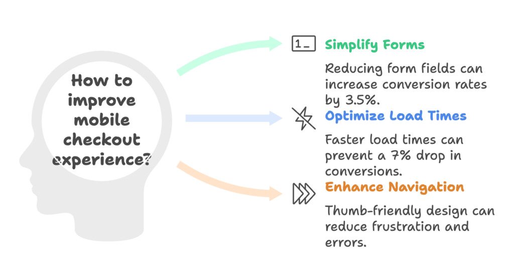
Nothing kills a mobile sale faster than endless form fields. On a small screen, every additional field feels like climbing another step on a never-ending staircase. Research shows that excessive form fields are among the top reasons shoppers abandon their carts—each additional field increases the likelihood of abandonment by 10%.
Consider this real-world example: Stellar Eats, a meal delivery service on Shopify, removed their secondary address fields and saw conversions jump by 3.5% overnight. They didn’t lose any essential information, but they gained significant revenue by simply streamlining their form.
The takeaway? Ask only what you absolutely need to complete the sale. Everything else can wait for post-purchase engagement.
Slow Load Times
Mobile users are often on spotty connections—in elevators, on commuter trains, or juggling multiple apps. Pages that take longer than 3 seconds to load can result in a 7% drop in conversions. Each additional second costs you money.
Think about the last time you tried to check out on a site that kept freezing or loading. Did you stick around? Probably not. Neither will your customers.
Shopify’s CDN helps, but store owners still need to optimize images, minimize scripts, and leverage caching tools to create a lightning-fast checkout experience—especially on mobile.
Unintuitive Navigation
When was the last time you used your desktop computer with just your thumbs? Never, right? Yet that’s exactly how most of your customers navigate your mobile store.
Tiny buttons, closely packed links, and confusing layouts force customers to zoom, pinch, and precisely tap—actions that quickly lead to frustration. Forms designed for desktop often require mobile users to constantly zoom in and out, leading to errors and abandoned carts.
Mobile checkout requires thumb-friendly design where all critical elements are easily tappable without zooming or squinting.
B. Impact of Checkout Friction on Shopify Stores
Revenue Loss
Let’s put a dollar figure on the problem: mobile checkout abandonment costs businesses approximately $18 billion annually. For the average Shopify store, optimizing mobile checkout can recover between 15-35% of otherwise abandoned carts.
This isn’t just about the sales you’re losing today. It’s about the customer relationships you’re failing to build for tomorrow. A frustrated checkout experience doesn’t just cost you one sale—it potentially costs you a lifetime customer.
Customer Experience
Beyond immediate sales, poor mobile checkout experiences damage your brand. Studies show that 62% of customers who experience checkout difficulties are less likely to return to that store in the future. Meanwhile, 38% share their negative experiences with friends or on social media.
The friction at checkout doesn’t just stop a sale—it creates negative word-of-mouth that can poison future marketing efforts.
II. Simplifying the Mobile Checkout Process
A. Streamlined Checkout Flow
Now that we understand what’s breaking your mobile checkout, let’s fix it. The first principle is simple: fewer steps equal more sales.
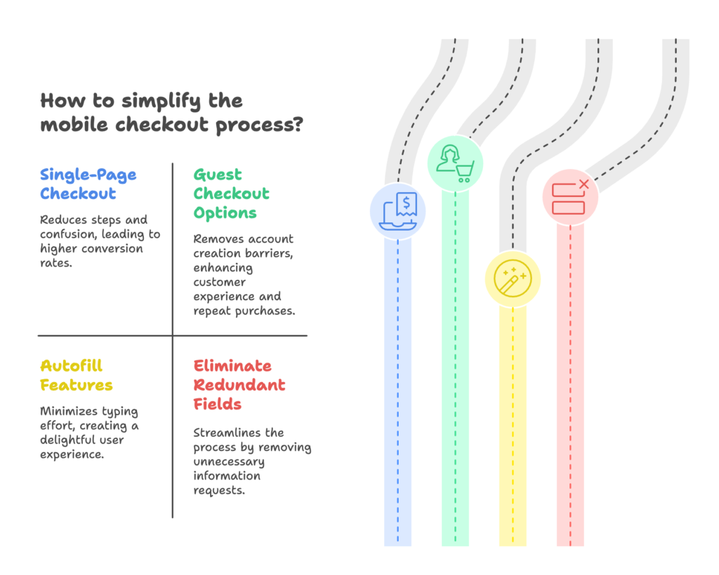
Single-Page Checkout
Traditional multi-page checkouts force mobile users to load new pages between steps. Each page load is another opportunity for network issues, confusion, or simple impatience to derail the sale.
Shopify’s single-page checkout feature allows you to combine cart details, shipping options, and payment information into one scrollable view. This approach has proven remarkably effective—one Shopify merchant increased their conversion rates from 58% to 65% simply by implementing single-page checkout.
With single-page checkout, customers can see their progress all at once. They don’t wonder “how many more screens?” or lose context between steps. Everything they need is on one continuously scrolling page.
Guest Checkout Options
Nothing kills mobile momentum faster than forcing account creation. When someone’s ready to buy, creating a new account—with password requirements, email verification, and additional form fields—feels like an unnecessary roadblock.
Guest checkout removes this barrier entirely. Customers can complete their purchase without creating an account, then optionally create one after the sale is complete.
What about building your customer database? Here’s the insight many miss: Shop Pay users generate higher repeat purchases without forced registration. Why? Because they’ve had a positive experience, and that positive experience makes them more likely to engage further with your brand.
The rule is simple: never place account creation between the customer and the “buy” button.
B. Reducing Form Complexity
Autofill Features
Mobile typing is inherently tedious. Every field that requires keyboard input increases abandonment risk. Modern browsers and operating systems offer sophisticated autofill capabilities—but only if your checkout is properly configured to use them.
Enable autofill for names, addresses, credit card information, and other standard fields by using proper field types and autofill attributes. This small technical step can dramatically reduce the typing burden on mobile users.
When a customer sees their information magically populate with a single tap, they experience a moment of delight—not frustration. That’s the difference between a sale and an abandonment.
Eliminate Redundant Fields
Every field in your checkout should earn its place. Ask yourself: “Do I absolutely need this information to fulfill the order?” If not, remove it or make it optional.
Essential fields typically include:
- Name
- Shipping address
- Payment information
Everything else—phone numbers, company names, even billing addresses (when they match shipping)—should be considered optional or eliminated entirely.
Remember, you can always collect additional information post-purchase through order confirmation emails or account creation incentives.
III. Enhancing User Experience on Small Screens
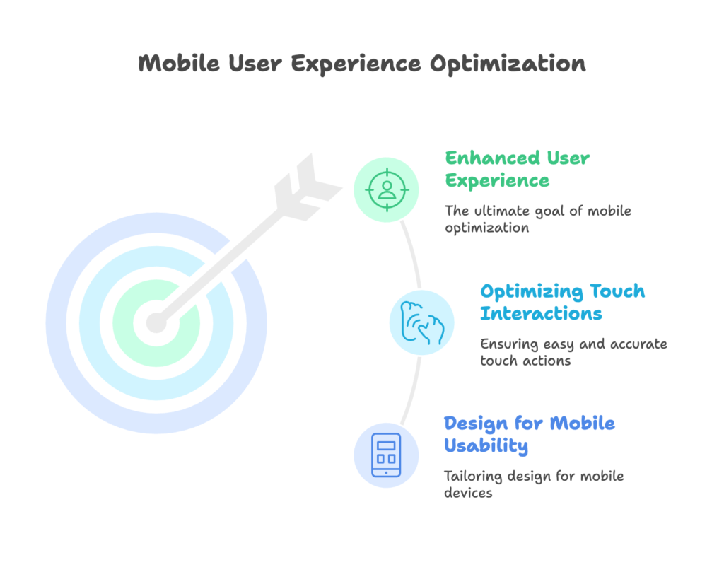
A. Design for Mobile Usability
Mobile optimization isn’t just about making things smaller—it’s about completely rethinking the experience for thumb-driven navigation on a vertical screen.
Responsive Design
While most Shopify themes claim to be “responsive,” not all responsive designs are created equal. True mobile optimization requires testing your checkout flow on actual mobile devices across different screen sizes.
Look for these common issues:
- Text too small to read without zooming
- Buttons too close together for accurate tapping
- Form fields that get covered by the mobile keyboard
- Elements that extend beyond the screen width, causing horizontal scrolling
Fix these issues by using relative units (like percentages or viewport units) rather than fixed pixels, and test extensively on real devices—not just browser simulations.
Progress Indicators
On mobile, screen real estate is precious, but clarity is even more valuable. A simple progress indicator showing exactly where the customer is in the checkout process reduces uncertainty and builds confidence.
Your progress indicator should be:
- Clearly visible without scrolling
- Simple enough to understand at a glance
- Accurate (showing actual progress, not arbitrary steps)
When customers know exactly where they are and what’s left to complete, they’re more likely to continue through the process.
B. Optimizing Touch Interactions
Large Buttons
According to MIT Touch Lab research, the average adult fingertip is about 10-14mm wide. This means your touchable elements—especially critical ones like “Add to Cart” or “Complete Purchase”—should be at least 44×44 pixels (Apple’s recommended minimum) or ideally 48×48 pixels (Google’s recommendation).
Beyond size, your primary action buttons should:
- Use contrasting colors that stand out from the page
- Include clear, action-oriented text (“Place My Order Now” rather than “Submit”)
- Have sufficient space around them to prevent accidental taps on adjacent elements
Make your primary action button impossible to miss and easy to tap—even for customers with larger fingers or slightly impaired motor control.
Minimized Scrolling
While some scrolling is inevitable on mobile, strategic element placement can reduce unnecessary finger movement. The most critical action—your “Complete Purchase” button—should be visible at the bottom of the screen without requiring a hunt.
Consider the natural flow of mobile scrolling: users scan down the page, inputting information as they go. When they reach the bottom, they should find the action button waiting for them—not another screen of scrolling to track it down.
This principle applies to all elements: place them where users naturally expect to find them, following the logical flow of the checkout process.
IV. Speed Optimization Strategies for Mobile Checkout
A. Improving Page Load Times
Speed isn’t just a convenience factor—it’s a conversion factor. Mobile users are particularly sensitive to delays, often abandoning sites that don’t respond instantly.
Image Optimization
Product images are essential for confidence at checkout, but they’re also often the heaviest elements on the page. Compress images using tools like TinyPNG or convert them to next-generation formats like WebP to maintain quality while dramatically reducing file size.
For checkout pages specifically, consider whether all images are truly necessary. Could product thumbnails be smaller? Could some decorative images be replaced with CSS styling? Every kilobyte saved is a fraction of a second gained in loading time.
Lazy Loading
Why load content that’s not immediately visible? Lazy loading defers the loading of images and other resource-intensive elements until they’re actually needed—typically when they scroll into view.
Most modern Shopify themes support lazy loading natively, but you can also implement it manually with a few lines of JavaScript. This technique is particularly effective for longer checkout pages where customers might not scroll all the way down.
Browser Caching
Returning customers shouldn’t have to download the same assets repeatedly. Configure proper Cache-Control headers to instruct browsers to store certain elements locally, dramatically speeding up repeat visits.
While Shopify handles much of this automatically, you can further optimize by ensuring third-party apps and custom code follow caching best practices.
B. Reducing HTTP Requests
Each element on your page—images, scripts, stylesheets—typically requires a separate HTTP request. Each request adds loading time, especially on slower mobile connections.
Combine Files
Reduce HTTP requests by combining multiple CSS or JavaScript files into single files. Tools like Gulp or Webpack can automate this process, turning dozens of small requests into just a few larger ones.
For Shopify specifically, consider using asset bundling through the theme.liquid file or a build process that combines assets before uploading to your theme.
Remove Unnecessary Scripts
Third-party apps often add their own JavaScript to your site. While useful, these scripts can significantly slow down your checkout if they’re not optimized for performance.
Audit your active apps and remove any that aren’t directly contributing to your business goals. For essential apps, check if they offer asynchronous loading options that won’t block your page rendering.
Remember: every script on your checkout page is a potential conversion killer if it delays the completion of a purchase.
V. Payment Flexibility for Mobile Users
A. Mobile-Friendly Payment Options
The payment step is where many mobile transactions fall apart. Typing credit card details on a tiny keyboard is frustrating at best, and security concerns can add additional hesitation.
Digital Wallets
Digital wallets like Apple Pay, Google Pay, and Shop Pay eliminate the need to type payment information entirely. With a single tap or biometric authentication, customers can complete their purchase without entering a single digit of their credit card number.
The convenience is staggering: Shop Pay, for instance, increases checkout speed by up to 4x and improves conversion rates by up to 1.72x compared to traditional checkout methods.
For your Shopify store, enabling these options is straightforward:
- Shop Pay is available to all Shopify merchants
- Apple Pay and Google Pay can be activated through Shopify Payments
- Additional options like PayPal can be added through Shopify’s payment settings
The more mobile-friendly payment options you offer, the more likely customers are to find one that feels comfortable and convenient.
Express Checkout Buttons
Digital wallets provide another advantage: they can be presented as express checkout buttons directly on product pages or in the cart, allowing customers to bypass much of the traditional checkout process entirely.
Position these buttons prominently—above standard checkout options—to encourage their use. Each click saved is a potential abandonment prevented.
B. Secure Payment Signals
Trust Indicators
Mobile shoppers are particularly security-conscious. Clear trust signals can alleviate these concerns and prevent abandonment at the critical payment stage.
Effective trust indicators include:
- SSL certificate indicators (the lock icon in browsers)
- Payment processor logos (Visa, Mastercard, etc.)
- Security badges from recognized providers
- Brief reassuring text (“Your payment is secure”)
Place these indicators near payment fields where they’ll have the most impact on customer confidence.
Customer testimonials can also serve as powerful trust signals. Short quotes focused specifically on the ease and security of your checkout process can provide social proof at exactly the moment when customers need reassurance.
VI. Advanced Analytics & Testing for Optimization
A. Leveraging Shopify Analytics Tools
You can’t improve what you don’t measure. Shopify provides powerful analytics tools to help you understand exactly where your mobile checkout process might be breaking down.
Track Abandonment Rates
Shopify’s analytics dashboard provides insights into where customers drop off during checkout. Look for patterns in abandonment—do customers consistently leave at the shipping information step? The payment step? This data points directly to your biggest opportunities for improvement.
Pay particular attention to differences between desktop and mobile abandonment patterns. If mobile users abandon significantly more often at a specific step, that’s a clear indicator of a mobile-specific issue that needs addressing.
A/B Testing Designs
Once you’ve identified potential issues, use A/B testing to validate your solutions. Changes that seem intuitive might not always produce the expected results—only testing with real customers can confirm what actually works.
Elements worth testing include:
- Button placements and sizes
- Form field layouts
- Progress indicator designs
- Express checkout button prominence
Tools like Google Optimize can be integrated with your Shopify store to facilitate these tests, or you can use Shopify Apps specifically designed for A/B testing.
B. Core Web Vitals Monitoring
Key Metrics
Google’s Core Web Vitals provide standardized metrics for measuring user experience, with direct implications for both conversion rates and SEO performance:
- Largest Contentful Paint (LCP): Measures loading performance—aim for under 2.5 seconds
- Interaction to Next Paint (INP): Measures responsiveness—aim for under 200 milliseconds
- Cumulative Layout Shift (CLS): Measures visual stability—aim for under 0.1
These metrics are particularly relevant for mobile checkout, where slow loading, laggy interactions, or shifting layouts can quickly lead to frustration and abandonment.
Tools like Google PageSpeed Insights or the Chrome User Experience Report can help you measure these metrics for your checkout pages specifically.
VII. Practical Next Steps for Shopify Store Owners
Ready to transform your mobile checkout experience? Here’s a practical action plan you can implement starting today:
- Conduct a mobile usability audit: Complete a checkout on your own store using different mobile devices. Note any friction points, confusion, or frustration you experience.
- Implement quick wins first: Enable guest checkout, compress images, and ensure buttons are sufficiently large for easy tapping.
- Activate mobile payment options: Turn on Shop Pay, Apple Pay, and Google Pay through your Shopify payment settings.
- Simplify your checkout forms: Remove or make optional any fields that aren’t absolutely necessary for order fulfillment.
- Test with real users: Ask friends or family members to complete a checkout on their mobile devices while you observe (without guiding them).
- Monitor and iterate: Use Shopify’s analytics to track improvements in mobile conversion rates, and continue refining your checkout process based on data.
Remember, mobile checkout optimization isn’t a one-time project—it’s an ongoing process of improvement driven by user feedback and analytics. Small, incremental changes can add up to significant increases in your mobile conversion rates over time.
References
- Scaleshopify.com (2025). “How To Optimize Shopify Mobile Checkout For Conversions.”
- Uxify.com (2025). “Master Mobile Speed Optimization for Your Shopify Store.”
- Shopify.com (2024). “Ecommerce Checkout Best Practices: 11 Tips for Success.”
- Ecomexperts.io (2024). “Shopify Checkout Optimization: 5 Proven Ways to Reduce Cart Abandonment.”
- Lifesight.io (2024). “14 Proven Strategies To Optimize Your Ecommerce Shopify Page Checkout.”
Ready to supercharge your Shopify store’s sales with perfectly optimized discount codes and smart campaigns? Growth Suite is a Shopify app that helps you run effective on-site discount campaigns and collect valuable customer data. Its powerful analytics engine tracks visitor behavior to deliver personalized, time-limited offers at the perfect moment, increasing conversions and revenue. Install Growth Suite with a single click and start seeing results!