
Introduction: The Critical Importance of Mobile Optimization for Shopify Stores
Picture this: A potential customer discovers your Shopify store through Instagram. They’re intrigued by your product and tap through to learn more. But as your site loads, the text appears microscopic, images crowd the screen, and the “Add to Cart” button is nowhere to be found. Frustrated, they hit the back button—and just like that, you’ve lost a sale.
This scenario plays out thousands of times daily across e-commerce, and it’s entirely preventable. With over 81% of traffic on Shopify stores now coming from mobile devices, optimizing your store for smartphones isn’t just a nice-to-have—it’s essential for survival.
The gap between good and great mobile experiences is where today’s e-commerce battles are won and lost. Stores that nail their mobile optimization enjoy significantly higher conversion rates, stronger customer loyalty, and a decisive edge over competitors who treat mobile as an afterthought.
In this comprehensive guide, we’ll explore how to transform your Shopify store into a mobile conversion powerhouse. You’ll learn practical, actionable strategies for enhancing every aspect of your mobile experience—from design philosophy to checkout optimization—with specific techniques you can implement today.
Ready to stop losing mobile customers and start maximizing your smartphone sales potential? Let’s dive in.
I. Understanding the Mobile Commerce Landscape
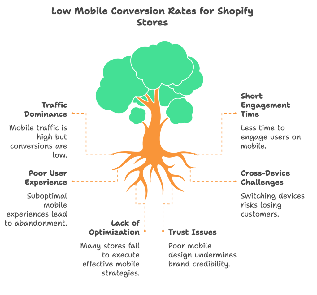
A. The Dominance of Mobile Shopping in E-commerce
The shift to mobile commerce has been swift and decisive. What began as a convenience has become the primary shopping channel for millions. Let’s look at what this means for your Shopify store.
1. Current Mobile Usage Statistics
The numbers tell a compelling story. In 2025, more than 81% of traffic to Shopify stores comes from mobile devices—a figure that continues to climb yearly. But here’s the kicker: despite this traffic dominance, mobile conversion rates typically lag 15-30% behind desktop, representing a massive opportunity gap for store owners who can close it.
Smartphone shopping behavior has evolved significantly too. The average mobile shopper now spends 4.2 minutes per session on an e-commerce site, compared to 7.5 minutes on desktop. This means you have less time to make an impression and guide users to purchase.
For Shopify specifically, the benchmark mobile conversion rate hovers around 1.3%, compared to desktop’s 1.9%. Top-performing stores, however, have closed or even reversed this gap—proving that mobile conversion challenges are solvable with the right approach.
2. The Shift in Consumer Behavior
Today’s consumers instinctively reach for their phones when shopping online. Mobile has become the default starting point in the customer journey, even when purchases eventually happen elsewhere. This “mobile-first browsing” behavior means your smartphone experience often forms the crucial first impression of your brand.
Cross-device shopping journeys have become increasingly common, with 67% of shoppers starting on mobile but potentially finishing on desktop or tablet. Each device switch introduces a risk of losing the customer, making seamless experiences across all devices critical.
Perhaps most telling is how mobile experiences shape overall brand perception. In recent studies, 57% of consumers reported they wouldn’t recommend a business with a poor mobile site, regardless of how good the products might be. Your mobile store isn’t just a sales channel—it’s your brand’s ambassador.
3. Business Impact of Mobile Performance
The correlation between mobile optimization and business outcomes is stark and undeniable. For every one-second improvement in mobile page load time, conversion rates typically increase by 27%. That’s not a typo—small performance gains drive massive revenue impacts.
The revenue implications are equally compelling. Shopify stores with optimized mobile experiences report average order value increases of 10-15%, likely because smooth experiences encourage product exploration and discovery.
Customer retention tells a similar story. Mobile-optimized stores see 22% higher return visitor rates compared to poorly optimized competitors. When mobile shoppers find a store that works well on their device, they’re more likely to come back again and again.
B. Mobile Optimization as a Competitive Advantage
While most store owners recognize mobile’s importance, surprisingly few execute it well. This execution gap creates a significant competitive opportunity.
1. Market Differentiation Through Superior Mobile Experience
Consider the case of Allbirds, a Shopify Plus merchant who committed heavily to mobile optimization. After restructuring their mobile experience around simplified navigation and accelerated checkout, they saw mobile conversion rates jump by 63%, significantly outperforming industry averages.
Or take Gym+Coffee, an athletic apparel brand that redesigned their mobile journey with a focus on thumb-friendly zones and streamlined product pages. The result? A 40% increase in smartphone sales and a 24% decrease in cart abandonment on mobile devices.
To identify mobile experience gaps in your own market, conduct a simple competitive audit. Test 5-10 competitor stores on your smartphone, making notes on what works and what frustrates you. Pay special attention to search functionality, product filtering, and checkout flow—these are common weak points where even small improvements can yield big advantages.
2. Mobile Experience as a Trust Signal
A polished mobile experience builds credibility in subtle but powerful ways. When a store functions flawlessly on smartphones, customers unconsciously perceive the brand as more professional, attentive, and trustworthy.
Specific design elements that boost mobile credibility include appropriately sized tap targets (preventing frustrating mis-taps), visible security indicators during checkout, and consistent styling throughout the journey. These details might seem minor, but together they build a foundation of trust that directly impacts purchasing decisions.
The link to repeat purchases is particularly strong. One study found that 60% of customers who abandoned a mobile transaction due to usability issues went on to buy from a competitor instead. More tellingly, 74% of those customers reported being less likely to return to the original site in the future. Your mobile experience isn’t just about today’s sale—it’s about securing tomorrow’s customer loyalty.
II. Mobile-First Design Principles for Shopify Stores
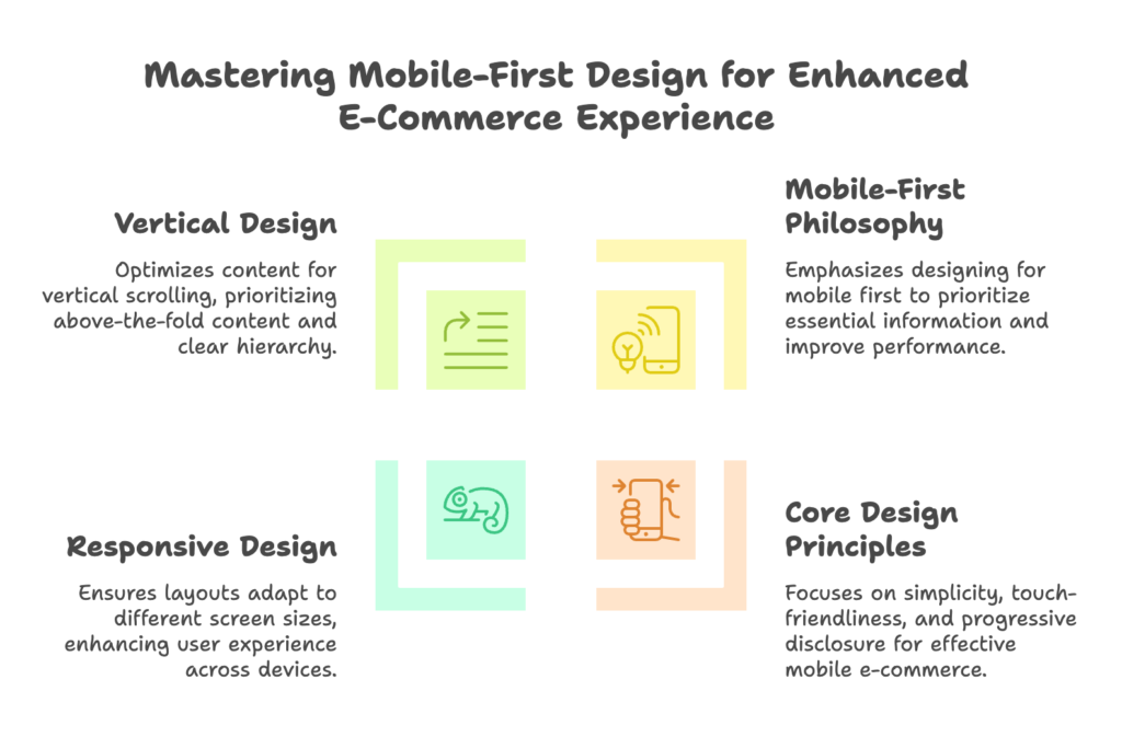
A. Understanding Mobile-First Design Philosophy
Mobile-first design is exactly what it sounds like—designing for the smallest screen first, then scaling up to larger devices. But it’s more than just a technical approach; it’s a mindset shift with profound implications for your Shopify store.
1. Mobile-First vs. Desktop-First Approach
The traditional desktop-first approach begins with a full-featured website that’s later condensed for smaller screens. This inevitably leads to compromises—features get cut, layouts get cramped, and the mobile experience suffers.
Mobile-first flips this process. By starting with the constraints of mobile, you’re forced to prioritize what truly matters. What essential information do users need? What actions are most critical? This clarity of purpose carries through to all screen sizes, resulting in more focused, effective experiences everywhere.
The benefits are compelling. Mobile-first sites typically load faster because they’re built with performance in mind from the beginning. They often have higher conversion rates because they eliminate distractions and guide users toward key actions. And perhaps most importantly, they future-proof your store as mobile traffic continues to grow.
Common pitfalls when retrofitting desktop designs for mobile include oversized images that slow loading, multi-column layouts that break on small screens, and hover-dependent interactions that simply don’t work on touchscreens. Starting with mobile eliminates these problems entirely.
From a resource perspective, mobile-first often proves more efficient. While it might seem easier to design for desktop’s larger canvas first, the inevitable rework required for mobile often consumes more time and budget in the long run.
2. Core Mobile Design Principles for E-commerce
Successful mobile e-commerce design rests on three foundational principles: simplicity, touch-friendliness, and progressive disclosure.
Simplicity means eliminating anything that doesn’t directly serve the user’s goals. Every element on your mobile store—every button, image, and line of text—should earn its place by contributing to the shopping experience. If it doesn’t help users discover, evaluate, or purchase products, question whether it belongs.
Touch-friendliness acknowledges the fundamental difference between mouse and finger interaction. Fingers are less precise than mouse pointers and obscure the screen when used. This means tap targets should be generously sized (at least 44×44 pixels), well-spaced to prevent accidental taps, and placed where thumbs can easily reach them—typically the center and bottom portions of the screen.
Progressive disclosure means revealing information gradually, as users need it. Instead of overwhelming mobile visitors with all product details at once, present the most crucial information first, with options to explore deeper as interest grows. This might mean using expandable sections for technical specifications, or revealing detailed shipping information only when relevant.
B. Implementing Responsive Design on Shopify
Responsive design—where layouts automatically adapt to different screen sizes—is the technical foundation of mobile optimization. Fortunately, Shopify makes implementing responsive design relatively straightforward.
1. Selecting Mobile-Responsive Shopify Themes
All themes in Shopify’s official theme store are responsive by default, but their mobile execution quality varies significantly. When evaluating themes for mobile performance, look beyond the desktop demos and ask these critical questions:
- Does the theme offer dedicated mobile previews?
- How does the navigation transform on small screens?
- Are collection pages and filters optimized for touch?
- How does the theme handle product options and variants on mobile?
- Is the checkout process streamlined for small screens?
The choice between premium and free themes involves several mobile-specific considerations. Premium themes typically offer more sophisticated mobile features like sticky add-to-cart buttons, mobile-optimized mega-menus, and better-designed mobile product galleries. These enhancements often justify the investment for stores where mobile drives significant traffic.
Theme customization capabilities are equally important. Look for themes that offer mobile-specific customization options, allowing you to tailor the smartphone experience without affecting desktop. The ability to hide certain elements on mobile, adjust font sizes for smaller screens, or rearrange content blocks can make a tremendous difference in usability.
2. Customizing Themes for Mobile Optimization
Most Shopify themes include settings that directly impact the mobile experience. Common examples include:
- Mobile menu depth (how many levels of navigation to display)
- Product grid columns on mobile (2-column layouts often work better than 3-column)
- Mobile-specific logo size
- Font size adjustments for small screens
- Mobile sticky header options
Explore your theme’s settings thoroughly, as these simple adjustments can significantly improve mobile usability without requiring custom code.
For more advanced customization, custom CSS offers powerful control over your mobile presentation. Using media queries, you can apply styles specifically to mobile devices. For example:
@media only screen and (max-width: 767px) {
  .product-title {
    font-size: 24px;
    line-height: 1.2;
  }

  .buy-button {
    width: 100%;
    padding: 15px;
  }
}
This approach allows you to fine-tune the mobile experience while maintaining your desktop design. Common CSS customizations include enlarging buttons, simplifying typography, and adjusting spacing for touch interfaces.
Testing theme responsiveness requires looking beyond your personal device. Use tools like BrowserStack or Chrome’s device emulation to verify your store’s appearance across different screen sizes and device types. Pay special attention to the transition points where layouts shift—these “breakpoints” often reveal design issues that need addressing.
C. Vertical Design Optimization
Mobile users scroll vertically—a lot. Optimizing for this vertical orientation is a core aspect of mobile-first design.
1. Content Prioritization for Mobile Screens
Above-the-fold content—what users see before scrolling—is prime real estate on mobile. This initial viewport should immediately communicate three things: what you sell, why it matters, and what action users should take next.
For Shopify homepages, this typically means featuring a compelling hero image, a concise value proposition, and a prominent “Shop Now” call-to-action—all visible without scrolling. Product pages might prioritize the product image, title, price, and add-to-cart button in this valuable space.
As users scroll down, maintain a clear information hierarchy that aligns with their decision-making process. On product pages, for instance, the sequence might be: visual presentation (images/videos), key selling points, product options, detailed specifications, and finally social proof like reviews.
Content chunking—breaking information into digestible sections—becomes especially important on mobile. Rather than long, uninterrupted blocks of text, use headings, short paragraphs, bullet points, and white space to create visual breathing room. This approach reduces cognitive load and makes complex information more approachable on small screens.
2. Single-Column Layout Implementation
Multi-column desktop layouts invariably convert to single-column on mobile—a transformation that requires thoughtful planning. When columns stack vertically, their sequence matters tremendously. The most important column should come first in the mobile view, with secondary content following.
For example, a desktop product page might display the product description beside the image. On mobile, decide whether the image or description should appear first based on which better drives purchase decisions for your specific products.
Maintaining visual hierarchy in single-column formats means relying more heavily on typography, spacing, and visual cues to indicate importance. Section headers should be clearly distinguished from body text, and critical elements like pricing and availability should stand out through size, color, or weight differentiation.
Spacing considerations become paramount on mobile screens. Adequate padding between elements prevents accidental taps and creates visual separation between content sections. A common mistake is preserving desktop padding values on mobile, resulting in either too much wasted space or overcrowded elements. Mobile-specific spacing typically requires larger gaps between interactive elements (for touch accuracy) but more compact spacing within content blocks (to maximize limited screen real estate).
III. Mobile Navigation and User Experience Optimization
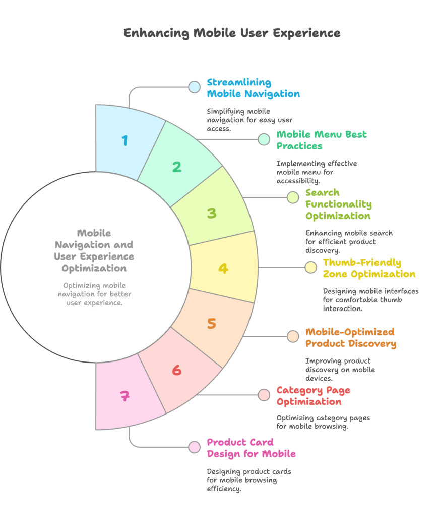
A. Streamlining Mobile Navigation
Navigation is perhaps the most critical component of your mobile experience. If customers can’t easily find what they’re looking for, nothing else about your store matters.
1. Mobile Menu Best Practices
The hamburger menu (☰) has become the universal symbol for mobile navigation, instantly recognizable to smartphone users. Implementing an effective hamburger menu means balancing accessibility with space efficiency.
Best practices include positioning the icon in either the top-left or top-right corner (with top-left becoming increasingly standard), ensuring it’s at least 44×44 pixels for easy tapping, and providing a subtle animation when opened to confirm user action.
The menu itself should be simple and scannable. Limit top-level categories to 5-7 options, use clear, concise labels, and consider including icons alongside text for improved visual recognition. Deep nested menus should be approached cautiously—each additional tap required to reach a destination increases the likelihood of abandonment.
Sticky navigation—elements that remain visible as users scroll—significantly improves mobile usability. A minimal header that stays fixed at the screen top, containing just your logo, menu icon, search icon, and cart, helps shoppers navigate your store without frustrating scrolling back to the top.
For larger Shopify stores with extensive product catalogs, consider supplementing the hamburger menu with a bottom navigation bar containing 4-5 essential destinations like Home, Shop, Search, Account, and Cart. This pattern, popularized by mobile apps, places critical navigation within easy thumb reach.
2. Search Functionality Optimization
On mobile, search often becomes the primary navigation method, particularly for stores with broad product offerings. A prominent search bar or icon should be immediately visible in your mobile header—don’t hide this critical functionality within the hamburger menu.
When tapped, the search field should expand to take advantage of available screen width, with a clear input field, prominent keyboard focus, and easy cancellation option. The search input itself should be configured to trigger the appropriate mobile keyboard type (typically search or text) and include relevant placeholder text (e.g., “Search products…”).
Predictive search transforms the mobile shopping experience by reducing typing and accelerating discovery. As users type, display matching products, collections, and even popular searches in real-time. Each suggestion should be large enough for accurate tapping and include a thumbnail image when displaying product results.
Voice search integration, while still emerging in e-commerce, offers particular value on mobile where typing can be cumbersome. If your theme or a third-party app supports voice input for search, consider implementing it—especially if your products have distinctive or hard-to-spell names.
3. Thumb-Friendly Zone Optimization
Understanding thumb ergonomics is crucial for mobile design. Most users hold their phones in one hand and interact primarily with their thumb, which can comfortably reach only certain screen areas.
The most accessible zone is an arc at the bottom of the screen, extending partway up the side opposite the holding hand. The least accessible is the upper corner opposite the holding hand (typically the upper-left for right-handed users). This creates a “heat map” of interactivity that should guide your placement of critical elements.
Map your most important interactive elements—particularly primary calls-to-action like “Add to Cart” or “Checkout”—to the easily thumbable zones. Secondary actions can occupy the moderate-reach areas, while infrequently used functions can live in the difficult-to-reach spaces.
Tap target size directly impacts usability and error rates. Interactive elements should maintain a minimum tappable area of 44×44 pixels, with important buttons extending to 48×48 pixels or larger. Remember that the visual size of a button might be smaller than its actual tap target—padding can increase the interactive area without affecting appearance.
Preventing accidental taps requires adequate spacing between interactive elements. Aim for at least 8 pixels of non-interactive space between tappable items, with more critical actions (like “Buy Now” vs. “Add to Wishlist”) separated by even greater distances to prevent costly mistakes.
B. Mobile-Optimized Product Discovery
How customers find products on mobile differs significantly from desktop browsing patterns. Optimizing this discovery process is essential for driving conversions.
1. Category Page Optimization
Mobile grid layouts for product collections require careful consideration. While desktop displays might comfortably show 4 or more products per row, mobile screens typically work best with 2-column grids. This format balances adequate product visibility with efficient screen use, allowing customers to see product details without squinting.
Each product card in the grid should maintain consistent height to create visual harmony, with product images cropped to identical aspect ratios (typically 1:1 square or 3:4 portrait). Information density matters tremendously—include only the most decision-critical details like product name, price, and perhaps a single key feature or rating summary.
Filter and sort functionality becomes even more critical on mobile where scrolling through large catalogs is cumbersome. Implement these tools through an easily accessible button or tab at the top of collection pages. When activated, filters should slide in from the bottom as a modal panel, utilizing the natural thumb zone and offering large, tappable options with visual feedback.
For complex product catalogs with numerous filtering options, consider a staged approach: first showing filter categories (Size, Color, Price, etc.), then revealing specific options when a category is selected. This prevents overwhelming users with too many choices at once.
The infinite scroll versus pagination debate has particular relevance for mobile. Infinite scroll eliminates the friction of pagination taps and aligns with natural smartphone scrolling behaviors. However, it can cause performance issues with very large collections and makes it difficult for users to reach footer content. A hybrid approach—loading 2-3 “pages” of products automatically, then offering a “Load More” button—often provides the best balance of usability and performance.
2. Product Card Design for Mobile
Product cards are the building blocks of mobile discovery. Their design directly impacts browsing efficiency and click-through rates to product pages.
Information hierarchy on these cards is crucial. The visual comes first—high-quality, clearly visible product images that load quickly and show the product in use. Following the image, the product title should be concise yet descriptive, ideally fitting on 1-2 lines.
Price information comes next, with any sale pricing prominently highlighted. Additional information should be strictly limited to decision-critical details—perhaps a star rating, color options indicator, or badge highlighting “New” or “Best Seller” status.
Image optimization for quick scanning means ensuring products are photographed consistently against clean backgrounds, properly lit to show details, and cropped to focus on the product itself. Consider using the same aspect ratio across all product images to create a cohesive, professional grid.
Quick-view functionality can significantly enhance mobile browsing by allowing customers to preview product details without navigating to the full product page. When implemented, ensure the quick-view modal is optimized for mobile—large enough to display critical information but not so complex that it becomes a mini product page. Focus on the essential decision points: multiple product images, price, key features, variant selection, and add-to-cart functionality.
IV. Mobile Performance Optimization Techniques
A. Mobile Page Speed Optimization
Performance isn’t just a technical concern—it’s a critical business metric. Mobile users are particularly sensitive to load times, with 53% abandoning sites that take longer than three seconds to load.
1. Image Optimization Strategies
Images typically constitute the largest portion of page weight on Shopify stores. Effective image optimization can dramatically improve load times without sacrificing visual quality.
Compression techniques for product images start with selecting the right format. JPEG works best for photographs, while PNG is preferable for images with transparency or text. For even better performance, consider next-gen formats like WebP, which Shopify now supports and which delivers superior compression with excellent quality.
Beyond format selection, tools like TinyPNG or Shopify’s built-in image optimization can reduce file size by 50-80% without perceptible quality loss. The best practice is compressing images before uploading to Shopify, as this gives you greater control over the compression quality-to-size ratio.
Implementing responsive images with srcset attributes allows browsers to download only the image size needed for the current device, rather than full-sized images scaled down for display. This technique is particularly valuable for hero images, banners, and other large visuals:
<img src="small.jpg"
     srcset="small.jpg 300w,
             medium.jpg 600w,
             large.jpg 1200w"
     sizes="(max-width: 600px) 100vw, 50vw"
     alt="Product description">
Lazy loading defers the loading of off-screen images until users scroll near them, drastically improving initial page load times. Modern browsers support native lazy loading with the loading=”lazy” attribute, while Shopify themes often include built-in lazy loading functionality for collection grids and image galleries.
2. Code Optimization for Mobile
JavaScript and CSS are frequently overlooked performance bottlenecks. Minimizing these resources by removing unnecessary code, whitespace, and comments can significantly reduce file sizes.
For Shopify stores, this might mean selectively loading JavaScript modules only when needed. For example, a product zoom feature’s code should only load on product pages, not across the entire site. Similarly, custom CSS should be audited regularly to remove unused styles, particularly those targeting desktop-only features.
Browser caching leverages stored resources for returning visitors, dramatically speeding up subsequent page loads. Shopify handles most caching configuration automatically, but you can enhance this by:
- Using consistent image references across your site
- Avoiding URL parameters for static resources
- Minimizing third-party domain usage for critical assets
Prioritizing above-the-fold content loading—a technique called “critical path rendering”—ensures users see something useful while the rest of the page loads. This involves identifying and loading the essential CSS needed for initial display before other resources. Some premium Shopify themes include this functionality, or it can be implemented through specialized apps.
3. Third-Party App Impact Management
Third-party apps and scripts often contribute significantly to page bloat and performance degradation. Each app you install potentially adds JavaScript, CSS, and additional HTTP requests to your pages.
Start by evaluating apps for mobile performance impact. Test your store’s speed using tools like Google PageSpeed Insights before and after installing each app. If an app causes noticeable slowdowns, consider whether its functionality justifies the performance cost or if alternatives exist.
For essential third-party scripts, asynchronous loading prevents them from blocking the rendering of your page. This technique allows your core content to display while external resources load in the background:
<script async src="analytics.js"></script>
Strategic placement of third-party elements also impacts perceived performance. Wherever possible, move non-critical third-party code to the end of your HTML document, after your core content. This ensures users can interact with your site even if some external resources are still loading.
Consider implementing a tag manager like Google Tag Manager to consolidate and control third-party scripts. This approach provides better performance control and makes it easier to audit and manage external code dependencies.
B. Technical SEO for Mobile Shopify Stores
Mobile optimization and SEO are now inseparably linked. Google’s mobile-first indexing means your site’s mobile version determines your search rankings.
1. Mobile SEO Best Practices
Mobile-friendly testing should be a regular part of your SEO routine. Google’s Mobile-Friendly Test tool evaluates your pages from a mobile perspective, identifying potential issues like text too small to read, clickable elements too close together, or content wider than the screen.
For Shopify stores specifically, common mobile SEO improvements include:
- Ensuring viewport meta tags are properly configured
- Verifying text is readable without zooming (minimum 16px font for body text)
- Checking that all important content is visible on mobile (not hidden via CSS)
- Confirming tap targets are appropriately sized and spaced
- Testing that forms work properly on mobile devices
Structured data implementation takes on added importance for mobile SERPs, where screen limitations mean fewer results are visible at once. Rich results—like product ratings, prices, and availability information—help your listings stand out in crowded mobile search results.
For Shopify product pages, implementing Product schema markup ensures Google understands your offerings in detail. Similarly, BreadcrumbList schema improves navigation signals, while FAQPage schema can help drive featured snippets for common product questions.
Mobile-specific schema considerations include ensuring LocalBusiness markup is complete for stores with physical locations (facilitating “near me” searches common on mobile) and implementing How-to schema for instructional content, which often appears in dedicated mobile SERP features.
2. Core Web Vitals Optimization
Google’s Core Web Vitals have become critical ranking factors, particularly for mobile sites. These metrics measure real-world user experience and directly impact your search visibility.
Largest Contentful Paint (LCP) measures loading performance—specifically, how quickly the largest content element (typically an image or text block) becomes visible. For Shopify stores, improving LCP often means:
- Optimizing hero images and feature product photos
- Implementing proper image dimensions and aspect ratios
- Eliminating render-blocking resources in the critical path
- Using effective caching policies
First Input Delay (FID) measures interactivity—how quickly the page responds when users first interact with it. Mobile optimization strategies include:
- Breaking up long JavaScript tasks into smaller chunks
- Deferring or removing unnecessary third-party scripts
- Optimizing event listeners to respond quickly on touch
- Minimizing main-thread work during page load
Cumulative Layout Shift (CLS) measures visual stability—how much elements move around as the page loads. This is particularly disruptive on mobile devices where unexpected shifts can cause misclicks. Prevention methods include:
- Setting explicit width and height attributes on images and embedded media
- Reserving space for dynamic content like ads or promotional banners
- Avoiding inserting content above existing content after page load
- Using transform animations rather than animations that change layout properties
Many Shopify themes aren’t fully optimized for Core Web Vitals out of the box. Consider using specialized apps designed to improve these metrics, or work with a developer to identify and address specific issues on your store.
V. Mobile Product Page Optimization for Conversions
A. Mobile Product Page Design Elements
Product pages are where browsing intent transforms into buying decisions. On mobile, this crucial conversion point requires thoughtful optimization.
1. Product Image Optimization
Mobile product galleries serve as customers’ hands and eyes when they can’t physically examine products. Implementing a mobile-friendly gallery means balancing visual detail with performance.
The ideal mobile product gallery features a prominent primary image that fills the width of the screen, with easy-to-access thumbnails for additional views. Swiping gestures should feel natural, with smooth transitions between images and clear indicators of how many images are available.
Image quality must remain high despite mobile constraints. Aim for images that are crisp on high-resolution displays without excessive file sizes. A good rule of thumb is 1200-1500 pixels wide—large enough for pinch-to-zoom functionality but not so massive that they slow loading.
Speaking of zoom, mobile zoom functionality requires careful implementation. Double-tap and pinch-to-zoom gestures should work naturally, allowing customers to examine product details closely. The zoomed view should maintain high resolution while remaining responsive to touch navigation.
Video integration on mobile product pages delivers exceptional conversion benefits, with studies showing conversion rate increases of 40% or more when videos are included. For optimal mobile experience, product videos should:
- Autoplay silently when in view (with clear play controls)
- Include captions or work well without sound
- Be brief (30-60 seconds) and focused on key product benefits
- Load adaptively based on connection speed
- Feature a compelling thumbnail that entices viewers to engage
2. Product Information Hierarchy
The limited screen space on mobile devices demands ruthless prioritization of product information. The sequence should follow the customer’s decision-making process.
Start with the essentials: product title, price, and a concise (1-2 sentence) value proposition that explains why this product is worth buying. This critical information should appear above the fold on most devices.
Follow with purchasing options—variants like size, color, or style—presented through large, touch-friendly selectors. Variant options should include visual previews where applicable (e.g., color swatches) and clearly indicate availability status.
The add-to-cart area should stand out visually, with a prominent button spanning most of the screen width. Consider including quantity selectors and, if relevant to your products, size guides or customization options in this high-priority zone.
For detailed product information beyond these essentials, collapsible sections work exceptionally well on mobile. This progressive disclosure approach allows customers to drill into specifics like materials, measurements, shipping details, or care instructions without overwhelming the initial view.
Each collapsible section should have a descriptive header and visual indicator of its expanded/collapsed state. When expanded, the content should be concise yet complete, with adequate spacing and properly formatted text for mobile readability.
Mobile-friendly product variant selectors deserve special attention. Unlike desktop interfaces where hover states and small click targets work fine, mobile variants need generous tap areas (44×44px minimum), clear visual feedback when selected, and explicit labeling. The currently selected variant should be immediately obvious, with out-of-stock options visually distinct but not removed entirely.
3. Social Proof Integration
Social proof elements—reviews, ratings, user photos, and testimonials—significantly impact purchase decisions, especially for mobile shoppers who may be browsing products while physically in competing stores.
Mobile-optimized review displays should begin with summary metrics (average rating, review count) near the top of the product page, typically just below the price. This snapshot gives customers immediate confidence feedback without requiring scrolling.
The full reviews section works best as a collapsible element lower on the page, with reviews presented in a mobile-friendly format: large text, adequate spacing, and a focus on the most relevant content. Consider implementing:
- Sort options that highlight the most helpful or recent reviews
- Filtering capabilities to find reviews mentioning specific features or use cases
- Truncated review text that expands when tapped, keeping the initial view scannable
- Visual indicators of verified purchasers to build additional trust
User-generated content integration, particularly customer photos showing the product in real-world use, provides powerful social proof. On mobile, these images work best in a horizontal scrolling gallery that customers can browse without leaving the product page. Ensure these images load lazily as users scroll to maintain performance.
Trust badges and certification placement matters tremendously on mobile, where purchasing anxiety can be higher due to the small screen and potentially distracting environments. Position key trust elements (secure payment icons, satisfaction guarantees, authenticity certifications) near the add-to-cart button where they’ll provide reassurance at the critical decision moment.
B. Mobile Call-to-Action Optimization
The call-to-action (CTA) represents the tipping point between browsing and buying. Mobile CTAs require special consideration to maximize conversion potential.
1. Add-to-Cart Button Design
The add-to-cart button should be unmistakable—the visual center of gravity on your product pages. Size-wise, it should be substantial (spanning at least 80% of screen width) with generous vertical padding (minimum 16px, preferably 20px) to create an easy tap target even for larger fingers.
Color choice should establish clear visual hierarchy, using your brand’s primary action color. This color should contrast strongly with the background while remaining on-brand. Text should be concise but descriptive (“Add to Cart” or “Add to Bag” rather than just “Add”) in a highly readable font.
Positioning best practices include keeping the button within the thumb’s natural range—typically fixed at the bottom of the screen or immediately following product options. Avoid placing the CTA where it might be accidentally tapped during scrolling, which can lead to frustration and abandoned sessions.
Sticky add-to-cart functionality—where the button remains visible as users scroll through product details—dramatically improves conversion rates on longer mobile product pages. This approach ensures the purchase option is always accessible without requiring users to scroll back up.
Implementation involves a fixed-position container at the screen bottom containing the essential elements: product thumbnail, selected options summary, price, and the add-to-cart button. This container should appear after users have scrolled beyond the initial CTA position and remain visible until they return to the top section.
Visual feedback for mobile interactions is crucial for confirming user actions. The add-to-cart button should provide immediate, obvious feedback when tapped—changing color, displaying a brief animation, or showing a loading indicator for the brief moment before the cart updates. Following the tap, a clear confirmation (either a cart sidebar or status message) should reassure users their action was successful.
2. Cross-Selling and Upselling on Mobile
Effective cross-selling and upselling can significantly increase average order value, but these tactics need careful adaptation for mobile interfaces.
Mobile-friendly product recommendation displays work best as horizontal scrolling carousels that don’t disrupt the vertical flow of the page. Limit visible recommendations to 2-3 products at once, with clear scrolling indicators showing more are available. Each recommended product should include a simple visual, brief title, price, and direct add-to-cart functionality to minimize friction.
Timing and placement of recommendations matters tremendously. On product pages, display complementary items (“Complete the look” or “Frequently bought together”) before the detailed description but after the primary add-to-cart button. This position captures attention without distracting from the main purchase decision.
Bundle offers on small screens require simplified presentation. Rather than displaying every included item with full details, consider a consolidated approach: a single representative image of the bundle, clear pricing showing the discount value, and a simple toggle to view included items. The emphasis should be on the savings benefit rather than comprehensive product information.
Post-add-to-cart suggestion techniques are particularly effective on mobile, where capturing attention at specific moments of engagement yields better results than persistent displays. After a customer adds an item to cart, present a focused recommendation modal with 1-2 highly relevant complementary products. Keep this interaction brief and provide a clear “No thanks” option to proceed directly to checkout.
VI. Mobile Checkout Optimization
A. Streamlining the Mobile Checkout Process
The checkout process represents the final hurdle between browsing and purchasing. On mobile, every additional tap, field, or moment of confusion during checkout significantly increases abandonment risk.
1. Form Field Optimization
Minimizing form fields is perhaps the single most effective mobile checkout optimization. Each field you remove increases completion rates—Shopify’s own research shows that reducing checkout fields from 16 to 6 can boost conversions by up to 35%.
Start by analyzing your current checkout process—which fields are truly necessary? Shipping address, contact information, and payment details are essential, but consider making fields like “company name” or “address line 2” optional or hidden by default. If you need additional information for marketing or product customization, consider collecting it post-purchase rather than during checkout.
Mobile-friendly input types dramatically improve form completion rates by presenting the appropriate keyboard for each field. Specify these input types in your checkout customization:
- For email fields:
input type="email"(triggers email keyboard with @ symbol) - For phone numbers:
input type="tel"(triggers numeric keypad) - For numeric information:
input type="number"(triggers numeric keypad) - For credit cards:
inputmode="numeric" pattern="[0-9]*"(triggers numeric keypad without decimal)
Autofill implementation significantly reduces typing burden, a major friction point on mobile. Ensure your checkout fields use standard name attributes that browsers recognize for autofill (name="address", name="email", etc.). For Shopify, this is handled automatically in the standard checkout, but becomes a consideration when using custom checkout extensions or scripts.
Field validation should help users, not frustrate them. Implement real-time validation that provides immediate feedback when a field is completed correctly, rather than only showing errors after submission. When errors do occur, place error messages directly adjacent to the problematic field, with clear instructions on how to correct the issue.
2. Guest Checkout Implementation
Guest checkout is particularly crucial for mobile users, who are often shopping on-the-go and unwilling to create accounts in the moment. Shopify data indicates that requiring account creation before purchase can increase cart abandonment by more than 35%.
Implement guest checkout as the default option, with account creation presented as an optional benefit rather than a requirement. The guest option should be visually prominent—not hidden or presented as a less desirable alternative.
Reducing friction means eliminating any unnecessary steps between the customer and purchase completion. Password creation, preference selections, and marketing opt-ins should all occur after the primary conversion goal is secured.
Post-purchase account creation incentives offer the best of both worlds—immediate conversion through guest checkout plus the long-term benefits of registered users. After completing a guest purchase, present a compelling reason to create an account, such as:
- Easy order tracking for the just-completed purchase
- A small discount on their next order
- Simplified checkout for future purchases
- Access to exclusive content or early product releases
Social login integration can further streamline account creation when customers are ready for it. Options like “Continue with Google” or “Sign in with Apple” eliminate the need for new password creation while still providing the benefits of registered accounts. When implementing these options, ensure the authorization screens are optimized for mobile and clearly communicate what information will be shared.
3. Progress Indication
Clear progress indicators are particularly important on mobile, where limited screen space can make checkout feel disorienting. Mobile-friendly checkout step indicators should be simple, visual, and persistent—maintaining their position as users move through the process.
Effective approaches include numbered steps (“Step 2 of 3: Shipping”), progress bars showing percentage complete, or simplified breadcrumb trails. Whatever format you choose, ensure it’s large enough to be easily visible but compact enough not to dominate limited mobile screen space.
Maintaining context during multi-step processes means reinforcing what’s already been completed while indicating what’s ahead. Each step should include a brief summary of previously entered information (e.g., showing the shipping address during the payment step) along with clear forward and back navigation.
Error handling becomes particularly critical on mobile, where typing mistakes are common and network connections can be unreliable. When errors occur, provide clear, specific guidance on how to resolve them—preferably without losing any previously entered information. Position error messages directly adjacent to the problematic field, using color, icons, and concise language to explain both what went wrong and how to fix it.
B. Mobile Payment Optimization
Payment is the culmination of the customer journey. Streamlining this final step is essential for capturing mobile sales.
1. Digital Wallet Integration
Digital wallets like Shop Pay, Apple Pay, and Google Pay have transformed mobile checkout by eliminating the need to manually enter payment and shipping information. These services store customer details securely and make them available with biometric authentication (face or fingerprint), reducing checkout to a single tap.
Implementation on Shopify is relatively straightforward—Shop Pay is available by default, while Apple Pay and Google Pay can be activated in your payment settings. The key to success is proper presentation. These options should appear prominently at the beginning of the checkout process, not buried among traditional payment methods.
For maximum effectiveness, enable accelerated checkout buttons on product pages and the cart view, allowing customers to bypass the traditional checkout flow entirely. These buttons typically increase mobile conversion rates by 20-60% by eliminating multiple steps from the purchase process.
Mobile-friendly display of payment options means recognizing the device context. For example, only showing Apple Pay on iOS devices and Google Pay on Android, while making Shop Pay prominent for all users. Use recognizable logos rather than text-only labels, and ensure tap targets are generously sized.
Security indicators become especially important when introducing new payment methods that customers might be unfamiliar with. Include brief explanatory text (“Fast, secure checkout with your saved information”) and recognizable security icons near digital wallet options to build trust in these streamlined methods.
2. Mobile-Specific Payment UX
For customers who prefer traditional payment methods, optimizing the credit card entry experience is essential. Thumb-friendly payment selection interfaces use radio buttons or large, tappable cards rather than dropdown menus, with adequate spacing to prevent mis-taps.
Each payment option should have a distinct visual appearance, using recognizable logos alongside text labels. Place the most popular options first, typically credit cards followed by PayPal and other alternative methods.
Simplified credit card entry for mobile users starts with the right input field configuration. Use a single field for the card number with automatic spacing as numbers are entered (e.g., “4242 4242 4242 4242” rather than “4242424242424242”), making it easier for customers to verify accuracy.
For expiration date and CVV, use numeric keypads with appropriate masks and validation. Consider using a credit card form that visually resembles a physical card, with fields positioned to match their location on an actual credit card—this spatial consistency helps users locate and enter information more intuitively.
Order review optimization for small screens means presenting a concise summary of the essential information: items purchased (with thumbnails), quantities, prices, discounts applied, shipping method and cost, taxes, and final total. Allow customers to expand sections for more detail if desired, but keep the default view focused and scannable.
Include a prominent “Place Order” button at the bottom of the review screen, with the total amount clearly displayed within or near the button itself. This final call-to-action should stand out visually from the rest of the page, using your primary action color and a size that makes it unmistakable.
VII. Testing and Optimizing Mobile Performance
A. Mobile Testing Methodologies
Testing is the foundation of effective mobile optimization. Without systematic evaluation across devices and conditions, you’re essentially guessing at what works.
1. Device Testing Approaches
The real device versus emulator testing debate has a clear answer for e-commerce: both are valuable for different purposes. Emulators and browser developer tools provide quick feedback during development and allow testing across many device configurations. Real device testing, however, remains essential for validating the actual user experience, including touch interactions, performance, and rendering nuances that emulators might miss.
A pragmatic approach combines both methods: use emulators for rapid iteration and broad device coverage, then validate on real devices before finalizing changes. If budget constrains your real device testing, focus on the most common devices among your specific customer base (available in your analytics data).
Critical device and screen size coverage should include at minimum:
- Small iOS devices (iPhone SE or similar)
- Medium iOS devices (iPhone standard models)
- Large iOS devices (iPhone Pro Max or similar)
- Small Android devices (5″ screen or smaller)
- Medium Android devices (5.5″-6.5″ screens)
- Large Android devices (6.7″+ screens)
If particular device types represent significant segments of your traffic, prioritize those in your testing. Pay special attention to older devices with less processing power, as performance issues often manifest there first.
Testing tools and platforms for Shopify stores range from free options like Chrome DevTools (with its excellent device emulation features) to specialized services like BrowserStack or Sauce Labs that provide access to real devices in the cloud. Shopify’s own Theme Editor includes a basic mobile preview, though it’s not a substitute for comprehensive testing.
For a structured approach, create testing checklists covering key user journeys—product discovery, detail page interaction, cart operations, and checkout completion. Document issues with screenshots and specific device information to facilitate troubleshooting and verification once fixes are implemented.
2. User Testing for Mobile Experiences
Technical testing confirms functionality, but only user testing reveals usability. Mobile-specific user testing methodologies emphasize observing real people completing tasks on smartphones.
Structured testing should focus on core conversion paths: finding a specific product, adding it to cart, and completing checkout. As testers work through these tasks, watch for hesitation, confusion, or errors—these are the friction points that need addressing.
Ask testers to verbalize their thought process as they navigate your store, providing insight into expectations and assumptions that might not be apparent from behavior alone. Questions like “What would you expect to happen if you tapped here?” or “How would you search for a specific product?” reveal mental models that should inform your design.
Remote mobile testing has become increasingly viable and allows for broader geographic and demographic coverage. Tools like UserTesting, Lookback, or Maze enable you to observe users interacting with your mobile store from their own devices, in natural environments.
For budget-conscious testing, consider “guerrilla” methods—watching friends, family, or even customers use your mobile store while taking notes. Even 5-10 informal sessions can reveal significant usability issues that might otherwise go unnoticed.
Analyzing and implementing mobile user feedback requires a methodical approach. Categorize observed issues by severity and frequency, prioritizing fixes for problems that impact the most users or create the largest conversion barriers. Look for patterns across multiple test sessions rather than reacting to individual preferences, and verify that proposed solutions actually resolve the identified problems through follow-up testing.
B. Mobile Analytics and Optimization
Analytics transform mobile optimization from guesswork to science, providing data-driven insights to guide your efforts.
1. Mobile-Specific KPIs and Metrics
Mobile performance requires dedicated metrics that acknowledge the unique characteristics of smartphone shopping. While overall conversion rate remains important, mobile-specific indicators provide more actionable insights.
Mobile conversion funnel analysis should track progression through key stages: product page views, add-to-cart actions, checkout initiations, and completed purchases. By calculating the drop-off rate between each stage and comparing them to desktop benchmarks, you can identify where mobile users face the greatest friction.
Pay particular attention to the add-to-cart to checkout-initiated ratio, as this often reveals mobile-specific barriers like difficult product option selection or concerns about proceeding to payment on a small screen.
Mobile-specific bounce rate interpretation differs from desktop analysis. While high bounce rates generally indicate problems, on mobile they must be evaluated in context. Users often visit mobile sites with specific, focused intent—checking a price or store hours, for example—and bounce when they’ve found what they needed. A high bounce rate combined with very short session duration suggests problems, while higher bounce with reasonable engagement time might simply reflect focused mobile behavior.
The most revealing mobile metrics often combine behavioral and technical data:
- Average page load time on mobile devices
- Tap-to-start checkout vs. checkout completion ratio
- Mobile cart abandonment rate
- Percentage of users who attempt form completion vs. successful submissions
- Return visitor rate on mobile vs. desktop
Mobile page performance monitoring should track both technical metrics (loading time, rendering speed, interaction delays) and their correlation with business outcomes. Tools like Google Analytics combined with Chrome User Experience Report data can reveal how performance impacts engagement and conversion across different device types and connection speeds.
2. A/B Testing for Mobile Optimization
A/B testing provides definitive answers about which mobile optimizations truly drive results. Mobile-specific testing hypotheses should focus on addressing known friction points in the smartphone experience:
- Will simplified product filtering increase mobile conversion rates?
- Does a sticky add-to-cart button improve completion rates on product pages?
- Will prominently featuring digital wallet payment options on product pages increase mobile checkout completion?
- Does reducing the number of form fields in checkout impact mobile conversion more significantly than on desktop?
Shopify offers several A/B testing approaches. For theme-level testing, third-party apps like Google Optimize, Dynamic Yield, or dedicated Shopify A/B testing apps provide the necessary functionality. For smaller tests focused on specific elements, Shopify’s native A/B price testing or simple traffic-split tests between similar product pages can yield insights.
When implementing tests, ensure they target mobile users specifically—either by creating mobile-only variants or segmenting results by device type during analysis. Control for variables like traffic source and time of day to maintain test validity.
Interpreting test results for mobile improvements requires statistical significance appropriate to your traffic levels. For high-traffic Shopify stores, traditional 95% confidence levels work well. Smaller stores may need to accept lower confidence thresholds or run tests for longer periods to gather sufficient data.
Beyond statistical significance, examine secondary metrics alongside your primary conversion goal. A change that increases conversion rate but significantly decreases average order value or return visit likelihood might not be beneficial long-term. Similarly, improvements that only benefit certain traffic segments might warrant targeted implementation rather than site-wide changes.
VIII. Conclusion: Implementing a Mobile Optimization Roadmap
A. Prioritizing Mobile Optimization Efforts
With so many potential mobile optimizations, strategic prioritization becomes essential. Not all improvements deliver equal value, and resources are inevitably limited.
1. Quick Wins vs. Long-term Improvements
Identifying high-impact, low-effort optimizations provides the best starting point for your mobile strategy. Use analytics data to pinpoint the largest gaps between mobile and desktop performance, then assess which can be addressed most quickly:
- Quick wins typically include image optimization, enabling digital wallet payments, adjusting button sizes, and implementing basic responsive fixes.
- Medium-term improvements might involve simplifying the checkout process, improving product filtering, or enhancing mobile search functionality.
- Long-term projects could include complete theme overhauls, custom mobile features, or advanced performance optimizations requiring development resources.
Creating a phased implementation plan balances immediate gains with sustained improvement. A typical roadmap might include:
- Phase 1 (1-2 weeks): Technical fundamentals—image optimization, performance improvements, fixing obvious usability issues
- Phase 2 (2-4 weeks): Experience enhancements—improving product discovery, streamlining checkout, optimizing product pages
- Phase 3 (1-3 months): Conversion optimization—systematic testing and refinement based on user data and feedback
- Phase 4 (ongoing): Continuous improvement and adaptation to new mobile trends and technologies
Measuring success at each implementation stage provides validation and builds momentum. Define specific key performance indicators for each phase—initial stages might focus on technical metrics like page speed and bounce rate, while later phases track conversion rates, average order value, and revenue per mobile visitor.
Document baseline metrics before beginning optimizations, then measure changes after each significant implementation. This creates a clear record of impact and helps identify which changes deliver the greatest returns for your specific store and audience.
2. Continuous Improvement Framework
Mobile optimization isn’t a one-time project but an ongoing process. Establishing mobile optimization review cycles ensures your store keeps pace with changing device capabilities, user expectations, and competitive landscapes.
A sustainable approach includes:
- Monthly performance reviews examining key mobile metrics
- Quarterly competitive analysis of leading stores in your category
- Bi-annual user testing to identify emerging friction points
- Annual theme evaluation to assess whether larger architectural changes are needed
Keeping pace with mobile technology trends requires ongoing education and awareness. Follow Shopify’s development blog, mobile usability resources from Google, and e-commerce benchmarking reports to stay informed of emerging standards and expectations.
New devices, screen sizes, and interaction models regularly reshape mobile commerce—from the emergence of foldable phones to changing gesture controls. Allocate time and resources to understanding these developments and assessing their relevance to your specific customer base.
Integrating customer feedback into optimization efforts closes the loop between data and real-world experience. Actively solicit mobile-specific feedback through post-purchase surveys, on-site feedback tools, and customer service interactions. Questions like “How would you rate your shopping experience on your smartphone?” or “Was anything frustrating about browsing our store on your mobile device?” yield invaluable qualitative insights to complement your quantitative data.
Remember that mobile optimization isn’t just about fixing problems—it’s about creating opportunities. As smartphone capabilities evolve, new possibilities for engaging customers emerge. The most successful Shopify stores don’t just eliminate mobile friction; they actively seek ways to leverage mobile’s unique characteristics to create superior shopping experiences.
By embracing a structured, continuous approach to mobile optimization, you position your Shopify store not just to survive in the mobile-first world, but to thrive in it—turning the smartphone shift from a challenge into your competitive advantage.
References
- The Shop Strategy Project Brief (2025). Project Overview and Content Categories for Shopify Store Owners.
- Ideal Customer Profile for The Shop Strategy Content Project (2025). Detailed segmentation of Shopify store owner profiles from Starter to Advanced users.
- TinyIMG Blog (2023). “Optimize Shopify for Mobile: Best Practices and Tips.” https://tiny-img.com/blog/mobile-shopify-optimization/
- Instant Team (2025). “15 best Shopify mobile optimization tips to enhance user experience.” https://instant.so/blog/shopify-mobile-optimization
- Instant Team (2025). “How mobile optimization impacts Shopify store performance.” https://instant.so/blog/how-mobile-optimization-impacts-shopify-store-performance
- Shopify Blog (2025). “Mobile UX Design: Best Practices for Designing Mobile Sites.” https://www.shopify.com/blog/mobile-ux-design
Ready to supercharge your Shopify store’s mobile conversions with perfectly optimized discount campaigns? Growth Suite is a Shopify app that helps you create personalized, time-limited offers that look and feel native on mobile devices. With AI-driven campaign timing and seamless integration with your product pages, cart, and checkout, Growth Suite dramatically improves mobile conversion rates without compromising your brand experience. Install it with a single click and start turning mobile browsers into buyers today!