Ever watched potential customers fill their carts with your products only to disappear at the final step? You’re not alone. The moment of truth for any online store isn’t when shoppers browse your products—it’s when they actually complete their purchase. And for many Shopify store owners, that critical moment is where potential sales evaporate into thin air.
Checkout optimization isn’t just another ecommerce buzzword—it’s the difference between thriving and merely surviving in the competitive online retail space. With eCommerce retailers losing a staggering $18 billion annually due to cart abandonment, mastering your checkout process has never been more crucial.
Understanding Checkout Optimization
At its core, checkout optimization is the art and science of refining your store’s purchase completion process to convert more browsers into buyers. Think of it as removing every possible obstacle standing between your customer’s desire and their completed purchase.
Checkout optimization encompasses several key elements:
- Streamlining the path from cart to purchase confirmation
- Eliminating friction points that cause hesitation
- Strategic enhancements that encourage shoppers to complete their purchase
- Building trust throughout the payment process
The numbers speak volumes: effective checkout optimization can increase conversion rates by up to 35.62%. Yet the average cart abandonment rate hovers around 70%—meaning most stores are watching seven out of ten potential customers walk away at the finish line.
The Shopify Checkout Advantage
Here’s where Shopify store owners have a distinct edge. The platform’s native checkout system outperforms competitors by up to 36% in conversion rates. Why? Because Shopify has spent years refining their checkout experience based on millions of transactions across thousands of stores.
Shopify’s built-in checkout capabilities include:
- One-page checkout design that minimizes steps to purchase
- Integration with Shopify’s identity network for returning customers
- Enterprise-grade security features that build customer confidence
- Flexible customization options to match your brand
When properly optimized, your Shopify checkout doesn’t just process transactions—it transforms your entire business. You’ll see increased conversions, happier customers, stronger loyalty, and ultimately, a more profitable store. But optimizing checkout isn’t a set-it-and-forget-it task. It requires understanding why customers abandon carts in the first place.
Understanding Checkout Abandonment on Shopify
Picture this: Sarah finds the perfect pair of shoes on your store. She adds them to her cart, begins checkout, then suddenly closes the tab. What happened? Understanding the psychology behind checkout abandonment is the first step toward fixing it.
Common Reasons for Cart Abandonment

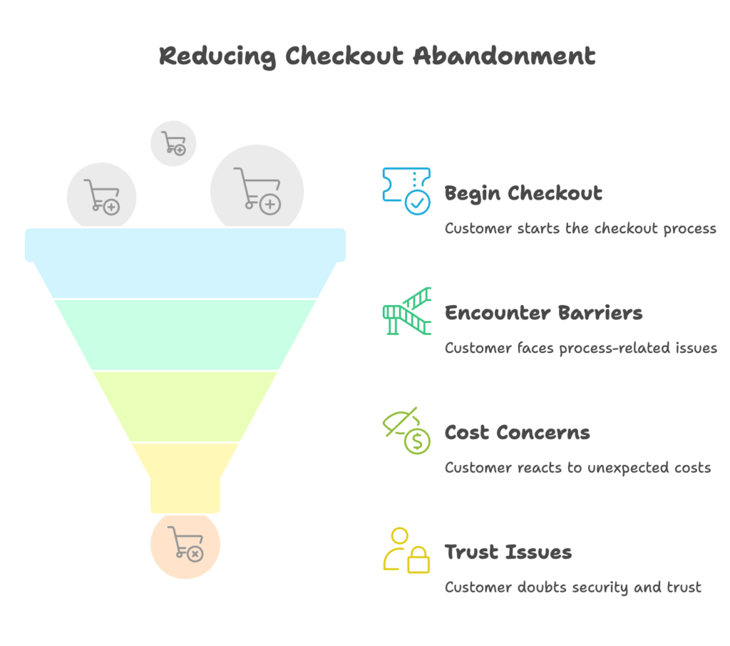
Cart abandonment happens for numerous reasons, but they generally fall into three main categories:
Process-Related Barriers
Sometimes, it’s the checkout process itself that drives customers away:
- Information overload: Requesting too much information creates friction. Each additional field increases the likelihood of abandonment.
- Confusing navigation: When customers can’t easily move forward or backward in the checkout process, frustration builds quickly.
- Forced account creation: Making customers create an account before purchasing is a notorious conversion killer. One study found that 34% of abandoned carts resulted from mandatory account creation.
I recently worked with a Shopify store that cut their abandonment rate by 28% simply by simplifying their checkout form from 12 fields to 6. Sometimes less really is more.
Cost-Related Barriers
Price sensitivity is a major factor in checkout abandonment:
- Surprise shipping costs: An alarming 55% of shoppers abandon carts due to unexpected shipping fees that appear during checkout.
- Missing discount options: Customers who can’t find where to enter coupon codes often abandon to search for promotions.
- Lack of price transparency: When the final price differs from what customers expected, trust erodes instantly.
Think about your own online shopping habits. How many times have you abandoned a purchase after seeing shipping costs that weren’t mentioned earlier? Your customers feel the same way.
Trust and Security Concerns
E-commerce requires trust—especially when asking for payment information:
- Payment security doubts: Without clear security indicators, customers may fear their financial data isn’t safe.
- Missing trust signals: Absence of familiar payment icons, security badges, or guarantees creates uncertainty.
- Insufficient information: Unclear return policies or delivery timelines make customers hesitate.
A Shopify merchant I consulted with added prominent security badges to their checkout and saw conversions increase by 15% overnight. Never underestimate the power of reassurance.
Measuring Checkout Performance
You can’t improve what you don’t measure. Before making checkout changes, establish your baseline performance metrics.
Key Metrics to Track
Focus on these crucial checkout metrics:
- Checkout abandonment rate: The percentage of customers who begin checkout but don’t complete it.
- Conversion rate by checkout step: Where specifically are customers dropping off? Is there a particular step causing friction?
- Time spent on checkout: Longer checkout times often indicate confusion or difficulty.
- Cart-to-complete ratio: What percentage of cart additions result in completed purchases?
Using Shopify Analytics for Checkout Insights
Shopify’s built-in analytics offer powerful visibility into your checkout process:
- Funnel visualization: See exactly where customers drop off in your checkout flow.
- Behavior patterns: Identify common actions taken before abandonment.
- Segmentation analysis: Break down performance by device, traffic source, or customer type to spot trends.
One particularly useful report is the checkout funnel analysis, which shows conversion rates between each step. If you notice a substantial drop between shipping and payment pages, that’s your first area to investigate.
Now that we understand why customers abandon checkouts and how to measure it, let’s explore the essential customizations that can transform your Shopify checkout experience.
Essential Shopify Checkout Customizations
Your checkout page is more than a transaction machine—it’s an extension of your brand and a critical touchpoint with customers.

Let’s look at the fundamental customizations every Shopify store owner should implement.
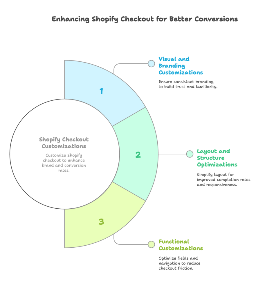
Visual and Branding Customizations
A checkout page that suddenly looks different from your store creates doubt and confusion. Consistent branding builds trust through familiarity.
Accessing Checkout Customization in Shopify
Finding checkout customization options is straightforward:
- Navigate to Online Store > Themes in your Shopify admin
- Click the Customize button on your active theme
- In the theme editor, go to Checkout section
While Shopify Plus merchants get access to checkout.liquid theme files for deep customization, all Shopify plans offer substantial visual customization options through this interface.
Key Visual Elements to Customize
Focus on these important visual elements:
- Logo and banner: Add your logo prominently to maintain brand recognition. Keep it appropriately sized—too large can be distracting.
- Color scheme: Match your checkout colors to your brand palette. Pay special attention to button colors, which should stand out clearly.
- Typography: Use fonts that reflect your brand personality while ensuring readability.
- Background elements: Consider adding subtle background patterns or images that align with your brand aesthetic.
I’ve seen conversion lifts of 5-8% just from aligning checkout visuals with store branding. It’s a small change with significant impact.
Optimizing Layout and Structure
The arrangement of elements on your checkout page dramatically affects completion rates:
- Form simplification: Label fields clearly and minimize the number of required inputs.
- Logical sequencing: Arrange information collection in a natural flow—personal details, then shipping, then payment.
- Responsive design: Ensure your checkout looks and functions perfectly on mobile devices, where over 60% of shopping now happens.
Remember that every field you add to checkout is another potential reason for customers to abandon. Ask yourself: “Is this information absolutely necessary for completing this transaction?”
Functional Customizations
Beyond aesthetics, functional improvements can dramatically impact checkout completion.
Checkout Field Optimization
Smart field management reduces friction:
- Label clarity: Use clear, concise field labels that leave no room for confusion.
- Field reduction: Remove unnecessary fields like “company name” for B2C purchases.
- Autofill enablement: Ensure your checkout accepts browser autofill to speed up information entry.
One particularly effective technique is combining the “First Name” and “Last Name” fields into a single “Full Name” field. This small change can increase completion rates by reducing the perceived form length.
Progress Indicators and Navigation
Customers want to know where they are in the checkout process:
- Clear progress bars: Show how many steps remain to completion.
- Step indicators: Label each checkout stage (Customer Information, Shipping, Payment).
- Intuitive navigation: Make it easy to move between steps without losing entered information.
Progress indicators do more than orient customers—they create a psychological commitment to complete the process. Once someone sees they’re “2/3 done,” they’re more likely to finish rather than abandon.
These essential customizations create the foundation for a high-converting checkout. But to truly maximize conversions, you’ll need to implement more advanced optimization strategies.
Advanced Shopify Checkout Optimization Strategies
Ready to take your checkout performance to the next level? These advanced strategies separate high-converting stores from average performers.

Let’s explore techniques that can dramatically improve your checkout completion rates.
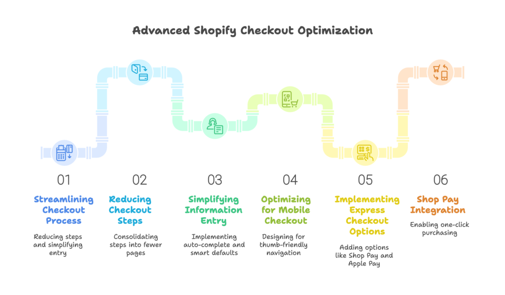
Streamlining the Checkout Process
When it comes to checkout, every extra second and every additional click increases abandonment risk. Streamlining is all about creating the shortest possible path to purchase.
Reducing Checkout Steps
Fewer steps mean fewer opportunities for abandonment:
- One-page checkout: Consolidate checkout into a single page where possible. This approach can increase conversions by up to 20%.
- Information grouping: Organize related information together to create logical sections rather than separate pages.
- Field elimination: Critically evaluate every field and remove any that aren’t absolutely necessary.
Amazon’s patent on “1-Click ordering” wasn’t valued at millions by accident. The fewer steps between desire and purchase, the higher your conversion rate will be.
Simplifying Information Entry
Make data input as effortless as possible:
- Address auto-complete: Implement Google Places API or similar services to auto-populate address fields as customers type.
- Smart defaults: Pre-select the most common options based on customer location (like country or shipping method).
- Real-time validation: Show field validation instantly rather than after form submission, allowing immediate correction.
I worked with a Shopify store that added address auto-complete and saw their checkout completion time decrease by 25%, with a corresponding 12% lift in conversion rate. Small conveniences make a big difference.
Optimizing for Mobile Checkout
With mobile commerce growing rapidly, mobile-specific optimization is crucial:
- Thumb-friendly design: Position buttons where they’re easily tapped with a thumb while holding a phone.
- Specialized input types: Use mobile-specific input types like tel for phone numbers and email for email addresses to trigger appropriate keyboards.
- Responsive testing: Test checkout flow on multiple devices to ensure consistent experience across screen sizes.
Mobile checkout abandonment is typically 10-15% higher than desktop. Closing this gap represents one of your biggest conversion opportunities.
Implementing Express Checkout Options
Express checkout options can dramatically increase conversion rates by reducing checkout friction to near-zero levels.
Shop Pay Integration
Shopify’s accelerated checkout solution offers compelling benefits:
- One-click purchasing: Returns customers can complete purchases with a single tap using stored information.
- Conversion boost: Shop Pay increases conversion by up to 50% compared to guest checkout.
- Performance advantage: Shop Pay outperforms other accelerated checkouts by at least 10% in completion rate.
Shop Pay also offers installment options in eligible countries, which can increase average order value by making higher-priced items more accessible.
Additional Express Payment Methods
Diversifying payment options removes barriers for different customer preferences:
- Apple Pay: Essential for iOS users, with conversion rates up to 2x higher than standard checkout.
- Google Pay: Serves Android users with similar convenience benefits.
- PayPal Express: Particularly valuable for customers concerned about sharing credit card details directly.
Each additional relevant payment method can increase your overall conversion rate by 3-5%. The key is offering options that align with your customer base’s preferences.
Guest Checkout Optimization
Don’t force account creation before purchase:
- Prominent guest option: Make guest checkout the default or highly visible option.
- Strategic information collection: Gather only essential information during guest checkout.
- Post-purchase account incentives: Offer benefits for creating an account after purchase completion.
A classic study by Baymard Institute found that 37% of customers abandoned checkouts that required account creation. Always remember: get the sale first, then build the relationship.
Now that we’ve streamlined the process, let’s focus on building trust throughout the checkout experience.
Trust-Building Elements for Checkout Success
Trust isn’t a nice-to-have in e-commerce—it’s essential. When asking customers to share their payment details, you must actively demonstrate that their information is safe and their purchase is protected.
Security and Trust Signals
Visible security elements reassure hesitant shoppers and reduce abandonment due to trust concerns.
Visible Security Indicators
Make security apparent throughout checkout:
- Security badges: Display recognized trust symbols like SSL certificates, PCI compliance, and secure checkout icons.
- Reassuring messaging: Include brief statements like “Your information is secure” near sensitive form fields.
- Encryption indicators: Show the padlock icon and https:// in checkout URLs, and consider highlighting these security features.
A study by Actual Insights found that 61% of customers have canceled a transaction because trust logos were missing. These visual cues matter tremendously.
Payment Method Trust Signals
Familiar payment options build confidence:
- Payment logos: Display recognizable credit card and payment method logos.
- Payment variety: Offer multiple trusted payment options to accommodate preferences.
- Security explanations: Briefly explain how payment information is protected.
I’ve seen checkout pages with clear “Secure Payment” sections outperform identical pages without such sections by 12-18%. This simple addition visibly reduces customer anxiety.
Customer Support During Checkout
When customers have questions during checkout, immediate answers can save the sale.
Live Chat Integration
Real-time support prevents abandonment due to uncertainty:
- Shopify Inbox integration: Implement Shopify’s messaging solution for seamless support.
- Automated responses: Set up canned answers for common checkout questions.
- Human escalation: Ensure complex issues can be quickly transferred to human agents.
Stores with live chat during checkout typically see 10-15% higher conversion rates. The mere presence of help creates confidence, even when customers don’t use it.
Helpful Information Placement
Strategic information positioning prevents abandonment due to unanswered questions:
- Contextual FAQs: Place relevant questions and answers near potential friction points (shipping options, return policy, etc.).
- Policy summaries: Include brief shipping and return policy information directly in checkout.
- Delivery expectations: Display estimated delivery dates to set clear expectations.
One particularly effective approach is adding expandable “What’s this?” links next to potentially confusing elements. This keeps the interface clean while providing information exactly where it’s needed.
With trust established, let’s tackle one of the biggest abandonment triggers: unexpected costs.
Reducing Cost-Related Abandonment
Price sensitivity is a reality in e-commerce. When shoppers encounter unexpected costs during checkout, many will abandon their carts instantly. Let’s explore strategies to prevent cost-related abandonment.
Shipping Cost Optimization
Shipping costs remain the #1 reason for cart abandonment. Managing these costs effectively is crucial for checkout success.
Strategic Free Shipping Offers
Free shipping can dramatically boost conversion rates:
- Threshold-based free shipping: Set minimum purchase amounts that qualify for free shipping. This technique increases average order value while reducing abandonment.
- Progress displays: Show customers how close they are to qualifying for free shipping. “Add $15 more to qualify for free shipping” prompts can increase cart value by 30% or more.
- Limited-time offers: Create urgency with temporary free shipping promotions during key selling periods.
The psychology behind free shipping is powerful. Many customers will add more products to their cart to reach a free shipping threshold, even if the additional cost exceeds what they would have paid for shipping.
Transparent Cost Display
Avoid surprise fees at all costs:
- Early cost disclosure: Show shipping costs and any additional fees early in the shopping process.
- All-inclusive pricing: Consider building shipping costs into product prices when possible.
- Pre-checkout calculators: Implement shipping cost calculators on product or cart pages before checkout begins.
I worked with a skincare brand that added a shipping cost calculator to their cart page and saw checkout abandonment drop by 23%. Customers aren’t necessarily opposed to paying for shipping—they just hate surprises.
Incentives and Promotions
Strategic incentives can overcome price sensitivity and create purchase urgency.
Strategic Discount Implementation
Well-timed discounts boost conversion:
- First-purchase offers: Provide special discounts for first-time buyers to overcome initial purchase hesitation.
- Abandonment recovery: Send targeted discount codes to customers who begin checkout but don’t complete it.
- Urgency creation: Use limited-time checkout offers with countdowns to prompt immediate action.
A well-executed abandonment recovery email with a modest discount can recover up to 15% of otherwise lost sales. That’s revenue that would have completely disappeared otherwise.
Flexible Payment Options
Payment flexibility reduces financial barriers:
- Buy Now, Pay Later: Integrate services like Affirm, Klarna, or Afterpay to allow installment payments.
- Early visibility: Highlight payment flexibility on product pages, not just at checkout.
- Multiple providers: Offer various financing options to accommodate different customer preferences.
BNPL options can increase conversion rates by 20-30% for higher-priced items. They’re particularly effective with millennial and Gen Z shoppers, who often prefer these options to traditional credit cards.
With cost barriers addressed, let’s look at how to continuously improve your checkout performance over time.
Post-Implementation Optimization and Testing
Checkout optimization isn’t a one-time task—it’s an ongoing process of testing, learning, and refining. Let’s explore how to systematically improve your checkout experience over time.
A/B Testing Checkout Elements
Controlled testing is the only reliable way to determine which changes truly improve conversion rates.
Systematic Testing Approach
Follow these testing best practices:
- Single-variable testing: Change only one element at a time to clearly identify what impacts performance.
- Prioritization: Test high-impact elements first—typically buttons, form fields, and trust signals have the largest effects.
- Clear metrics: Define specific, measurable success metrics before starting tests (conversion rate, abandonment rate, average order value).
While multivariate testing can be tempting, most Shopify stores don’t have enough checkout volume to get statistically significant results. Simple A/B tests with focused changes typically yield more actionable insights.
Key Elements to Test
Focus your testing efforts on these high-impact elements:
- Button design: Test colors, sizes, placement, and text of the primary action buttons.
- Form configuration: Experiment with field order, grouping, and label text.
- Express checkout: Test different placements and designs of express payment options.
- Trust signals: Try various security badges, customer testimonials, and guarantee placements.
Even small tweaks can yield surprising results. I’ve seen changing button text from “Complete Order” to “Place Order Now” increase conversions by 8%. Never assume you know what will work best—test it.
Continuous Improvement Strategy
Checkout optimization is never truly “done.” Establish systems for ongoing improvement.
Data-Driven Optimization
Let data guide your optimization efforts:
- Regular funnel analysis: Review checkout funnel metrics monthly to identify emerging issues.
- Abandonment pattern monitoring: Look for patterns in when and where customers leave checkout.
- Industry benchmarking: Compare your metrics against industry standards to identify underperforming areas.
One effective technique is recording and reviewing actual customer checkout sessions using tools like Hotjar. These recordings reveal friction points that analytics alone might miss.
Staying Current with Shopify Updates
Shopify continuously evolves its checkout capabilities:
- Feature adoption: Implement new checkout features as Shopify releases them.
- Customer expectation adjustment: Update your checkout experience to match changing consumer preferences and expectations.
- Competitive awareness: Regularly review competitor checkout experiences to identify innovations worth adopting.
The e-commerce landscape changes rapidly. A checkout experience that was optimal six months ago may be outdated today. Schedule quarterly checkout reviews to ensure you’re leveraging the latest best practices and capabilities.
Conclusion
Optimizing your Shopify checkout isn’t just about reducing friction—it’s about transforming the final step in your customer’s journey from a potential abandonment point into a seamless, trust-building experience that boosts your bottom line.
We’ve covered a comprehensive approach to checkout optimization, from understanding abandonment causes to implementing advanced strategies that maximize conversions. By applying these principles to your Shopify store, you can significantly reduce abandonment rates and increase sales without necessarily needing more traffic.
Remember that checkout optimization is both an art and a science. The technical aspects—streamlining forms, adding payment options, improving load times—matter tremendously. But equally important is the psychology of trust, clarity, and confidence that permeates every element of your checkout experience.
The most successful Shopify merchants view checkout not as a mere transaction mechanism but as a critical extension of their brand experience. When you optimize checkout with the same care you apply to product photography or store design, you create a complete customer journey that converts browsers into buyers and first-time customers into loyal fans.
Begin with the fundamentals: brand your checkout consistently, simplify the process, build trust, and be transparent about costs. Then test, refine, and continuously improve based on data and customer feedback. Your checkout experience will never be “perfect”—but with persistent optimization, it can become a powerful competitive advantage for your Shopify store.
References
- Shopify Enterprise. (2024, February 29). How to Optimize Checkout Page Design. Shopify. https://www.shopify.com/enterprise/blog/checkout-page-design
- Aureate Labs. (2025, February 14). Shopify One Page Checkout Optimization To Skyrocket Your Sales. https://aureatelabs.com/blog/shopify-one-page-checkout/
- Lifesight. (2024, November 20). 14 Proven Strategies To Optimize Your Ecommerce Shopify Page Checkout. https://lifesight.io/blog/strategies-to-optimize-shopify-page-checkout/
- Shopify Blog. (2023, August 10). Ecommerce Checkout Best Practices: 11 Tips for Success. https://www.shopify.com/blog/ecommerce-checkout
- Digital Silk. (2024, April 15). Shopify Checkout: How To Customize & Optimize For More Sales. https://www.digitalsilk.com/digital-trends/shopify-checkout/
Ready to supercharge your Shopify store’s sales with perfectly optimized discount codes? Growth Suite is a Shopify app that helps you create and run effective on-site discount campaigns using AI-driven insights. Growth Suite analyzes visitor behavior to deliver personalized offers at the exact right moment, significantly boosting your conversion rates. The app even auto-applies discount codes and creates natural urgency with countdown timers. Install Growth Suite with a single click today and transform your checkout experience!
Don’t forget to check other articles;
Conversion Rate Optimization for Shopify Stores
Streamlining Your Shopify Checkout Process: Step-by-Step Guide
Checkout Page Design: Best Practices for Shopify Store Owners
Payment Gateway Optimization: Selecting and Arranging Options for Maximum Conversion
Trust Signals in Checkout: Reducing Anxiety and Boosting Conversions
Express Checkout Solutions for Shopify: Implementation and Impact


[…] Shopify Checkout Optimization […]
[…] Shopify Checkout Optimization […]
[…] Shopify Checkout Optimization […]
[…] Shopify Checkout Optimization […]