
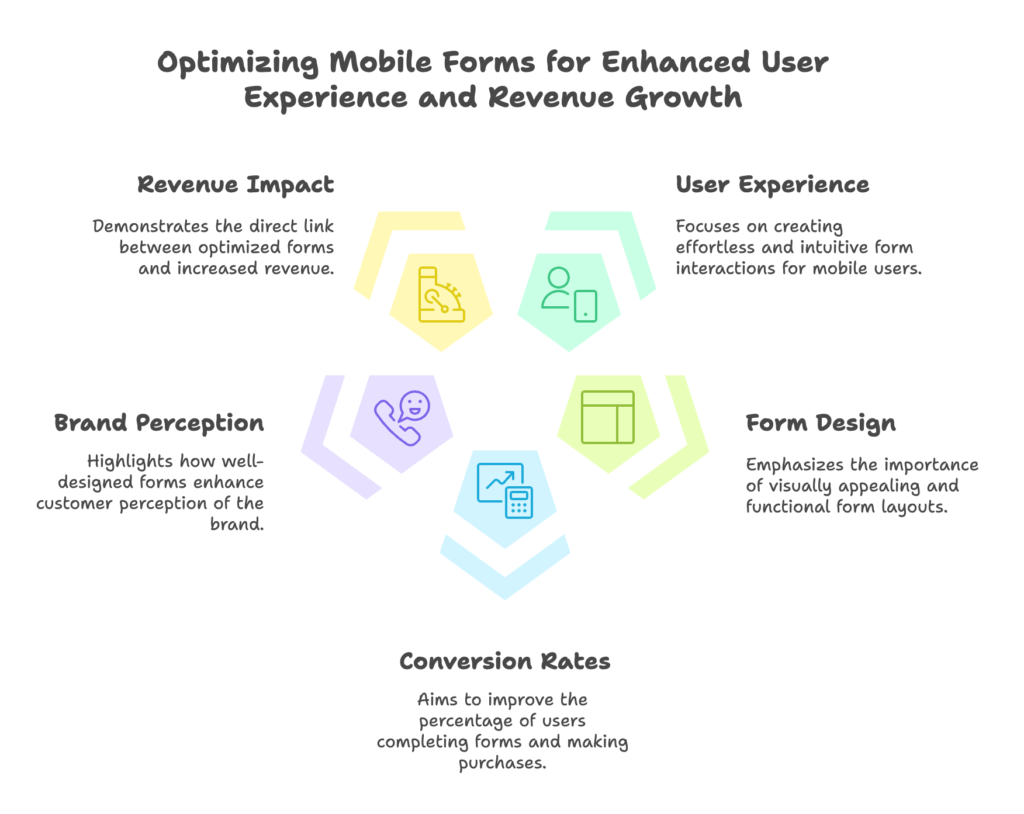
The Importance of Mobile Form Optimization
Your potential customers are scrolling through your Shopify store right now—on their phones. They’re adding products to their cart, exploring your collections, and getting ready to convert. But then, they hit your checkout form. The fields are tiny, the keyboard covers half the screen, and suddenly, they’re frustrated. Click. They’re gone.
Mobile shopping has transformed from a convenience to a necessity. With over 72% of e-commerce traffic now coming from mobile devices, your forms aren’t just a detail—they’re the gateway to your revenue. Yet many Shopify store owners still treat mobile forms as an afterthought, watching conversion rates suffer silently.
The difference between an optimized mobile form and a clunky one? It could be thousands in monthly revenue. A well-designed form creates a frictionless path to purchase, quietly encouraging customers to complete their journey instead of abandoning it midway.
In this guide, you’ll discover practical strategies to optimize your Shopify store’s mobile forms—from simplifying designs and leveraging auto-fill features to implementing real-time validation. I’ll walk you through the process step by step, focusing on actionable techniques you can implement today to see results tomorrow.
I. Understanding Mobile Form Optimization
A. What is Mobile Form Optimization?
Mobile form optimization is the art and science of designing form experiences that feel effortless on smartphones and tablets. It’s about removing friction points that cause customers to abandon their journey. Think about it: on desktop, you have the luxury of space and precision. On mobile, you’re working with limited screen real estate and users who are often multitasking or on the go.
Forms represent critical touchpoints throughout your customer’s journey. They collect vital information, facilitate transactions, and drive engagement. Yet they’re also where many customers experience the most frustration. Each required field, each tap, each keyboard shift becomes a potential exit point.
Mobile users face unique challenges when completing forms. Typing is slower and more error-prone on touchscreens. Input fields can be difficult to tap accurately. Keyboards take up precious screen space. And let’s be honest—nobody enjoys filling out forms on their phone. Your job is to make this necessary evil as painless as possible.
B. The Role of Forms in Shopify Stores
Shopify stores rely on various forms throughout the customer journey. Each serves a different purpose but shares the same vulnerability to abandonment if poorly designed:
- Checkout forms: The final hurdle between browsing and buying
- Lead generation forms: Capturing visitor information for future marketing
- Contact forms: Enabling customer inquiries and support requests
- Subscription forms: Building your email list for ongoing engagement
The impact of well-designed forms extends beyond immediate conversions. When customers can easily complete a newsletter signup, they’re more likely to return. When checkout feels seamless, they’re more likely to recommend your store. Every form interaction shapes their perception of your brand’s attention to detail and customer experience.
A study by the Baymard Institute found that 18% of US online shoppers abandoned an order in the past quarter due to a “too long/complicated checkout process.” That’s not just a usability statistic—it’s lost revenue walking out your digital door.
II. Key Strategies for Mobile Form Optimization
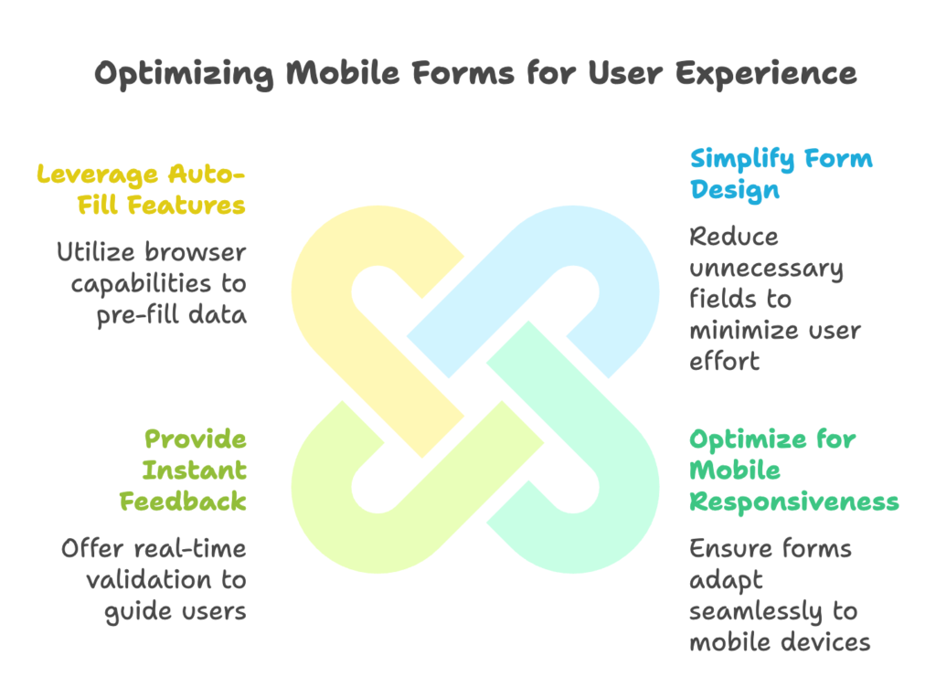
A. Simplify Form Design
The first rule of mobile form optimization is brutally simple: ask for less. Every field you add creates another opportunity for users to reconsider their decision. Do you really need their phone number right now? Could you collect their address after they’ve committed to the purchase?
Start by conducting a form audit. Go through each field and ask: “Is this absolutely necessary at this stage?” If not, remove it or make it optional. Essential information varies by context. For a newsletter signup, you might only need an email address. For shipping, perhaps just the ZIP code initially—you can request the full address later in the process.
Consider this approach: Instead of asking for a full address during account creation, collect just the ZIP code and email. Once the user places an order, then request shipping details. This staged approach reduces initial friction while still gathering necessary information when it becomes relevant.
Single-column layouts are non-negotiable for mobile forms. Multiple columns force mobile users to zoom and scroll horizontally—a recipe for frustration. A single column creates a clear, linear path that’s easy to follow on small screens. Your forms should flow naturally from top to bottom, with each field leading logically to the next.
B. Optimize for Mobile Responsiveness
Responsive design isn’t just about making your form fit on a small screen—it’s about making it feel native to the device. Input fields should be large enough (at least 48×48 pixels, according to Google’s guidelines) to tap accurately without zooming. Buttons should be prominent and easy to press with a thumb.
Test your forms across multiple devices—not just different screen sizes but different operating systems too. An input field that works perfectly on iOS might behave differently on Android. Pay special attention to form behavior when the keyboard appears and disappears. Does your form adjust correctly, or does it push important elements off-screen?
Use appropriate input types to trigger helpful keyboard layouts. For email fields, use type="email" to bring up a keyboard with the @ symbol. For phone numbers, use type="tel" to display a numeric keypad. These small touches significantly reduce input friction by presenting users with the right tools for each task.
Consider this example: A customer trying to enter their credit card details. With the right input type, they’ll see a numeric keyboard. Without it, they’ll need to switch keyboard modes repeatedly—adding unnecessary steps and increasing the likelihood of abandonment.
C. Provide Instant Feedback
Nothing frustrates users more than submitting a form only to discover errors they need to fix. Real-time validation catches mistakes as they happen, allowing immediate correction without the frustration of a full form reload.
Implement validation that guides rather than scolds. Instead of just highlighting errors in red after submission, provide helpful suggestions as users type. If a password needs special characters, show a strength indicator that updates in real-time. If an email address is missing the @ symbol, point this out gently before the user moves to the next field.
Visual cues help users understand what’s happening. Use clear symbols like checkmarks for valid inputs and explanatory error messages for invalid ones. Make sure these indicators are visible on mobile screens without requiring scrolling to see the feedback.
Here’s a practical example: When a customer enters their email in your newsletter signup, the field could show a subtle green outline as soon as they’ve entered a valid format. This instant positive feedback reassures them they’re on the right track before they even hit submit.
D. Leverage Auto-Fill Features
Modern browsers and devices offer powerful auto-fill capabilities—use them! Properly marked-up forms can pull saved information like names, addresses, and payment details, significantly reducing the typing burden on mobile users.
Implement proper form field attributes like autocomplete="name" or autocomplete="email" to help browsers identify fields correctly. For addresses, use specific attributes like autocomplete="address-line1" and autocomplete="postal-code" to enable precise auto-filling.
Predictive text suggestions can further streamline the input process. For example, as a user types “cal” in a state field, suggesting “California” saves them from typing the remaining characters. Similarly, implementing address validation can suggest complete addresses based on partial information, turning a multi-field task into just a few taps.
III. Advanced Techniques for Mobile Form Optimization
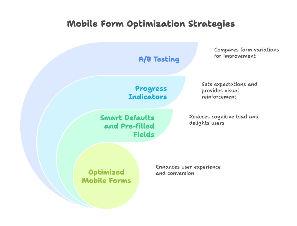
A. A/B Testing for Continuous Improvement
Even the most thoughtfully designed forms benefit from testing against alternatives. A/B testing allows you to compare different form variations to see which performs better with real users. Small tweaks can yield surprising results.
What elements should you test? Start with high-impact components like:
- Button text and colors (Does “Complete Purchase” outperform “Buy Now”?)
- Form length (Does splitting a long form into multiple steps improve completion rates?)
- Field order (Does asking for payment information before shipping details affect conversion?)
- Error message phrasing (Do supportive messages perform better than technical ones?)
Shopify’s native analytics combined with tools like Google Optimize can help you set up these tests. Focus on measuring completion rates, time spent on form, and field-specific drop-offs to identify your form’s weak points.
Remember that testing isn’t a one-and-done exercise. Customer expectations evolve, and what worked six months ago might not perform as well today. Schedule regular testing cycles to continuously refine your forms.
B. Use Progress Indicators for Longer Forms
When forms must span multiple steps, progress indicators become essential psychological tools. They answer the user’s subconscious question: “How much more effort do I need to invest before I’m done?”
Progress bars or step indicators (like “Step 2 of 4”) set clear expectations and create a sense of accomplishment as users advance. This reduces the perceived effort and makes longer forms feel more manageable.
Strategic placement of progress indicators matters. They should be visible without scrolling, typically at the top of the form. Each completed step should be clearly marked, providing visual reinforcement of progress already made.
For checkout forms specifically, consider using descriptive labels for each step (like “Shipping” → “Payment” → “Review”) rather than generic numbering. This helps users understand not just how far they’ve come, but what information they’ll need to provide next.
C. Smart Defaults and Pre-filled Fields
Smart defaults reduce the cognitive load on your customers by making reasonable assumptions about their preferences. For shipping options, pre-select the most commonly chosen method. For country selection, default to the user’s likely location based on their IP address.
For returning customers, pre-fill information they’ve previously provided. This feels like magic to users—they expect to re-enter their details, but instead find the form already knows them. This creates both delight and efficiency.
A word of caution: Always make pre-filled information editable and clearly visible. Customers should be able to verify and modify any defaults you’ve selected for them. Transparency builds trust, especially when handling sensitive information like addresses and payment details.
IV. Tools and Technologies for Shopify Form Optimization
A. Shopify-Specific Apps
Shopify’s app ecosystem offers specialized tools designed specifically for form optimization:
- Shopify Forms: Create customized contact forms, surveys, and lead generation forms with mobile-optimized templates
- Form Builder: Drag-and-drop interface for creating responsive forms with conditional logic
- PageFly: Advanced page builder with form elements specifically designed for mobile conversion
- Checkout Booster: Optimizes the checkout form experience with features like auto-complete and instant validation
Beyond form-building tools, analytics platforms help you understand how users interact with your forms. Google Analytics can track form abandonment rates and identify which fields cause the most drop-offs. Hotjar provides heat maps and session recordings to visualize exactly how users navigate your forms on mobile devices.
Most of these tools offer free trials or tiered pricing based on your store’s size and needs. Start with basic analytics to identify your biggest form issues, then invest in specialized tools to address those specific challenges.
B. Third-Party Integration Options
For more advanced form functionality, several third-party services integrate seamlessly with Shopify:
- Typeform: Creates conversational forms that feel more engaging than traditional inputs
- Praella: Provides user experience solutions specifically designed for Shopify stores, including form optimization
- Klaviyo: Offers sophisticated email signup forms with targeting and personalization options
- AddressComplete: Address verification that reduces typing by suggesting complete addresses from partial inputs
These integrations typically require a bit more technical setup than native Shopify apps, but they offer more specialized functionality for stores with specific needs. For example, if international shipping is a major part of your business, an address verification service can dramatically reduce input errors and customer frustration.
V. Common Mistakes to Avoid in Mobile Form Optimization
A. Overcomplicating Forms
The most common form mistake is simply asking for too much. Every field should earn its place in your form by serving a clear, immediate purpose. “Nice to have” information should be either eliminated or made explicitly optional.
Unclear instructions compound the problem of complex forms. Vague labels like “Address 1” and “Address 2” make users hesitate. What goes where? Be explicit: “Street Address” and “Apartment/Suite/Unit” leave no room for confusion.
Watch out for these red flags that indicate your forms may be overcomplicated:
- More than 7-8 fields for checkout forms
- Multiple required fields for email signups (an email address should be sufficient)
- Forcing account creation before purchase
- Requiring information that doesn’t seem relevant to the immediate transaction
Remember: Every field you remove not only improves completion rates but also reduces data maintenance costs and potential privacy concerns.
B. Ignoring Mobile Testing
Forms that look perfect on your desktop monitor can be unusable on mobile devices. Yet many store owners never experience their checkout process on a smartphone. This disconnect leads to optimizations that miss the mark for most of your customers.
Failure to test across different devices compounds this problem. An form that works beautifully on your iPhone might be broken on Android devices, or vice versa. Screen sizes, operating systems, and browsers all affect how your forms render and function.
The solution? Regular, systematic mobile testing. At minimum:
- Test on both iOS and Android devices
- Test on at least one small screen (phone) and one larger screen (tablet)
- Test with different connection speeds (including slower connections)
- Have someone else test your forms (you’re too familiar with them to notice certain issues)
Create a checklist of test scenarios: new customers vs. returning ones, different payment methods, various shipping options, etc. This structured approach ensures you’re not missing critical use cases.
VI. Practical Implementation Steps for Shopify Store Owners
A. Step-by-Step Guide to Optimizing Mobile Forms
Ready to improve your mobile forms? Here’s a practical roadmap:
- Audit Your Current Forms
- Complete each form on a mobile device as if you were a customer
- Note pain points: small fields, confusing labels, excessive scrolling
- Identify fields that could be eliminated or made optional
- Check completion times—forms should take under 3 minutes to complete
- Apply Simplification Techniques
- Reduce field count to absolute essentials
- Reorganize remaining fields in a logical sequence
- Convert multi-column layouts to single-column
- Increase touch target sizes (fields and buttons)
- Implement Technical Optimizations
- Add appropriate input types for all fields
- Implement autocomplete attributes
- Set up real-time validation with clear error messages
- Enable keyboard navigation between fields
- Test and Refine
- Test forms across multiple devices and browsers
- Set up analytics to track completion rates and drop-off points
- Implement A/B testing for key forms
- Collect and incorporate user feedback
For Shopify-specific implementation, take advantage of the platform’s built-in tools. The checkout settings in your Shopify admin allow you to customize certain aspects of the checkout form. For more extensive modifications, consider using Shopify Plus (which offers checkout customization) or specialized apps from the Shopify App Store.
Remember that form optimization is iterative. Start with the highest-impact changes—typically simplification and responsiveness—and then refine based on user data and feedback. Even small improvements can yield significant conversion gains when applied to high-traffic forms like checkout.
Conclusion: Next Steps for Shopify Store Owners
Mobile form optimization isn’t a one-time task—it’s an ongoing process of refinement. The strategies we’ve covered—simplifying designs, ensuring mobile responsiveness, providing instant feedback, and leveraging auto-fill features—provide a strong foundation for improving your Shopify store’s conversion rates.
The most important step is to start. Choose one form on your site—ideally your checkout or email signup—and apply these principles today. The improvement in user experience will translate directly to your bottom line through higher completion rates and increased customer satisfaction.
As mobile technology and user expectations evolve, continue testing and refining your forms. What works today might need adjustment tomorrow. Stay curious, keep measuring, and never stop asking: “How can I make this easier for my customers?”
Remember: In mobile commerce, the smallest details often make the biggest difference. Your commitment to optimizing these crucial touchpoints distinguishes your store from competitors who treat mobile as an afterthought. Your customers will reward you not just with conversions, but with loyalty and recommendations.
References
- Shopify Blog: “CRO for Mobile: How to Boost Mobile Conversions” (2024). Retrieved from [Shopify.com].
- Praella Blog: “Mastering Shopify Form Optimization: Enhance Your Conversion Rates” (2024). Retrieved from [Praella.com].
- TinyIMG Blog: “Optimize Shopify for Mobile: Best Practices and Tips” (2023). Retrieved from [TinyIMG.com].
- SimiCart Blog: “Shopify Mobile Optimization Guide: Speed, Design, SEO…” (2025). Retrieved from [SimiCart.com].
- WiserNotify Blog: “10 Shopify Mobile Optimization Tips to Boost Store Speed” (2025). Retrieved from [WiserNotify.com].
Ready to supercharge your Shopify store’s sales with perfectly optimized forms and discount codes? Growth Suite is a Shopify app that helps you do just that. Using powerful AI-driven campaigns, Growth Suite creates personalized, limited-time offers that encourage customers to complete their purchases. It analyzes visitor behavior to present offers at the perfect moment, significantly reducing form abandonment and boosting conversions. Install it with a single click and start seeing results today!