Your customers are shopping with their thumbs. Right now, someone is scrolling through your Shopify store on a crowded bus, while waiting in line for coffee, or lounging on their couch. And if they can’t easily navigate your store with a single thumb? They’re gone.
Mobile commerce isn’t just growing—it’s dominating. In 2024, mobile accounts for over 72% of all e-commerce traffic, yet many Shopify stores still treat mobile optimization as an afterthought. This disconnect creates a massive opportunity for store owners willing to prioritize touch-friendly design.
Think about the last time you abandoned a mobile purchase. Was it because you accidentally tapped the wrong tiny button? Or because you couldn’t find the search function? These seemingly small frustrations cost Shopify store owners millions in lost revenue every year.
This guide will walk you through transforming your Shopify store’s navigation into a smooth, thumb-friendly experience that converts mobile browsers into buyers. You’ll learn practical techniques to implement large touch targets, create intuitive menus, and leverage Shopify’s built-in features for mobile optimization. By the end, you’ll have a clear roadmap for creating a mobile navigation system that feels invisible to users—because the best mobile experiences are the ones customers don’t even notice.
I. Understanding Touch-Friendly Design Principles
Before diving into technical implementations, let’s understand what makes mobile navigation work for human thumbs and attention spans.
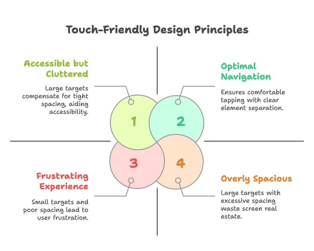
Touch-friendly design isn’t just about making things bigger—it’s about creating interfaces that feel natural and intuitive on small, touch-based screens.
A. Key Features of Touch-Friendly Design
Large Touch Targets
Have you ever tried to tap a tiny link on your phone, only to hit something else entirely? That frustration drives customers away. The average adult fingertip is about 10mm wide, translating to roughly 44-48 pixels on most devices. But that doesn’t mean a 48px button is sufficient.
Apple recommends touch targets of at least 44×44 points, while Google suggests 48x48dp. In practice, I recommend going even larger for primary navigation elements—at least 60×60 pixels for main menu items. This size ensures users can comfortably tap without precision or frustration.
Implementing larger touch targets in Shopify is straightforward. Using your theme’s editor:
- Navigate to your theme customization panel
- Look for “Header” or “Navigation” settings
- Adjust button sizes and padding for mobile view
- If your theme doesn’t offer these options, you may need to edit the CSS (we’ll cover this later)
Remember that making buttons larger isn’t just about accessibility—it communicates importance. Your “Add to Cart” button should be unmistakably tappable, while secondary functions can be slightly smaller.
Spacing Between Elements
Even perfectly sized buttons cause frustration when packed too closely together. The space between elements (padding) is just as important as the elements themselves.
A good rule of thumb: allow at least 8px of space between any tappable elements on mobile. For primary navigation items, I recommend 12-16px spacing to prevent accidental taps.
To implement proper spacing in Shopify:
- Access your theme’s CSS file (in most cases, this will be in base.css or theme.scss)
- Look for mobile-specific media queries (usually starting with
@media (max-width: 768px)) - Add or modify padding properties for navigation elements
For example, this CSS snippet increases spacing between mobile menu items:
@media (max-width: 768px) {
  .navigation__item {
    padding: 16px 0;
    margin-bottom: 8px;
  }
}
The right spacing creates a rhythm that guides users through your navigation naturally, reducing cognitive load and making your store feel more premium.
B. Mobile-First Design Approach
Why Mobile-First Matters
Mobile-first isn’t just a design philosophy—it’s a business strategy. When you design for the smallest screen first, you’re forced to prioritize what truly matters. What’s the single most important action you want customers to take? On mobile, that clarity is essential.
Google’s mobile-first indexing means your store’s mobile experience now determines your search ranking more than your desktop version. A clunky mobile navigation doesn’t just frustrate users—it actively harms your visibility.
Implementing mobile-first design in Shopify starts with theme selection. Look specifically for themes that advertise being “built mobile-first” rather than just “responsive.” The difference is subtle but important:
- Responsive themes adapt desktop designs to fit mobile screens (often imperfectly)
- Mobile-first themes start with the mobile experience and expand for larger screens
Popular mobile-first Shopify themes include Dawn (Shopify’s own default theme), Prestige, Impulse, and Expanse. When evaluating themes, always preview the mobile view first before checking desktop.
Vertical Layouts
Mobile users scroll vertically with ease—it’s the most natural touch gesture. Horizontal scrolling, by contrast, feels awkward and is easily missed. This is why vertical layouts dominate mobile design.
For Shopify navigation, this means:
- Use single-column layouts for mobile menus
- Transform horizontal desktop navigation into vertical stacked menus on mobile
- Embrace scrolling—don’t try to fit everything “above the fold”
The most effective implementation is a sticky header with a hamburger menu that expands into a full-height vertical menu. This approach maintains navigational context while maximizing screen space for content.
To enhance your vertical layouts:
- Use “progressive disclosure”—reveal submenu items only when needed
- Group related items visually with subtle spacing or dividers
- Keep primary navigation visible while hiding secondary options in expandable sections
Remember that customers don’t mind scrolling, but they do mind hunting for navigation. Make your primary menu always accessible, and let content flow naturally down the page.
II. Optimizing Shopify Navigation for Mobile Users
With our foundational principles established, let’s explore how to apply them specifically to Shopify store navigation.
The goal is to create intuitive pathways that guide mobile users through your product catalog effortlessly.
A. Simplifying the Navigation Menu
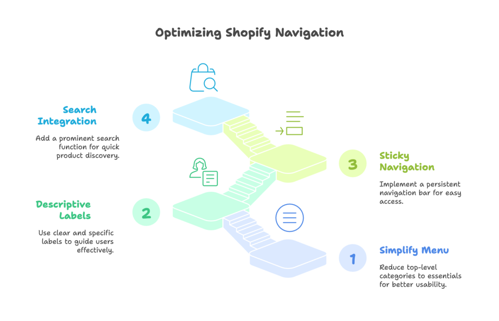
Concise Menus
Mobile screens demand ruthless prioritization. Every item in your main navigation should earn its place by directly contributing to sales or customer understanding.
The magic number for top-level mobile navigation is 3-5 items. Beyond that, cognitive load increases and usability decreases. This often requires tough decisions about what makes the cut.
To simplify your Shopify navigation:
- Go to Online Store → Navigation in your Shopify admin
- Edit your Main Menu
- Limit top-level categories to your absolute essentials (Collections, Products, Search, Account)
- Move secondary items (About, Blog, Contact) to a footer menu or submenu
Take ASOS as an example—their mobile navigation features just four primary categories, despite having thousands of products. They rely on strong categorization and search rather than overwhelming users with options.
If you have a complex product catalog, use dropdown menus to organize subcategories. This maintains simplicity while providing access to your full inventory. In your Shopify navigation editor, you can easily drag menu items to nest them under parent categories.
Descriptive Labels
Clarity trumps cleverness in mobile navigation. Users should never wonder what’s behind a menu item.
Avoid:
- “Shop” (too vague—shop what?)
- “Discover” (mysterious but unhelpful)
- Internal language that doesn’t match how customers think
Instead, use:
- “Men’s Jackets” (specific product category)
- “Summer Collection” (clear seasonal offering)
- “How To Choose” (explicit help purpose)
To implement in Shopify:
- Edit your navigation menus in the Shopify admin
- Review each label from a new customer’s perspective
- Update vague labels with specific, action-oriented alternatives
- Test with someone unfamiliar with your products to verify clarity
Remember that on mobile, users often can’t see visual cues or hover states that might clarify ambiguous labels. Each word must stand on its own merit.
B. Enhancing Accessibility
Sticky Navigation Bars
Mobile users scroll rapidly and can easily lose their navigational context. A sticky navigation bar—one that remains visible as users scroll down—solves this problem elegantly.
The best sticky navigations on mobile include:
- Your logo (tappable to return home)
- A hamburger menu icon
- Search icon
- Cart icon with item count
These four elements cover the core navigation needs while maintaining a clean interface. To implement this in Shopify:
- Check if your theme already supports sticky navigation (many modern themes do)
- If not, you’ll need to add some custom code to your theme.liquid file:
<script>
  window.onscroll = function() {stickyNav()};

  var header = document.getElementById("shopify-section-header");
  var sticky = header.offsetTop;

  function stickyNav() {
    if (window.pageYOffset > sticky) {
      header.classList.add("sticky");
    } else {
      header.classList.remove("sticky");
    }
  }
</script>
You’ll also need to add corresponding CSS:
.sticky {
  position: fixed;
  top: 0;
  width: 100%;
  z-index: 1000;
  background: white; /* Match your theme's background */
  box-shadow: 0 2px 4px rgba(0,0,0,0.1);
  transition: all 0.3s ease;
}
The key is to keep your sticky header minimal on mobile—every pixel of vertical space is valuable. Consider shrinking your logo on scroll to maximize content visibility.
Search Bar Integration
Search is often the fastest path to purchase for mobile users. Think about it: typing what you want is much easier than navigating through multiple category levels with your thumb.
For Shopify stores with more than 20 products, a prominent search function is non-negotiable. The best implementations:
- Use a clear search icon in the sticky header
- Expand to full-width search on tap
- Offer predictive search results as the user types
- Include images in search results for faster recognition
To optimize your Shopify search for mobile:
- Ensure predictive search is enabled in your theme settings
- Customize the search results to show images and prices
- Consider adding popular search terms as suggestions
- Test your search with common misspellings to ensure it still works
Many Shopify themes hide the search bar behind an icon on mobile. If your theme does this, make sure the icon is at least 44×44 pixels and has adequate spacing from other elements.
III. Advanced Techniques for Mobile Navigation Optimization
Ready to take your mobile navigation from functional to exceptional? These advanced techniques will help your store stand out from the competition and provide a truly seamless experience for power shoppers.
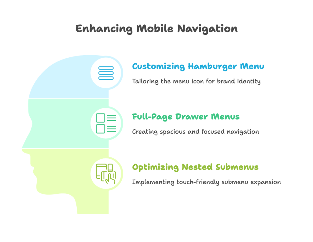
A. Customizing the Hamburger Menu
Icon Design
The hamburger menu icon (☰) has become universally recognized, but that doesn’t mean yours has to look generic. A subtle customization can reinforce your brand while maintaining usability.
Consider these creative approaches:
- Using your brand colors for the hamburger icon
- Slightly altering the shape to match your brand aesthetic (rounded corners for playful brands, sharp angles for premium ones)
- Adding a subtle animation when tapped
To customize your hamburger icon in Shopify:
- Locate the icon-hamburger.liquid snippet in your theme files
- Replace the default SVG with your custom design (maintaining the same dimensions)
- Add CSS transitions for smooth animations
For example, this code creates a smooth transition between hamburger and X icons:
.menu-icon {
  position: relative;
  width: 24px;
  height: 18px;
  cursor: pointer;
}

.menu-icon span {
  position: absolute;
  width: 100%;
  height: 2px;
  background-color: #333;
  transition: all 0.3s ease;
}

.menu-icon span:nth-child(1) { top: 0; }
.menu-icon span:nth-child(2) { top: 8px; }
.menu-icon span:nth-child(3) { top: 16px; }

.menu-open .menu-icon span:nth-child(1) {
  transform: rotate(45deg);
  top: 8px;
}

.menu-open .menu-icon span:nth-child(2) {
  opacity: 0;
}

.menu-open .menu-icon span:nth-child(3) {
  transform: rotate(-45deg);
  top: 8px;
}
Remember that any customization should enhance—not hinder—usability. Users should still immediately recognize the icon’s function.
Full-Page Drawer Menus
Standard dropdown menus can feel cramped on mobile. A full-page drawer menu provides ample space for navigation while creating a focused, distraction-free interface.
The most effective drawer menus include:
- Full-screen coverage (no distracting background content)
- Large, well-spaced tap targets
- Clear visual hierarchy between main and sub-categories
- Extra functionality like account access, currency selection, or language options
To implement a full-page drawer in Shopify:
- In your theme’s style.scss or custom CSS file, add styles for your mobile menu:
.mobile-nav-wrapper {
  position: fixed;
  top: 0;
  left: 0;
  right: 0;
  bottom: 0;
  background-color: white;
  z-index: 1000;
  transform: translateX(-100%);
  transition: transform 0.3s ease;
  overflow-y: auto;
  padding: 20px;
}

.mobile-nav-open .mobile-nav-wrapper {
  transform: translateX(0);
}

.mobile-nav__item {
  padding: 15px 0;
  border-bottom: 1px solid #f4f4f4;
}

.mobile-nav__link {
  font-size: 18px;
  display: block;
  width: 100%;
}
This creates a slide-in drawer that occupies the full screen, providing ample space for navigation items. The transition property creates a smooth animation effect that enhances the perceived quality of your store.
B. Optimizing Nested Submenus
Automatic Expansion
Traditional hover-based dropdowns don’t work on touchscreens. For complex category structures, you need a touch-optimized approach to nested navigation.
The most user-friendly method is the “accordion” pattern:
- Main categories are always visible
- Tapping a parent category with children expands to show subcategories
- Visual indicators (like + and – icons) show which items can expand
- Only one category expands at a time to maintain simplicity
To implement accordion submenus in Shopify:
- First, ensure your theme’s mobile menu has the right HTML structure with parent-child relationships
- Then add the following CSS for proper styling:
.has-submenu {
  position: relative;
}

.submenu-toggle {
  position: absolute;
  right: 0;
  top: 0;
  height: 100%;
  width: 50px;
  display: flex;
  align-items: center;
  justify-content: center;
}

.submenu {
  display: none;
  padding-left: 15px;
}

.submenu-open > .submenu {
  display: block;
}
Finally, add JavaScript to handle the toggle functionality:
document.querySelectorAll('.submenu-toggle').forEach(toggle => {
  toggle.addEventListener('click', function(e) {
    e.preventDefault();
    const parent = this.closest('.has-submenu');
    parent.classList.toggle('submenu-open');
  });
});
This implementation ensures users can access your full category structure without confusion or frustration. The key is providing clear visual feedback when items are tapped, so users always understand what’s happening.
IV. Leveraging Shopify Features for Mobile Optimization
Shopify offers several built-in features specifically designed for mobile optimization. Let’s explore how to leverage these tools to enhance your store’s mobile navigation without complex custom development.
A. Responsive Themes
Selecting Themes
Your theme choice is the foundation of your mobile experience. The right theme can make optimization straightforward, while the wrong one can create endless headaches.
When evaluating Shopify themes for mobile performance, look for:
- Themes explicitly designed with a mobile-first approach
- Custom mobile navigation options (not just scaled-down desktop menus)
- Fast loading times (under 3 seconds on mobile)
- Touch-friendly product galleries and cart features
- High ratings specifically mentioning mobile usability
To find the best mobile-optimized themes:
- Visit the Shopify Theme Store
- Use the filter option to sort by “Responsive layout”
- Preview themes on your phone, not just desktop
- Test the mobile navigation thoroughly before purchasing
- Check the theme’s update history—regularly updated themes are more likely to support modern mobile features
Top recommendations for mobile-friendly Shopify themes include Dawn (free), Prestige, Brooklyn, and Impulse. These themes provide excellent mobile navigation options out of the box.
Customizing Layouts
Even the best themes need customization to match your brand and product strategy. Shopify’s theme editor allows significant mobile-specific adjustments without coding.
Key mobile layout customizations to consider:
- Header density (compact headers work better on mobile)
- Menu link ordering (most important links first)
- Button size and contrast
- Typography scale (ensure readability on small screens)
To customize your mobile layout in Shopify:
- Go to Online Store → Themes → Customize
- Use the device toggle at the top of the screen to switch to mobile view
- Make adjustments specifically for the mobile experience
- Test changes on actual devices, not just the preview
Remember that some settings may affect both mobile and desktop views. When in doubt, prioritize the mobile experience—it’s likely where most of your traffic comes from.
B. Checkout Optimization
Mobile-Friendly Payments
Navigation doesn’t end at product selection—the checkout process is the final, critical navigation path. Mobile-friendly payment options can dramatically increase conversion rates by reducing friction.
The most effective mobile payment options include:
- Apple Pay (for iOS users)
- Google Pay (for Android users)
- Shop Pay (Shopify’s accelerated checkout)
- PayPal One-Touch
These options eliminate the need to enter payment and shipping information manually—a significant barrier on mobile devices.
To implement in Shopify:
- Go to Settings → Payments
- For credit card payments, ensure “Accelerated checkouts” is enabled
- In the alternative payments section, activate PayPal if relevant for your market
- Under Shop Pay settings, make sure it’s enabled
According to Shopify’s data, stores using Shop Pay convert at a 1.91x higher rate than those using standard checkout. For mobile users, this difference is even more pronounced.
Address Autocompletion
Typing shipping addresses on mobile keyboards is tedious and error-prone. Address autocompletion significantly improves this experience by suggesting complete addresses as customers type.
Shopify offers built-in address autocompletion powered by Google’s database of addresses worldwide. To enable this feature:
- Go to Settings → Checkout
- Under “Customer accounts,” find the address autocompletion setting
- Enable the feature
- Save your changes
This simple change can reduce checkout abandonment by making form completion faster and more accurate. It’s particularly valuable for mobile users dealing with small keyboards.
For international stores, ensure the feature works well across your target markets. Test the checkout process from different countries to verify the experience.
V. Testing and Iterating Mobile Navigation Design
Optimization is never a one-time task—it’s an ongoing process of improvement based on real user data. Let’s explore how to gather insights about your mobile navigation and use them to make informed enhancements.
A. Usability Testing
Heatmaps
Heatmaps provide visual representations of how users interact with your mobile navigation. They reveal where users tap, how far they scroll, and where they encounter friction.
Popular heatmap tools compatible with Shopify include:
- Hotjar
- Crazy Egg
- Microsoft Clarity (free)
To implement Hotjar on your Shopify store:
- Create a Hotjar account
- Obtain your tracking code
- In Shopify, go to Online Store → Themes → Actions → Edit code
- Find the theme.liquid file
- Paste your Hotjar tracking code just before the closing </head> tag
- Save the changes
When analyzing heatmaps, look for:
- “Dead zones” where users rarely tap
- Rage clicks (multiple rapid taps in the same area)
- Navigation elements that get ignored
- Scroll depth patterns (how far users typically scroll)
Use these insights to reposition important elements where users naturally interact, and simplify areas causing frustration.
A/B Testing
While heatmaps show how users interact with your current design, A/B testing helps you compare alternatives to determine which performs better.
Key navigation elements worth A/B testing include:
- Hamburger menu vs. bottom navigation bar
- Different menu item groupings and orders
- Button sizes and colors
- Menu labels and terminology
To implement A/B testing on Shopify:
- Use Shopify’s native A/B testing tool (for Plus merchants)
- Or integrate a third-party tool like Google Optimize or Optimizely
- Create variations that test a single change at a time
- Run tests for at least two weeks to gather significant data
- Analyze not just clicks but conversion impact
When running A/B tests for mobile navigation, it’s crucial to segment your data by device type. What works on desktop may perform differently on mobile, and vice versa.
B. Gathering User Feedback
Surveys and Interviews
Quantitative data tells you what is happening, but qualitative feedback helps you understand why. Direct user feedback provides context that analytics alone cannot.
Effective methods for gathering mobile navigation feedback include:
- Post-purchase email surveys
- On-site feedback widgets
- User testing sessions (watching real users navigate your store)
- Customer support conversation analysis
To implement feedback collection in Shopify:
- Use apps like Gorgias or Zendesk to track customer support themes
- Install a feedback widget through apps like Typeform or Hotjar
- Set up automated post-purchase emails asking specific questions about the shopping experience
When designing surveys, ask specific questions about the navigation experience:
- “How easy was it to find the products you were looking for?”
- “Was there anything confusing about navigating our store on your phone?”
- “If you could change one thing about our mobile website, what would it be?”
The most valuable insights often come from open-ended questions that allow users to express frustrations in their own words.
Conclusion
Mobile navigation isn’t just a technical concern—it’s the digital equivalent of store layout, signage, and customer flow. When done right, it becomes invisible, allowing customers to focus on your products rather than struggling with your interface.
The principles we’ve covered—from touch-friendly design and simplified menus to advanced drawer navigation and rigorous testing—form a comprehensive approach to mobile optimization. By implementing these strategies, you’ll create a shopping experience that feels natural and effortless on the devices your customers use most.
Remember that mobile optimization is an ongoing journey, not a destination. Customer expectations and mobile technologies continue to evolve, requiring regular assessment and refinement of your approach. The stores that win are those that constantly improve based on user feedback and behavior.
Start by implementing the quick wins—larger touch targets, simplified menus, and sticky navigation. Then gradually work toward more advanced optimizations like custom hamburger menus and enhanced checkout experiences. Test each change with real users to ensure it’s moving your metrics in the right direction.
Your mobile customers are shopping with one thumb and divided attention. By creating a touch-friendly navigation system that respects these constraints, you’ll convert more browsers into buyers and set your Shopify store apart from the competition.
References
- Shopify Blog – “Mobile UX Design Best Practices” (2025). Available at [shopify.com/blog/mobile-ux-design]
- SimiCart – “Shopify Mobile Navigation Optimization Guide” (2025). Available at [simicart.com/blog/shopify-mobile-navigation]
- PageFly – “7 Tips to Improve Your Shopify Store Navigation” (2024). Available at [pagefly.io/blogs/shopify/shopify-navigation]
- Collabnix – “A Developer’s Guide to Mobile-First Shopify Store Design” (2024). Available at [collabnix.com/a-developers-guide-to-mobile-first-shopify-store-design]
Ready to supercharge your Shopify store’s mobile experience and boost your sales? Growth Suite is a Shopify app that helps you analyze visitor behavior, optimize your mobile conversion rates, and run personalized discount campaigns that actually work. With its AI-powered campaign engine, Growth Suite creates perfectly timed offers that catch mobile shoppers at their moment of highest interest. Install it with a single click and start seeing results across all devices—especially mobile!